Mirabank

![]()
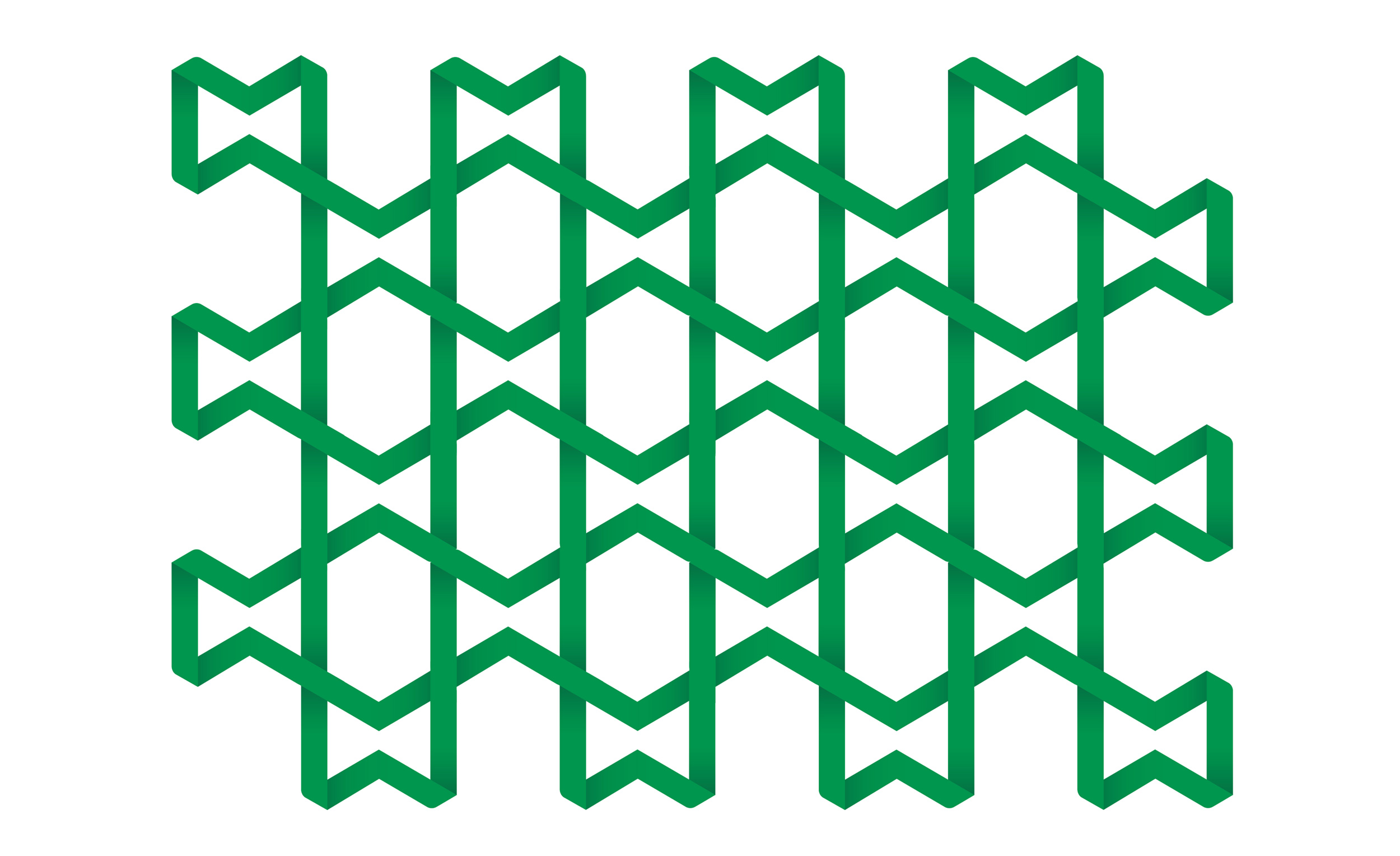
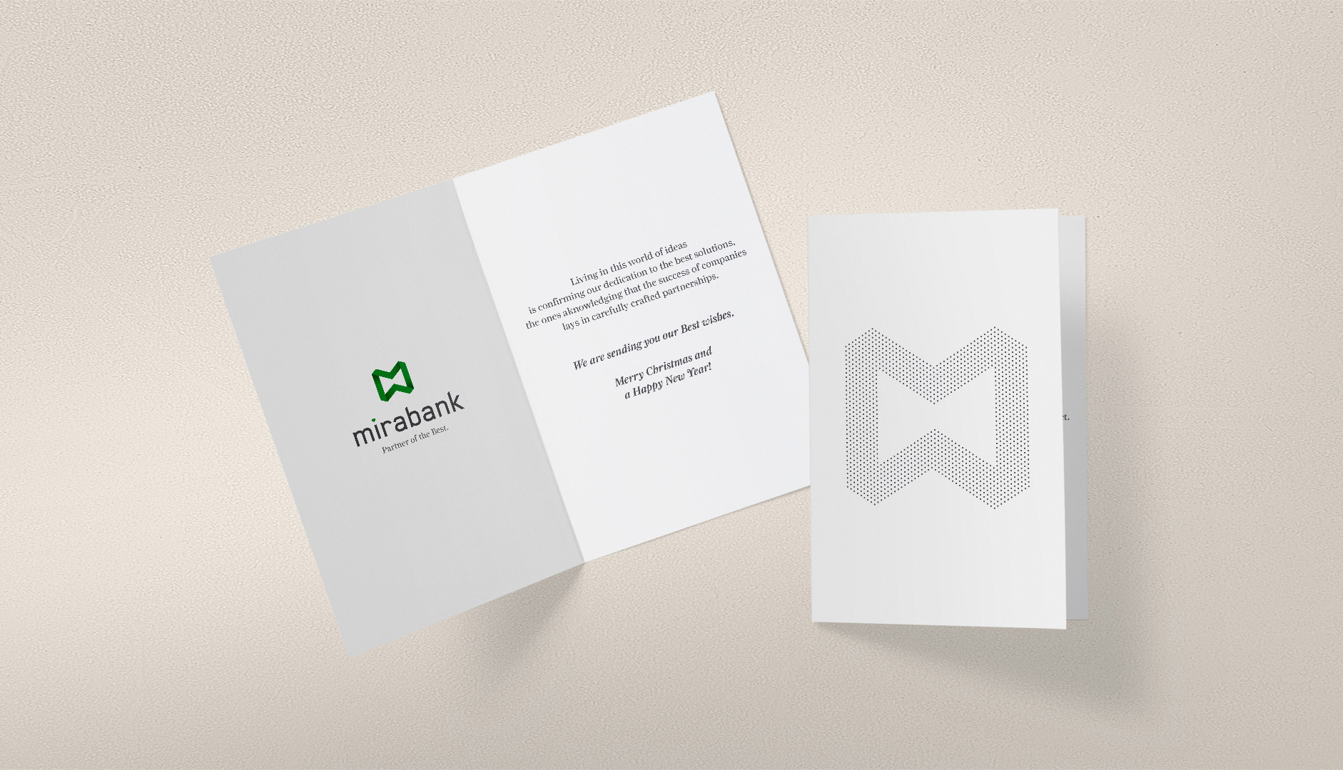
The logo makes the ‘M’ memorable and highly visible, and also sends a message of the perfection of the closed system, where everything moves within in a bespoke manner, for almost an eternity.
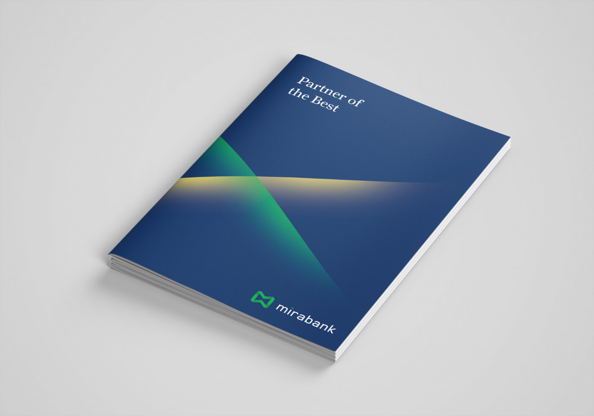
Mira was chosen to form the base for the bank’s name, for its international and Arabic connotations.
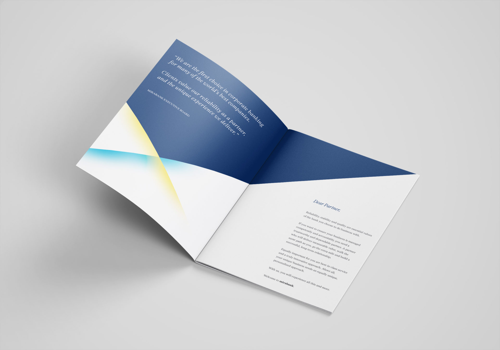
The core thought of ‘modern confidence’ resulted with the visual style that is easily communicating contemporary and approachable elegance of an investment bank.

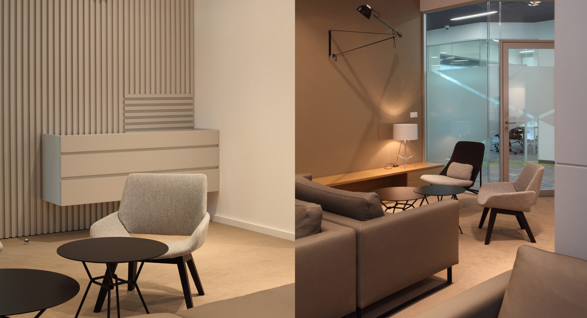
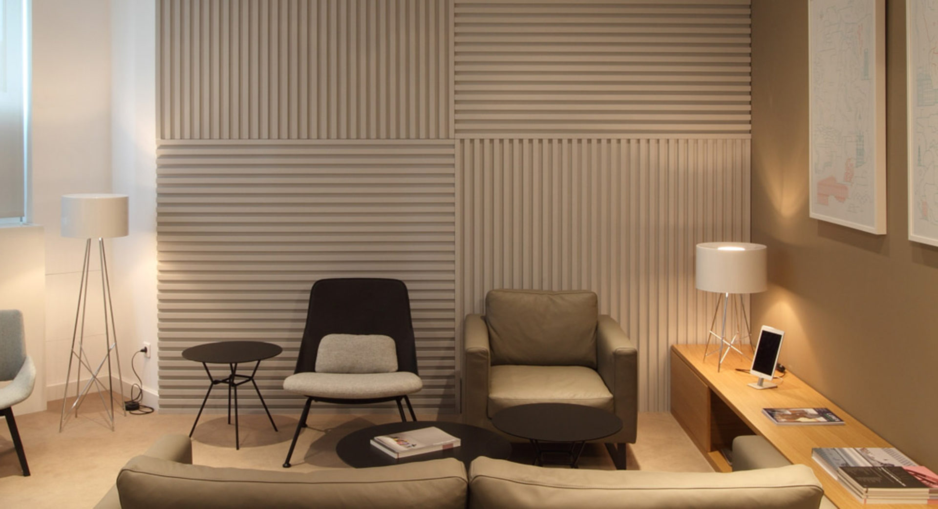
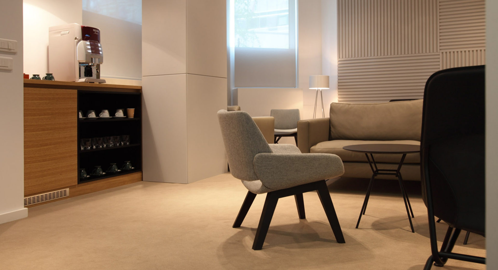
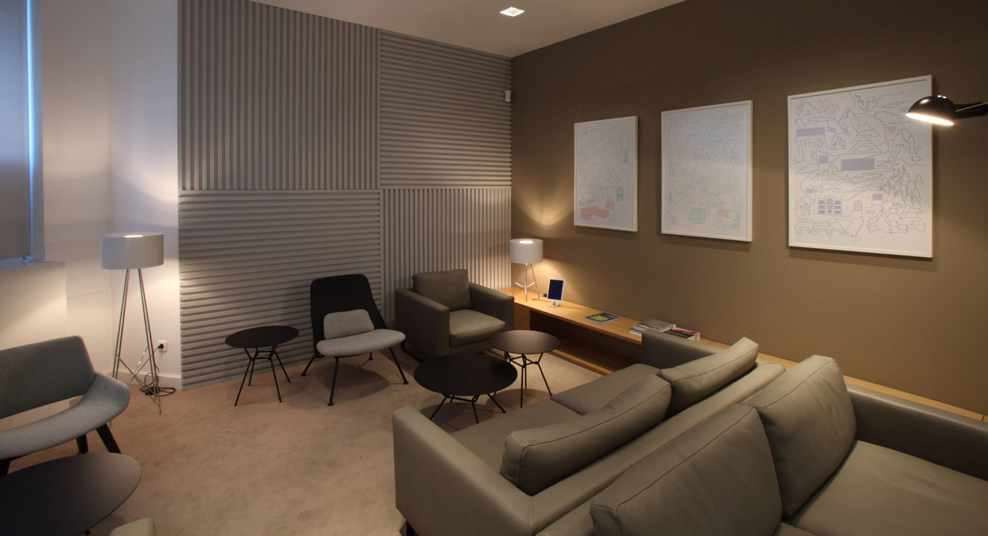
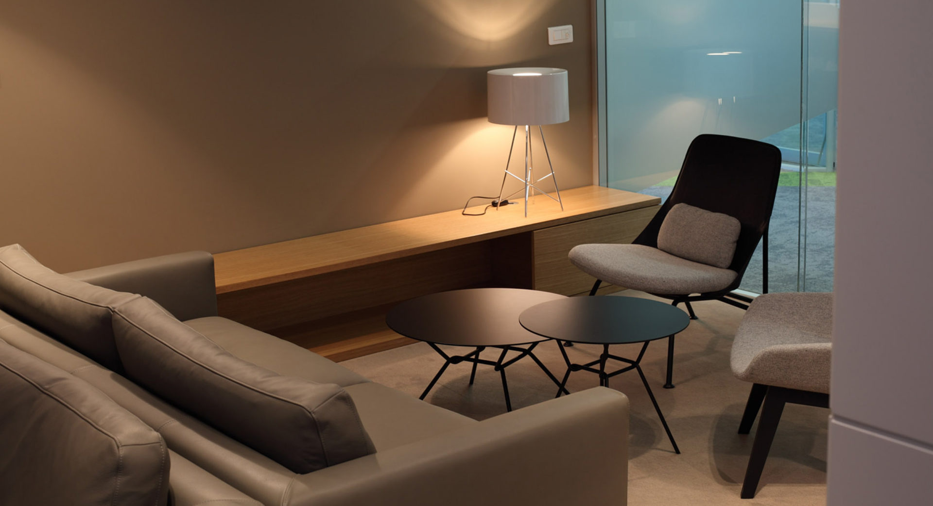
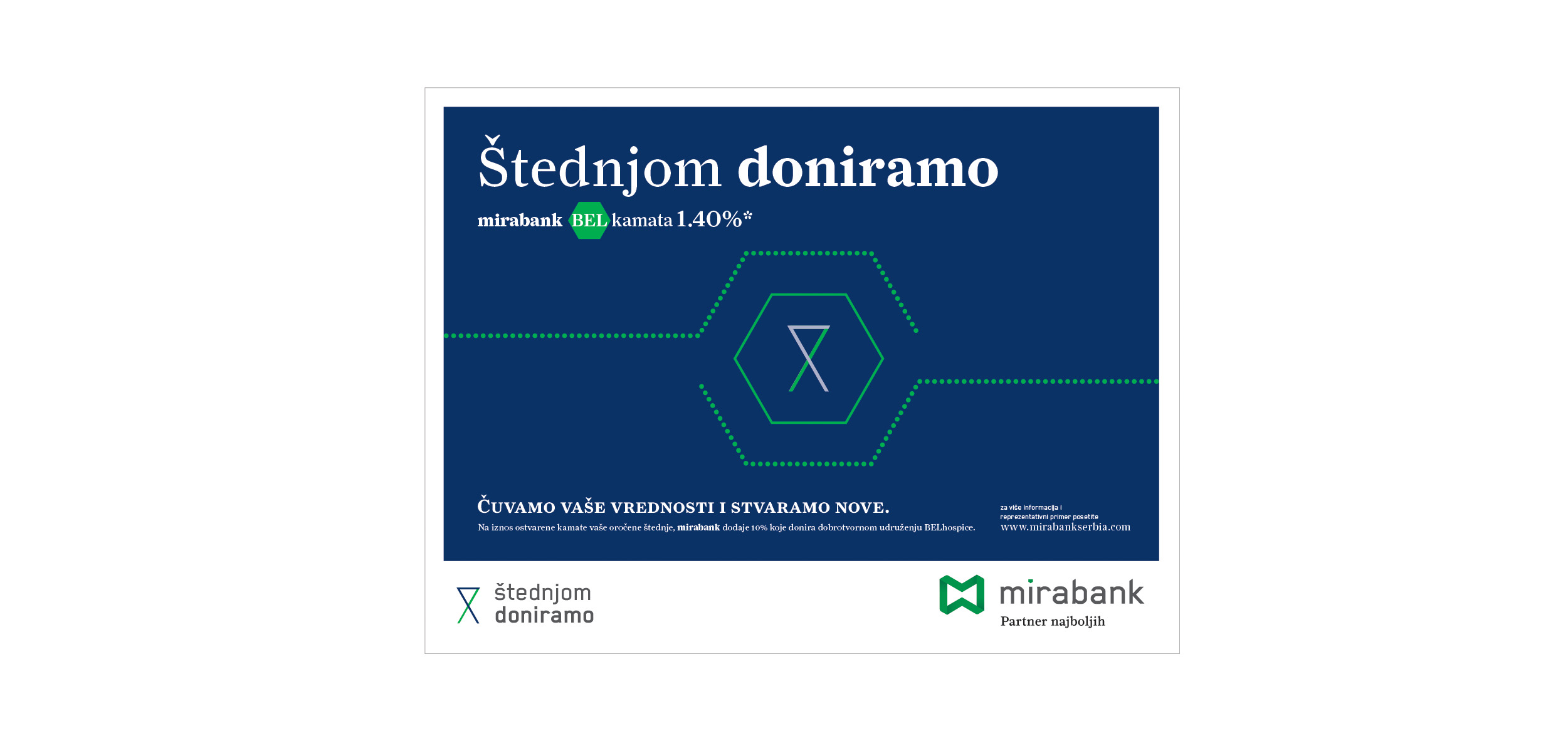
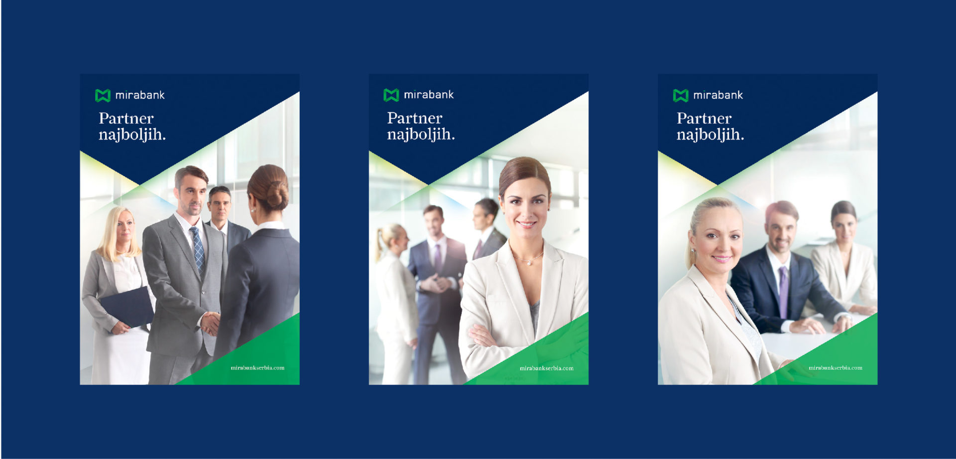
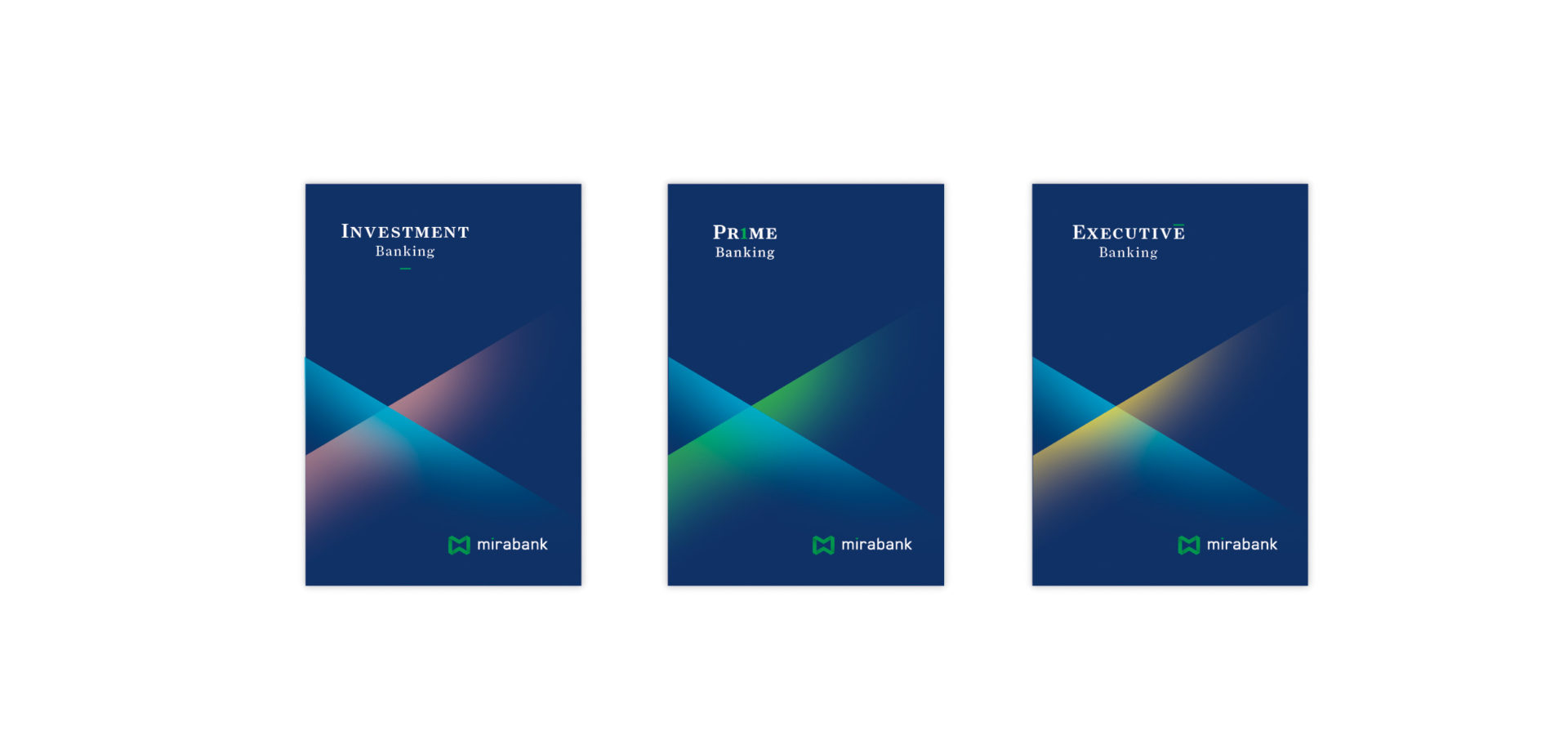
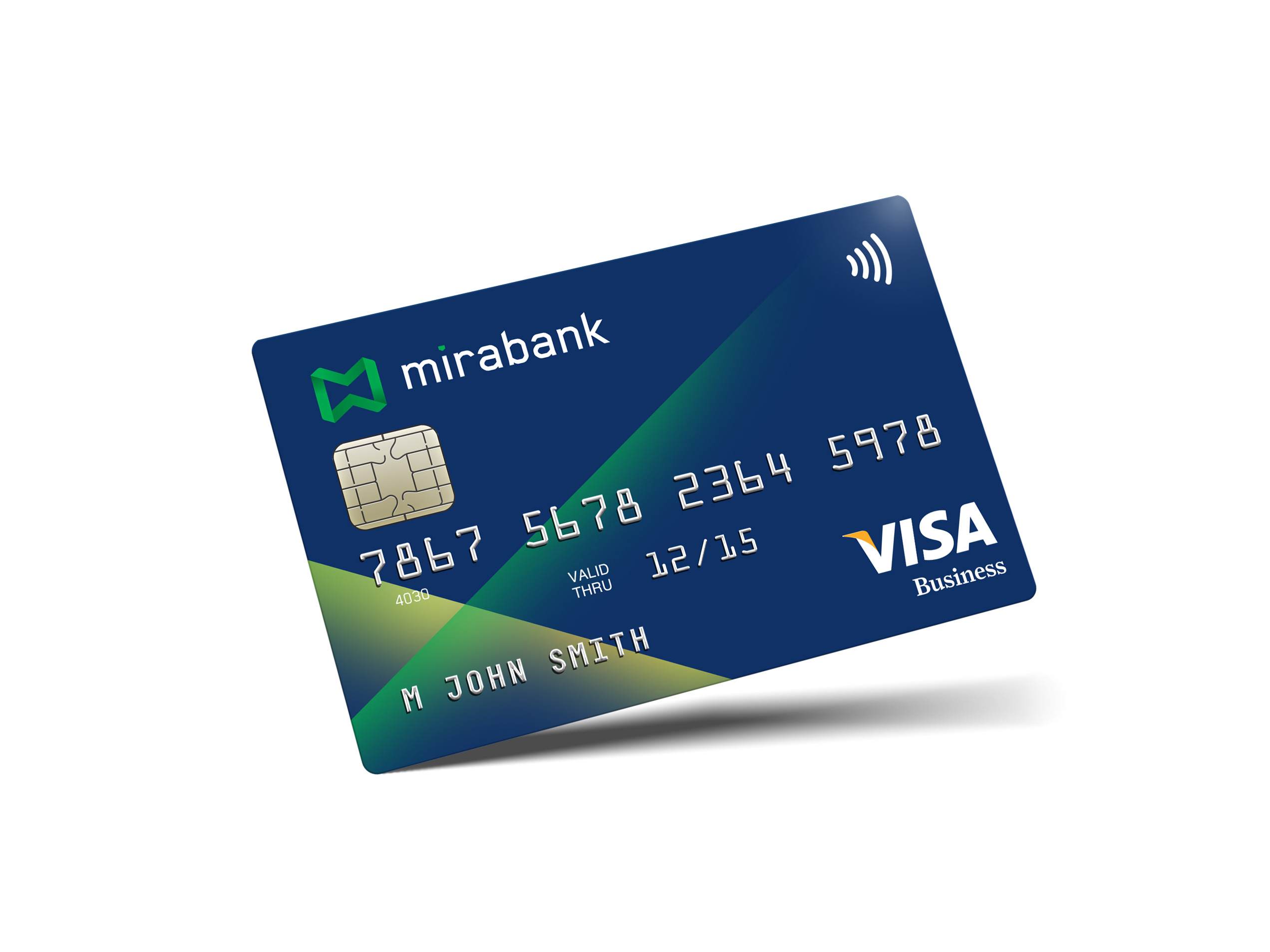
We produced a style guide book of graphic standards, a full range of business documentation, print ads, brochures, a website, interior signage guidelines and interior design and solutions, as well as organizing the opening event and celebrations of the first anniversary of the bank’s operations in Serbia.


Mirabank lounge