Max Medica
MaxMedica products have been approaching problems of daily stress, poor nutrition and hectic modern lifestyle for over a decade. ![]()
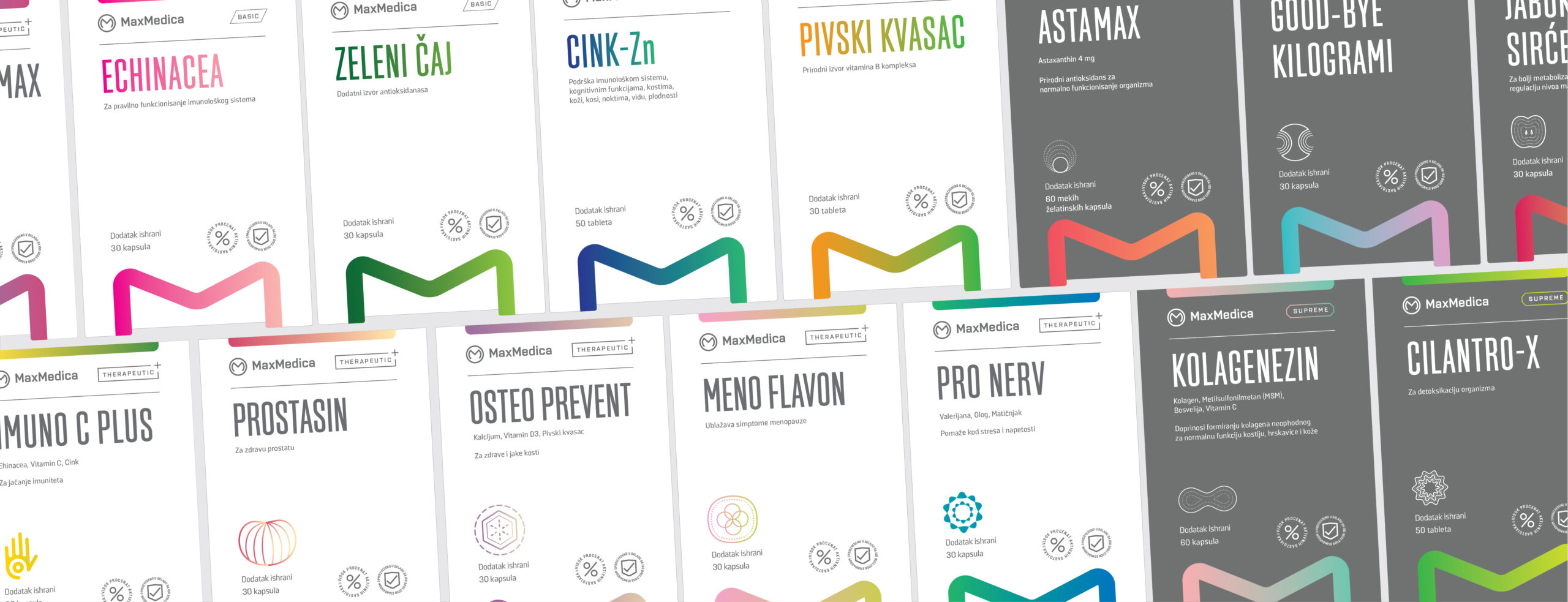
While in process of redesigning their diverse product range we were challenged to show different categories of their products, while obtaining consistency and elegance mandatory for the supplements of such quality.
Firstly, we went through a workshop in order to create a brand purpose statement necessary for the job ahead. After a busy day, we came to an understanding and agreed upon the following:
“Maxmedica produces superior products which encourage the quality of the lifestyle and contribute the preventive thinking of health and nutrition by providing people with vitality.”
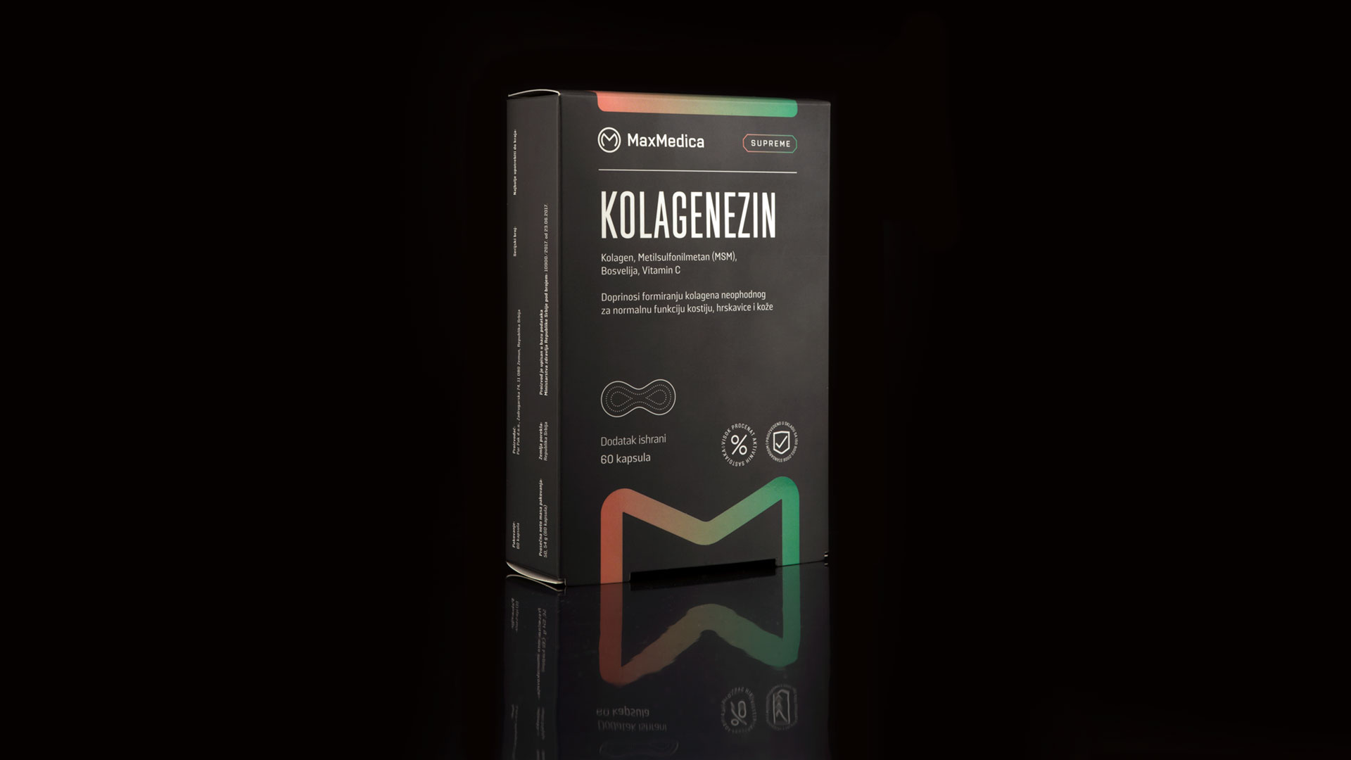
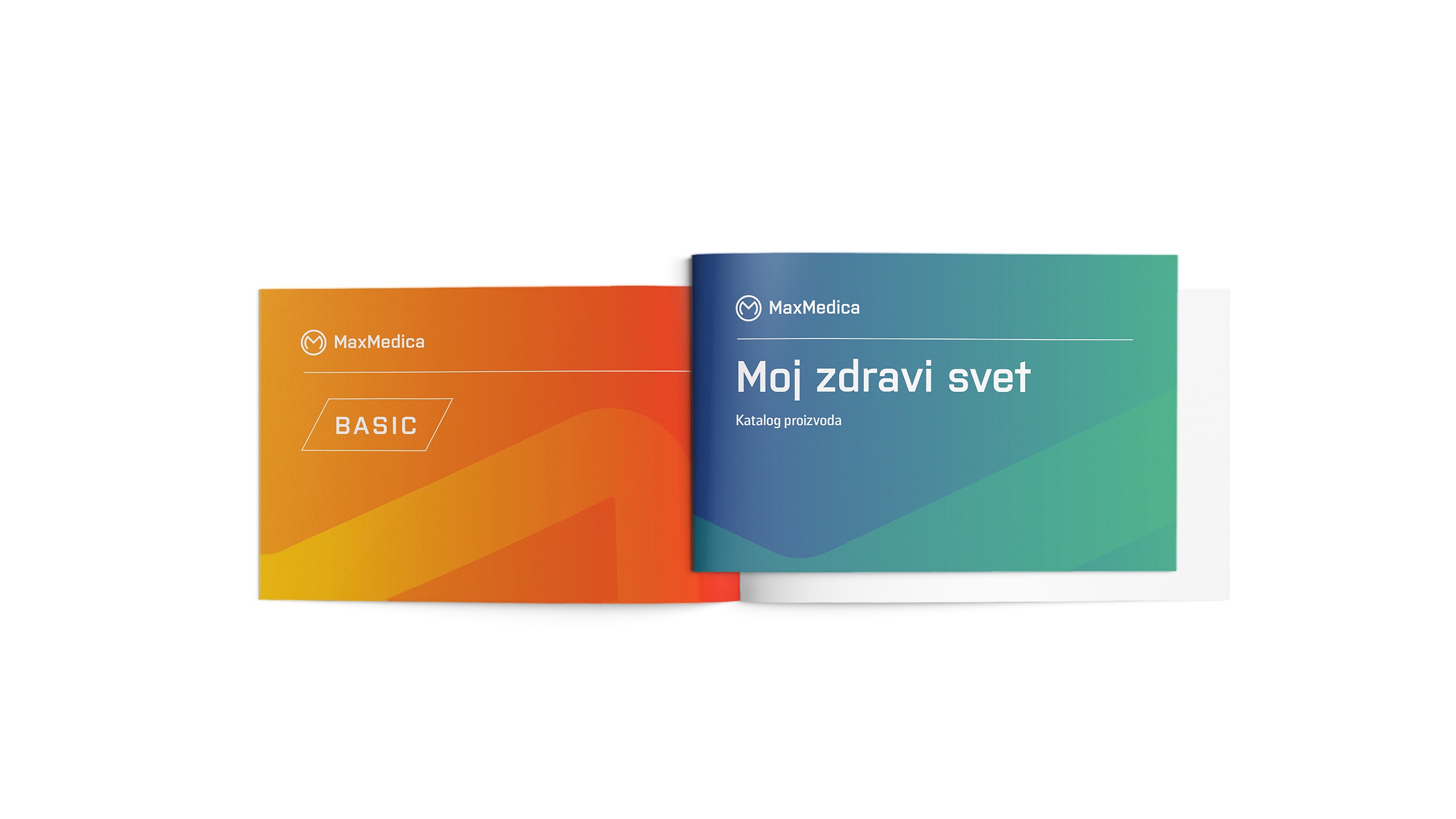
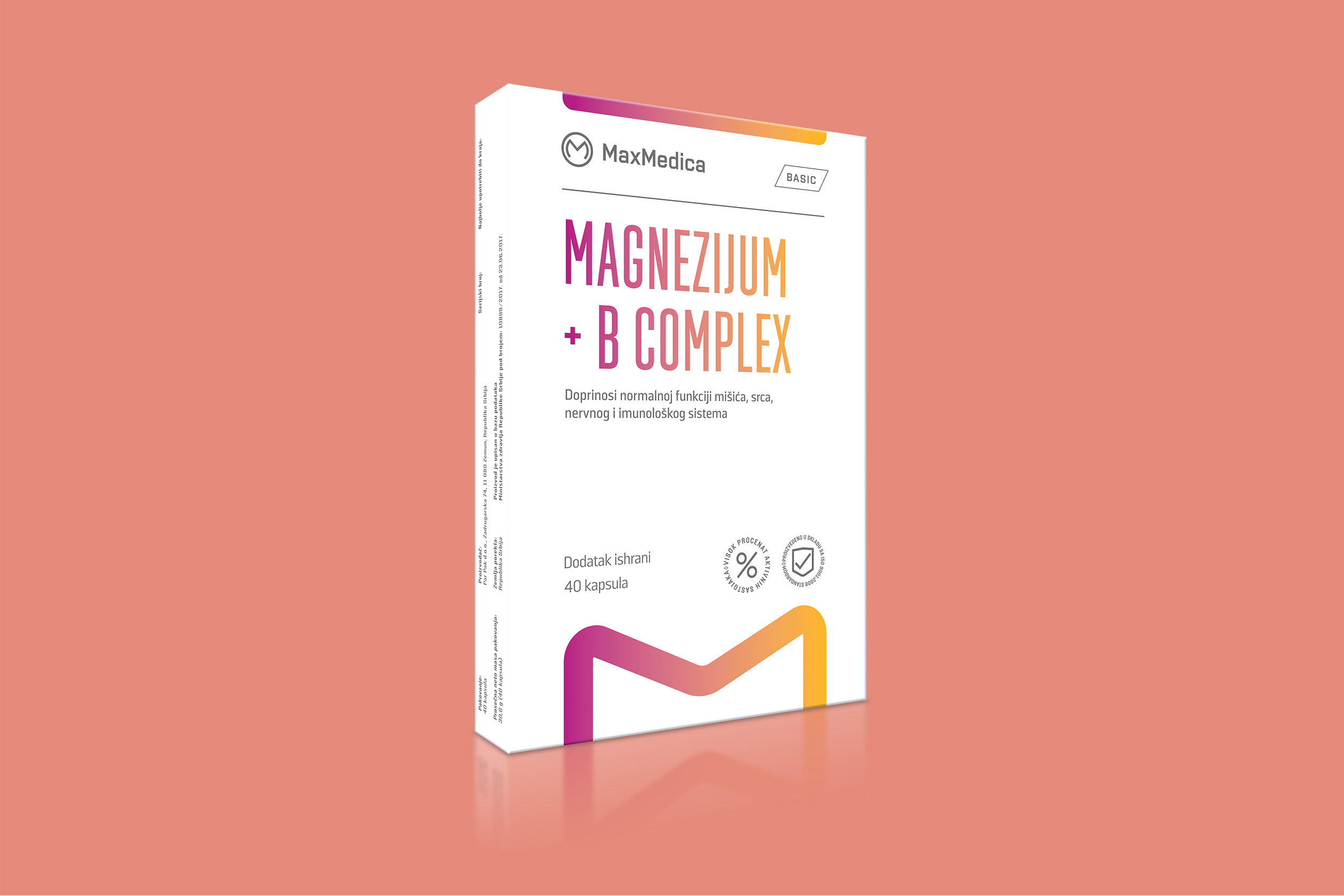
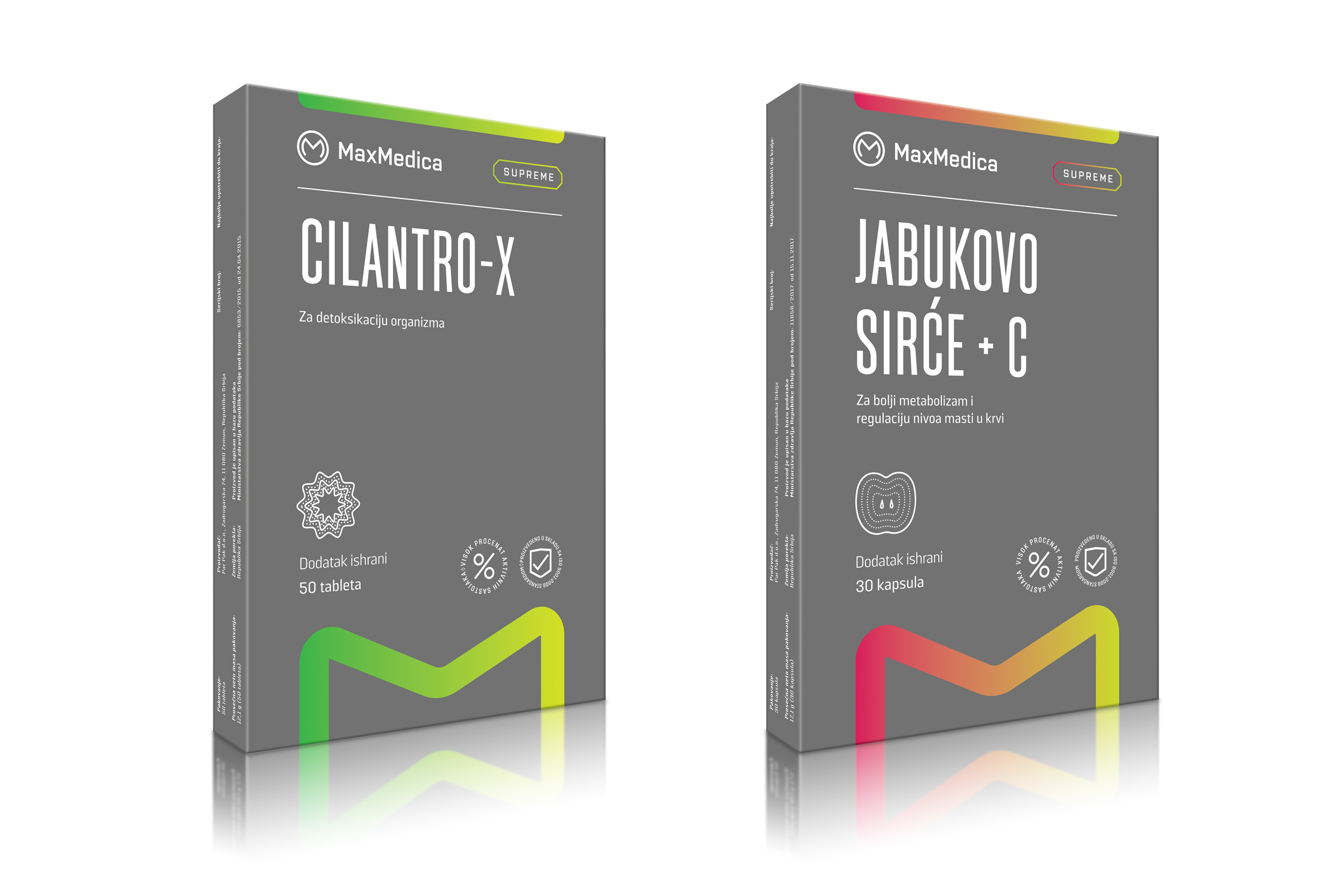
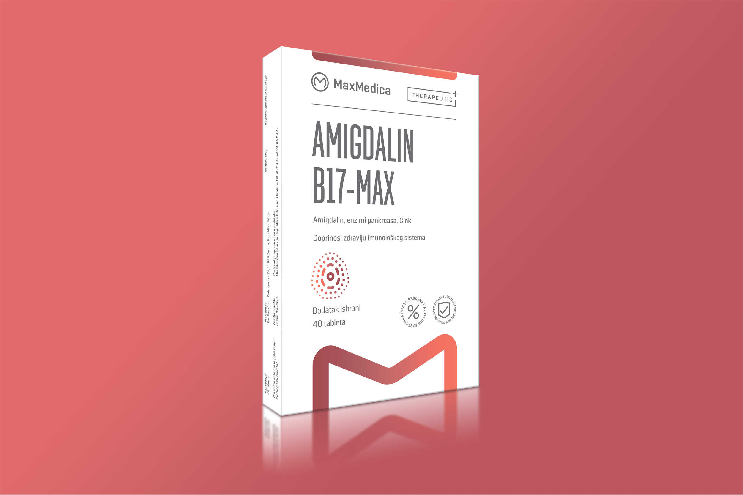
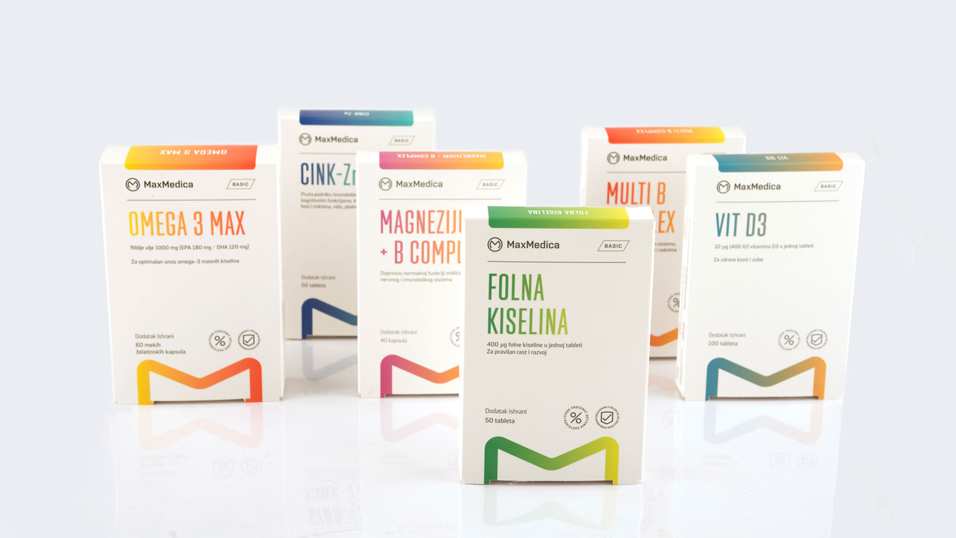
From that point, it was easy. We named the categories – therapeutic, basic and supreme, giving Maxmedica a structure and an easy way to manage their portfolio.
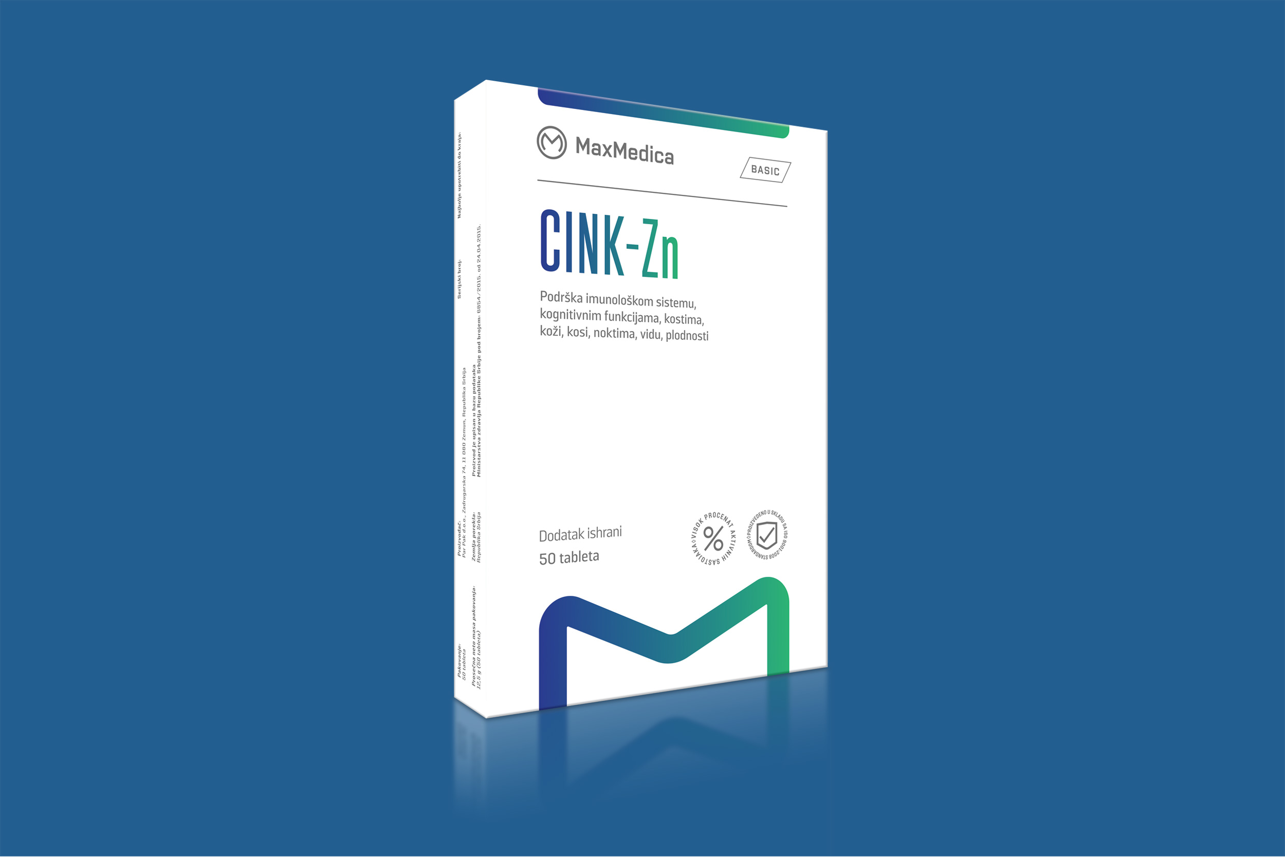
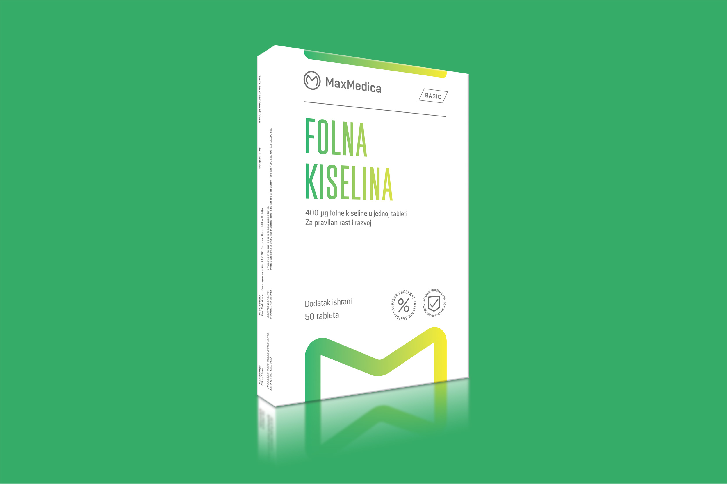
Logo and sign Max Medica have a unique position and size on the packaging, giving it high shall visibility and making it memorable.
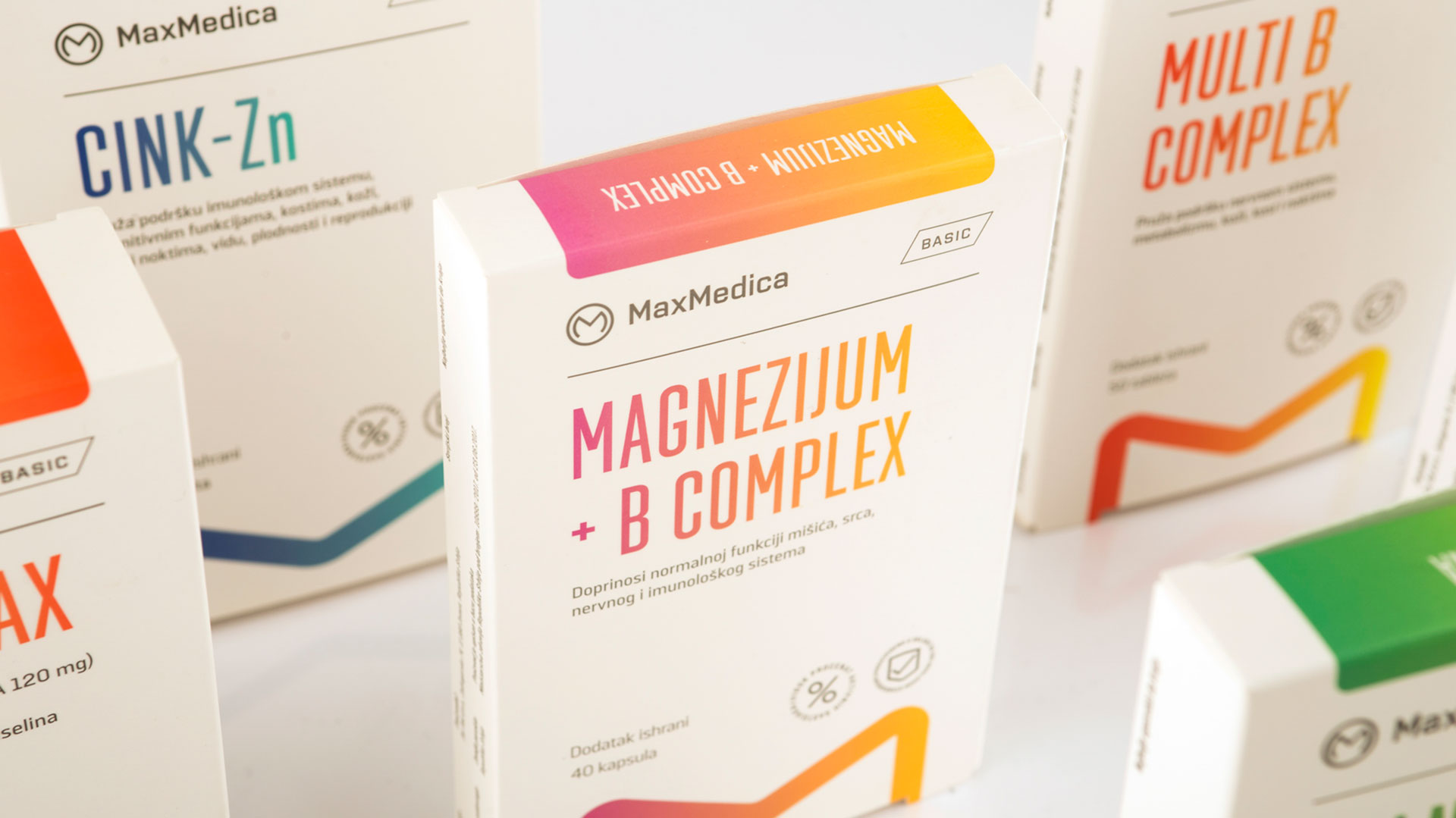
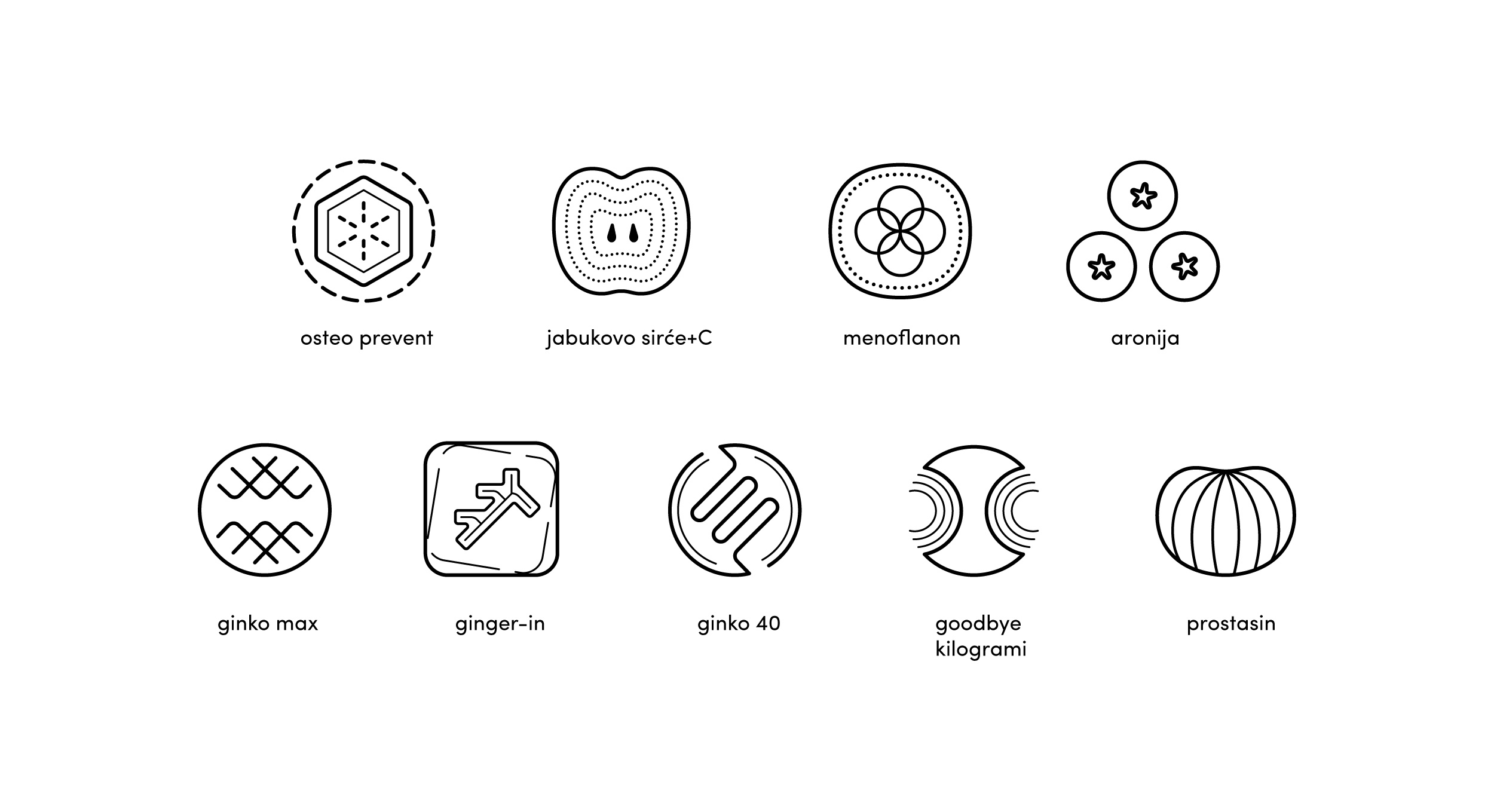
Typo, geometry and color palette are the structural elements for the visual coherency we’ve created.