Elfi
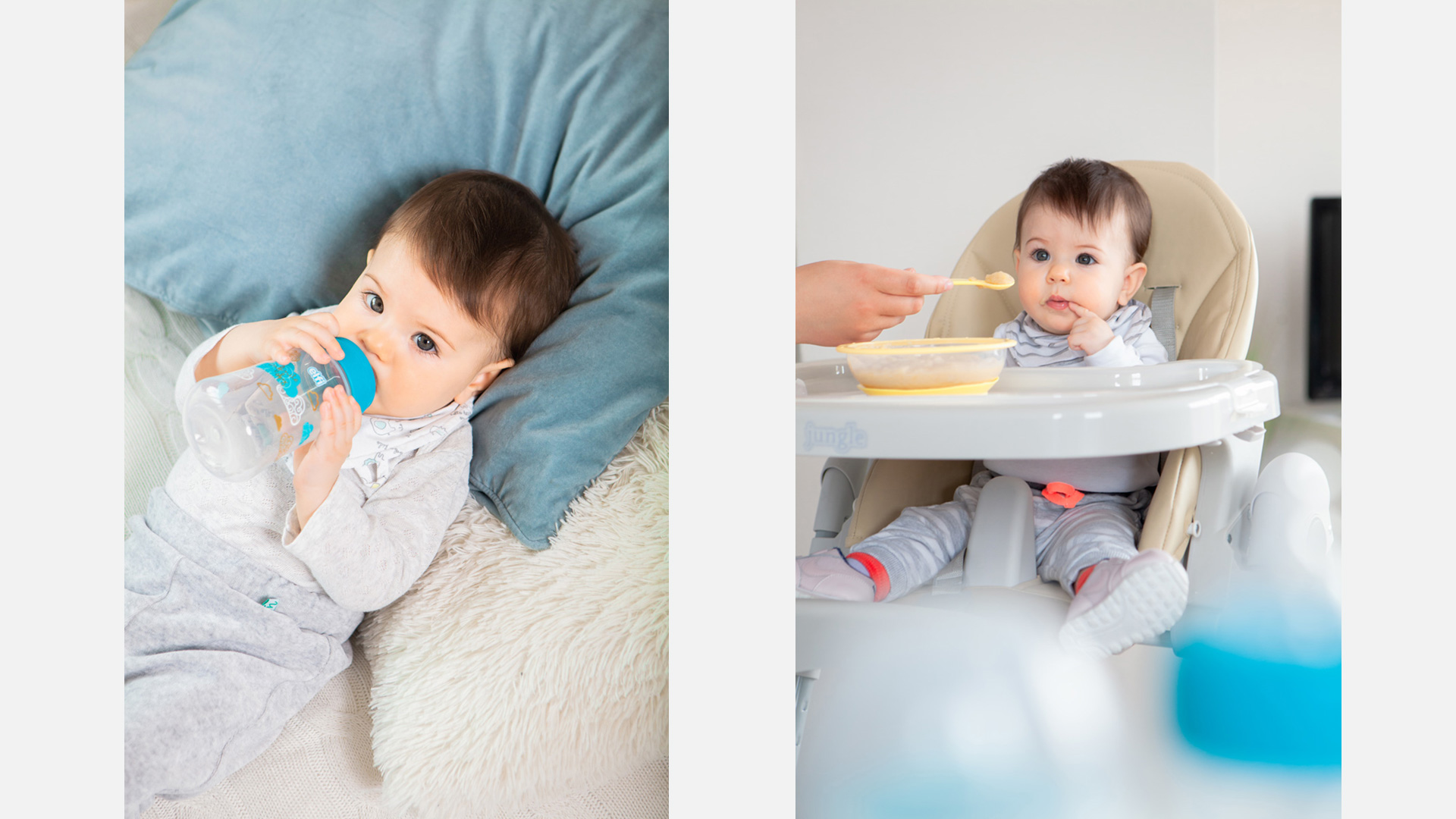
What is really important to a parent in making the right decision while purchasing baby’s accessories and equipment? Which qualities does he seek for? How the packaging translates such feelings and qualities?
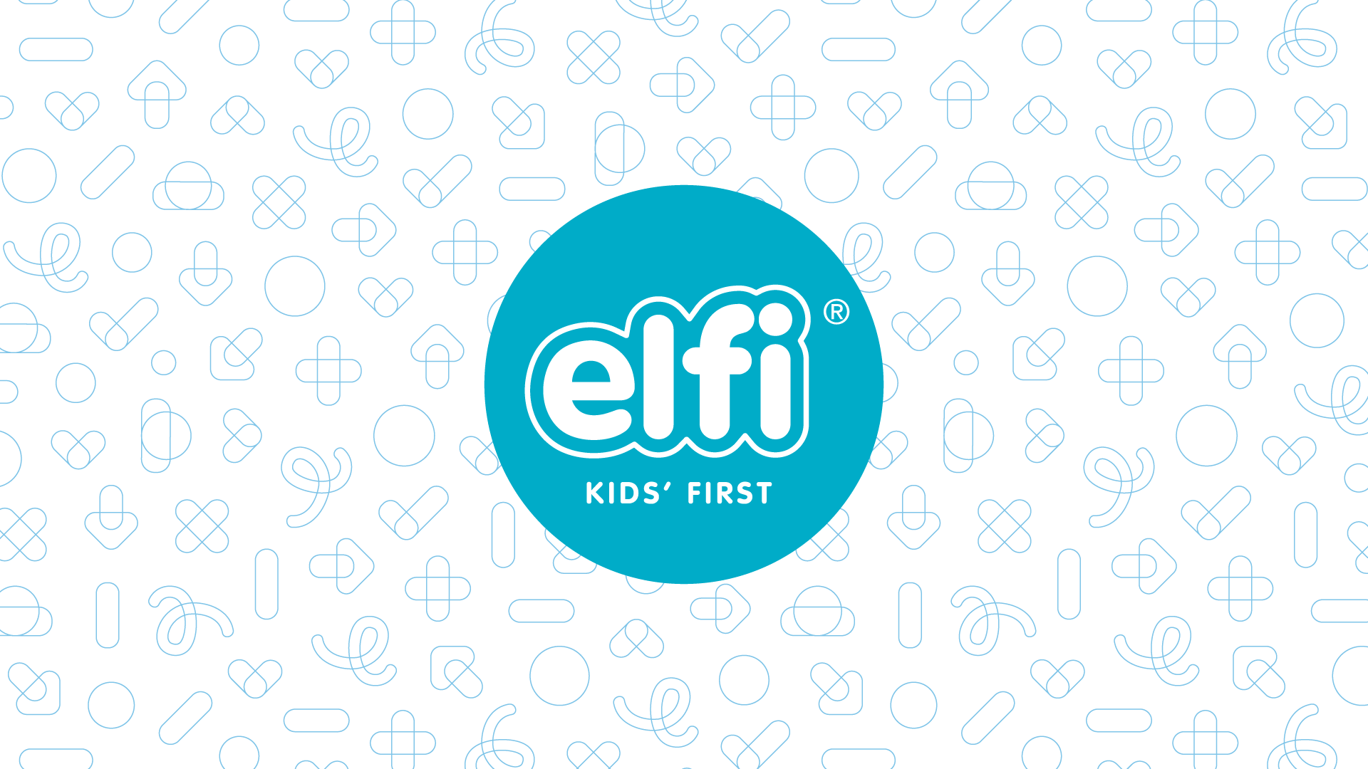
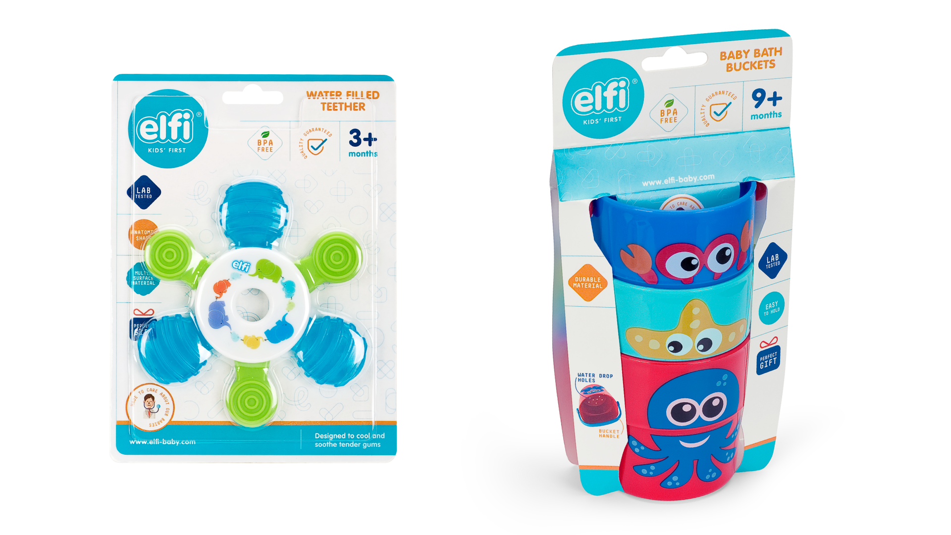
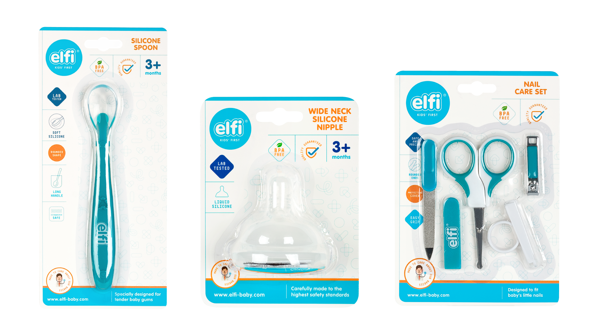
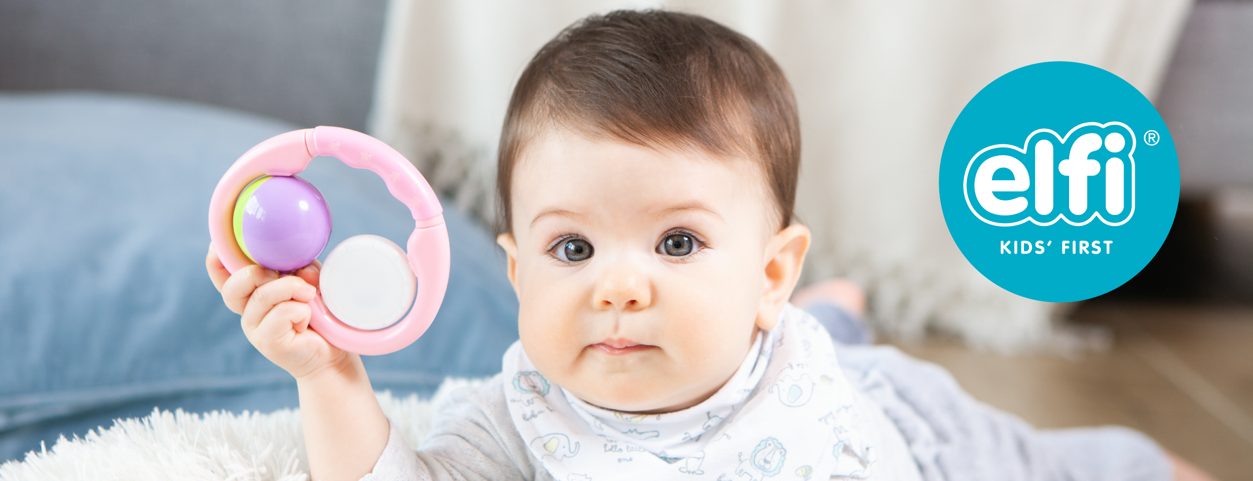
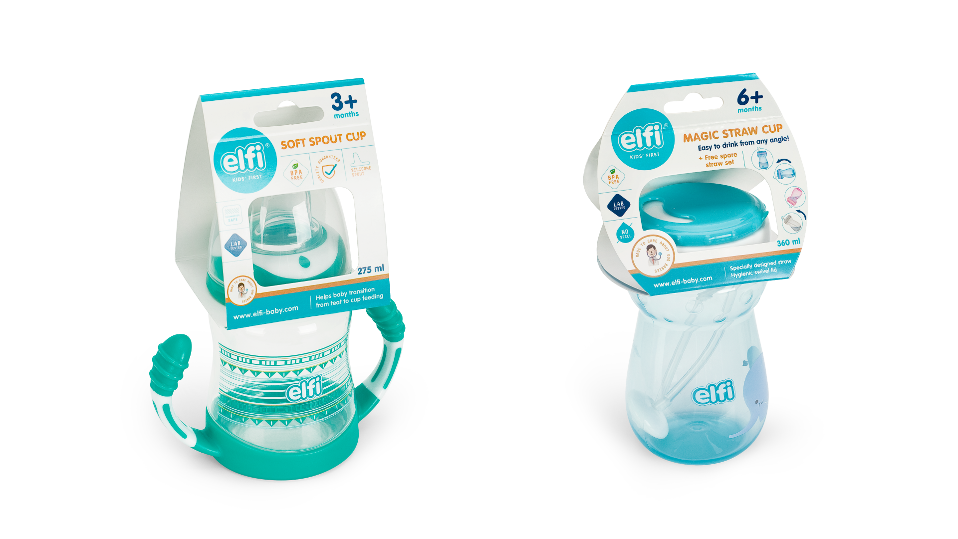
In redesigning the complete line of ELFI products, we were guided by the following terms: trust, quality, clean, new, safe. Alongside packaging, logo refreshment, collaterals we also had a strategic role by creating the positioning claim – Kids’ First.
Clean and simple design approach is used combining white and blue tones.
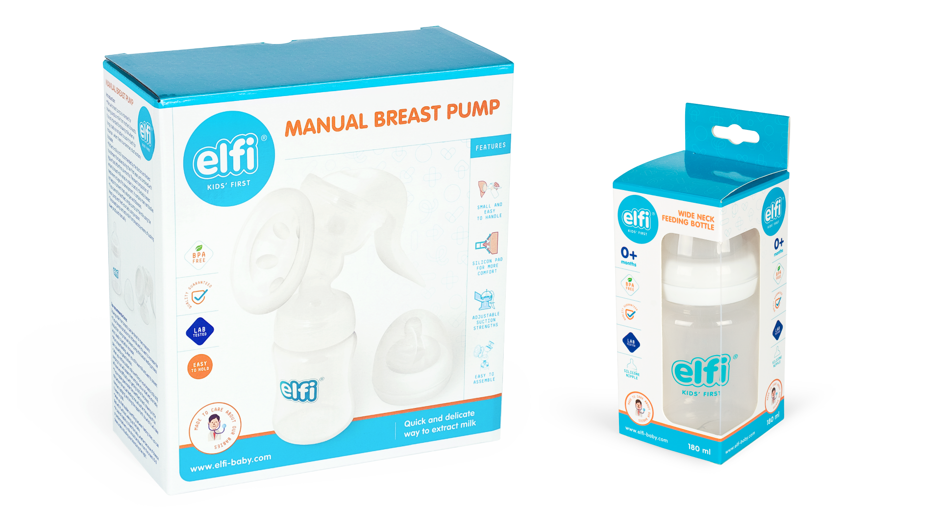
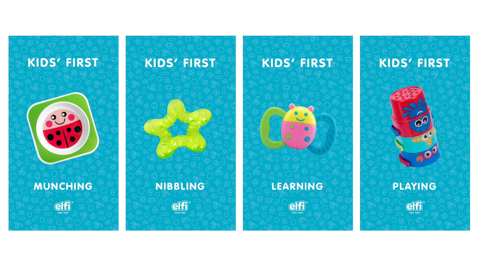
The structure and the layout of the graphic elements was inspired by the desired associations depicting the trustworthy product that is easy to use. The pattern is playful, vibrant and recognizable. As the product is aimed primarily to mothers – it was necessary to make a link with emotions that will by each and every detail denote the verified good, such as the doctor illustration, and the concise claim that gives us the most important information quickly, and encourages us to make an informed decision.

The positioning statement – brand headline, is sending two messages.
KIDS’ FIRST object, created with dedication and love
KIDS FIRST as an attitude in which we acknowledge the priority of caring for the child
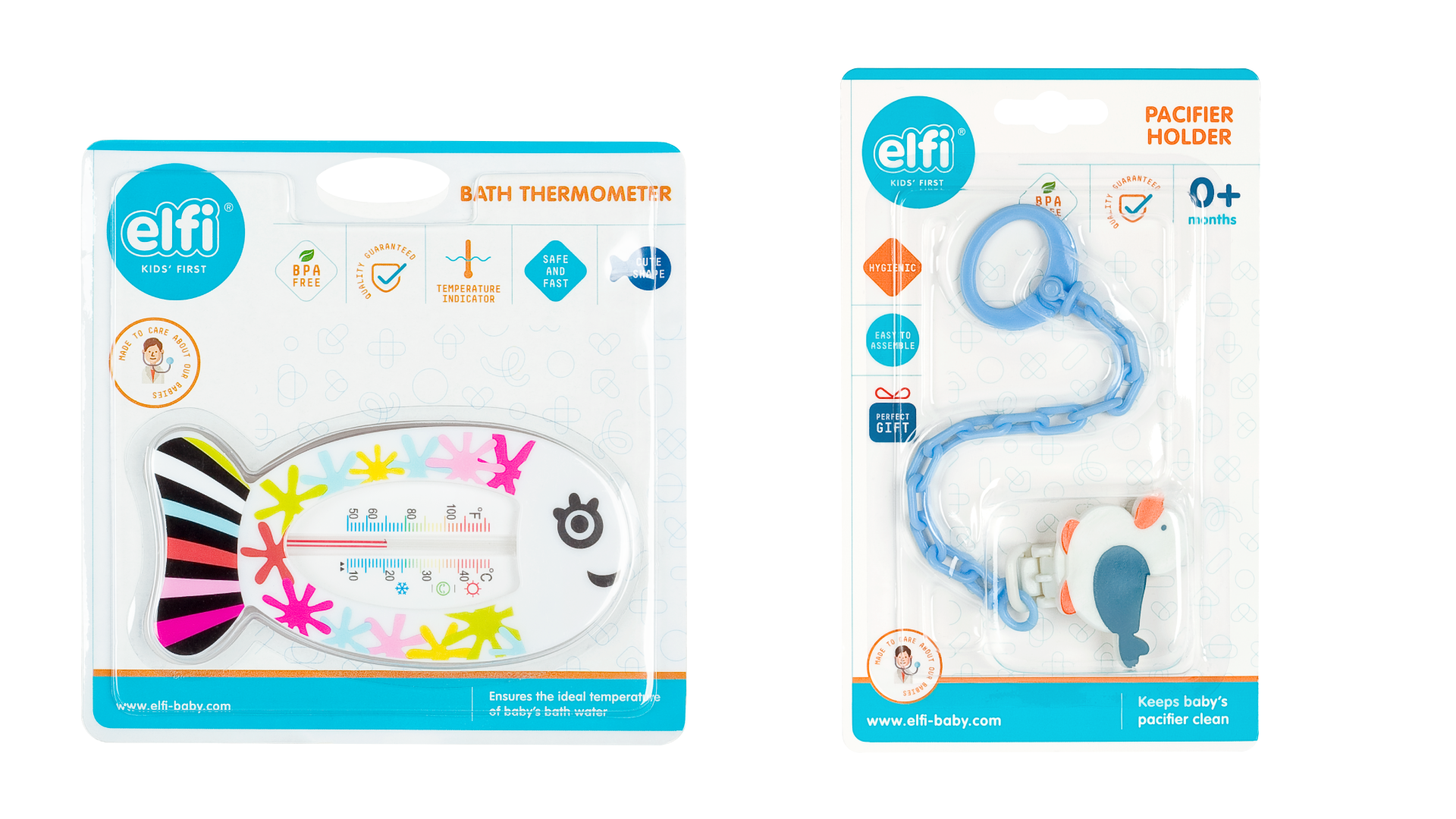
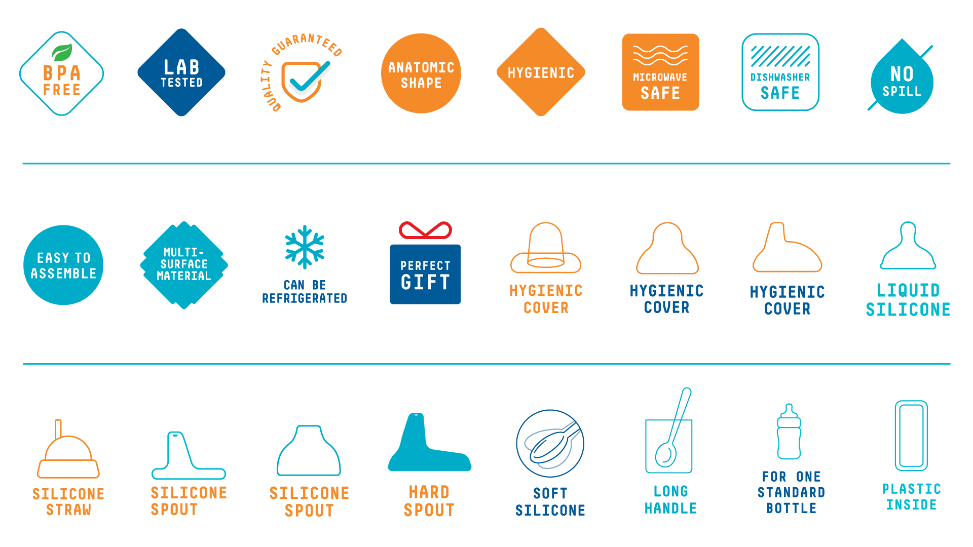
The picograms are linear, stylized, informative and clear.