Black&Brown
When the company with a range of premium quality marzipan-based snacks approached us, we were presented with a case of disjointed brand image, further complicated by expensive packing issues.
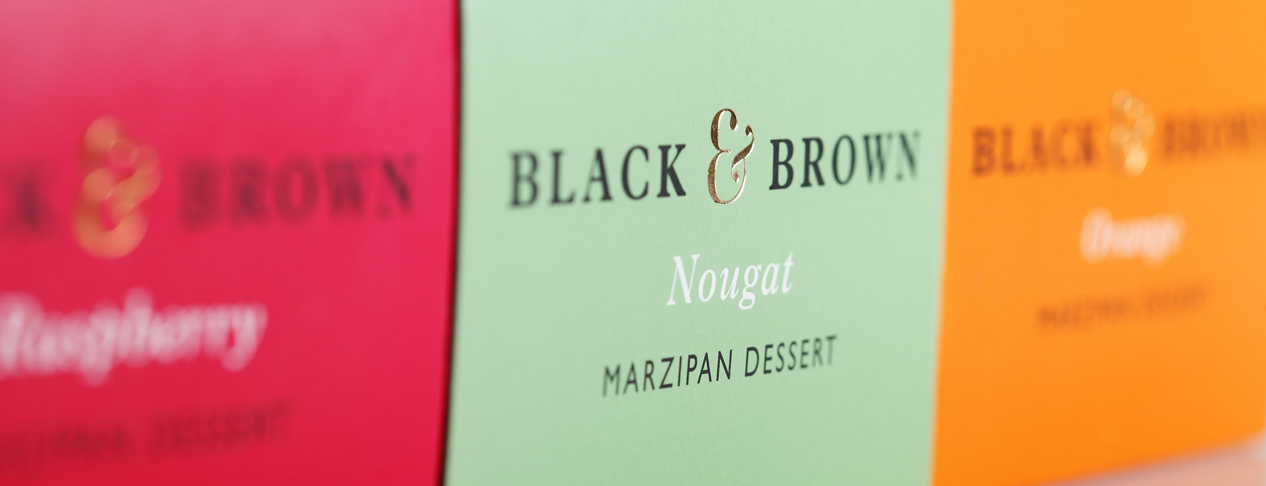
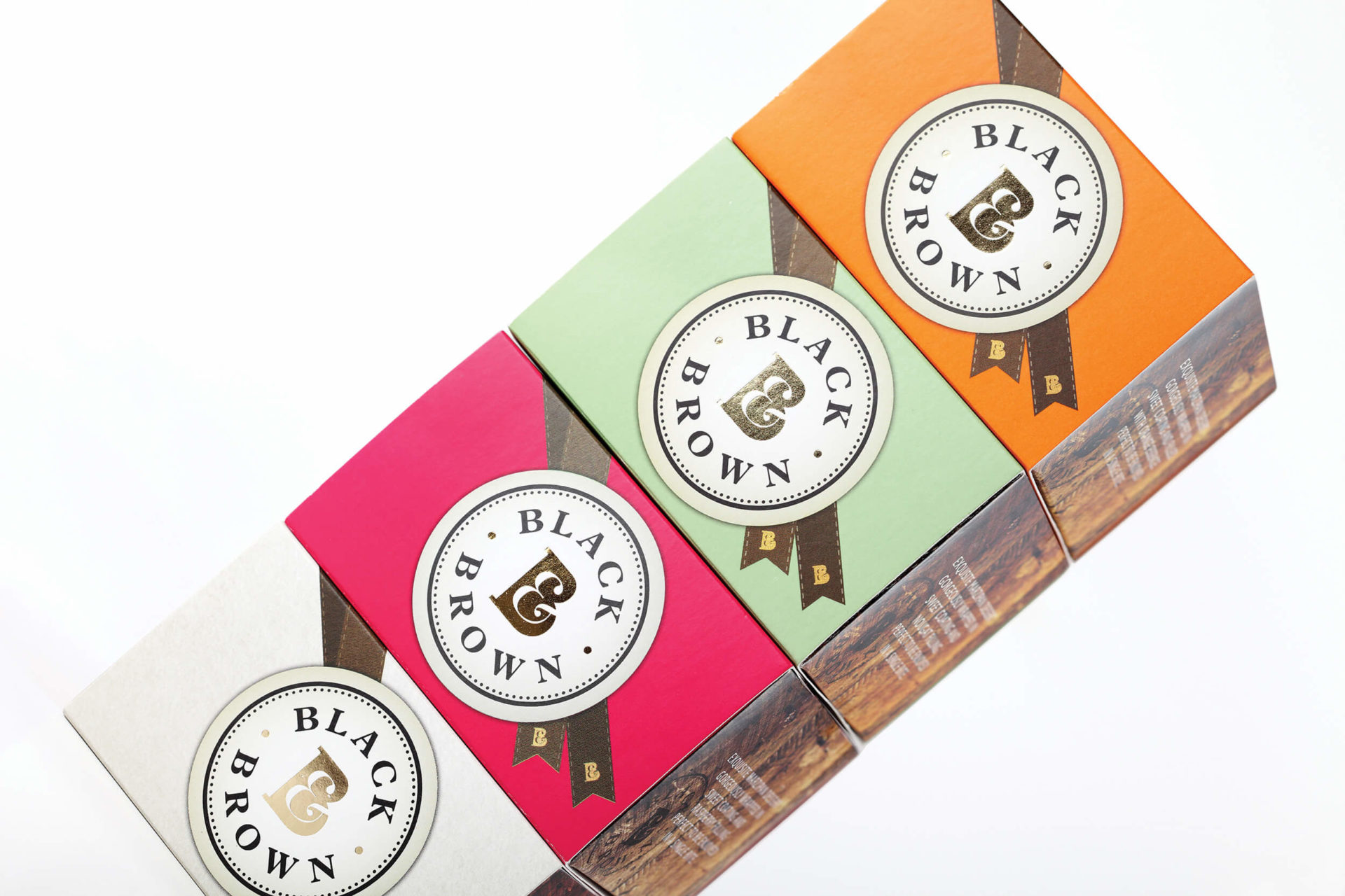
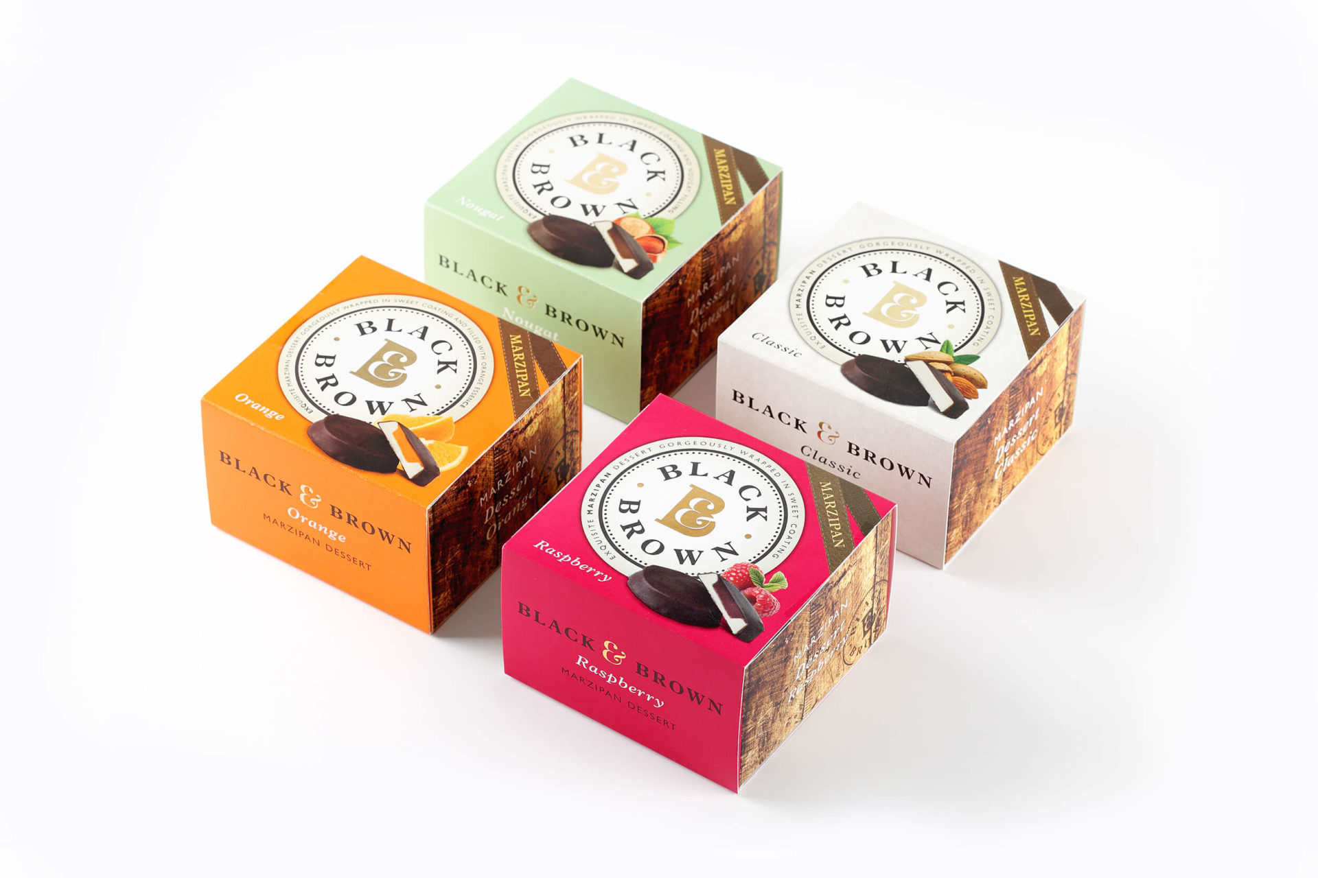
After research was conducted, the name Black&Brown was chosen to unify the product range, after which we set about repositioning it and redesigning its image. The idea was to communicate the premium price with an image of reassuring, yet approachable quality.
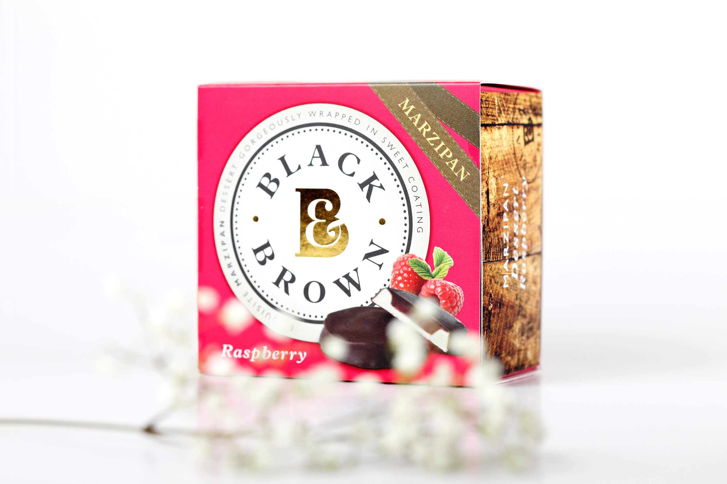
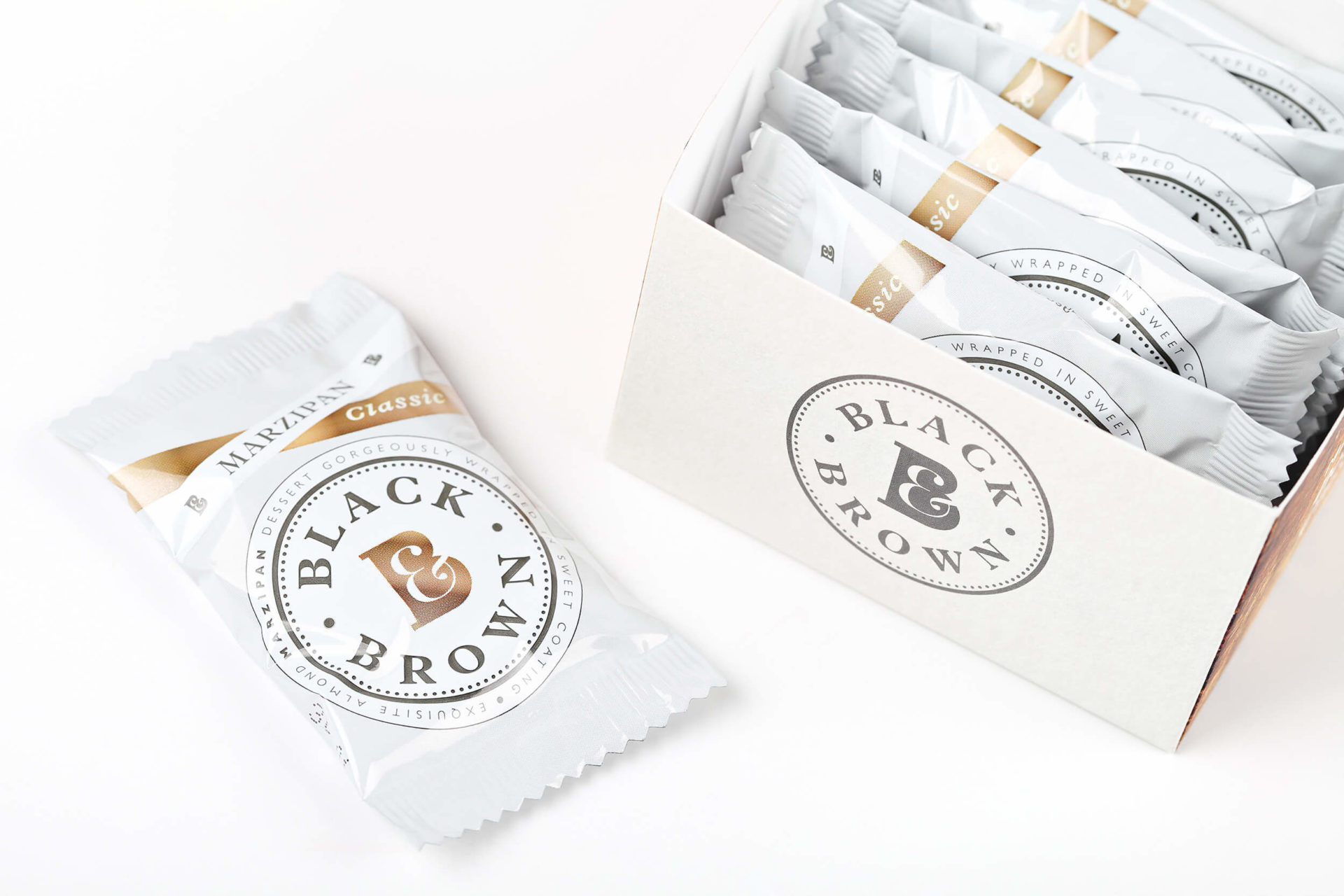
We created a new quality seal-like logo for the Black&Brown brand, applying it as a major visual unifier across the range, creating an instant shelf stand out, while at the same time suggesting a reputation for higher quality.
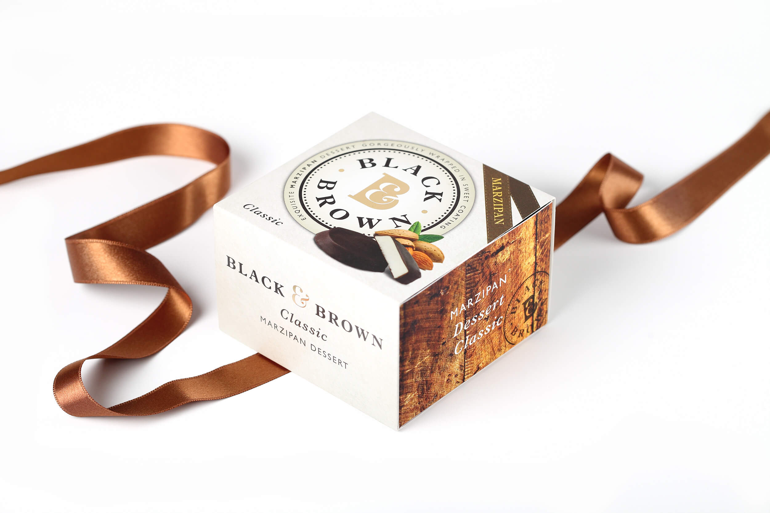
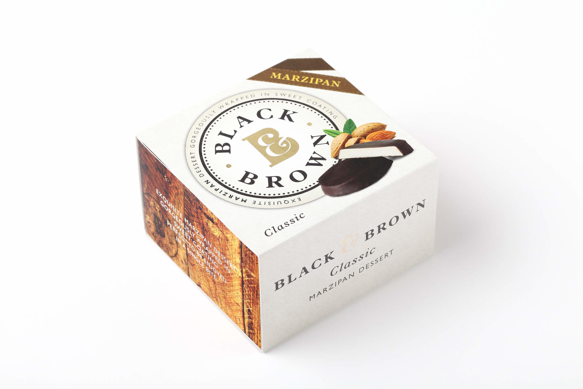
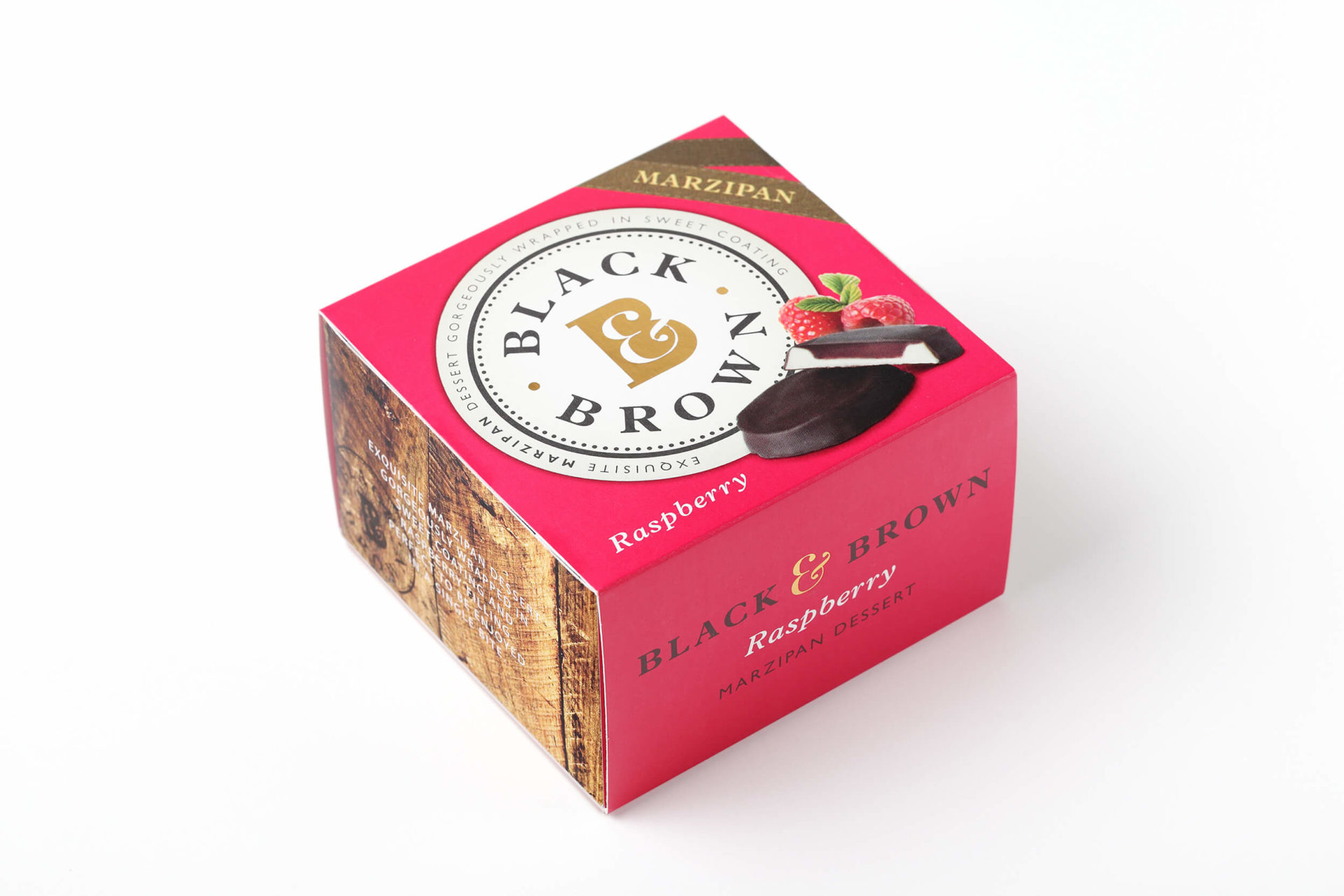
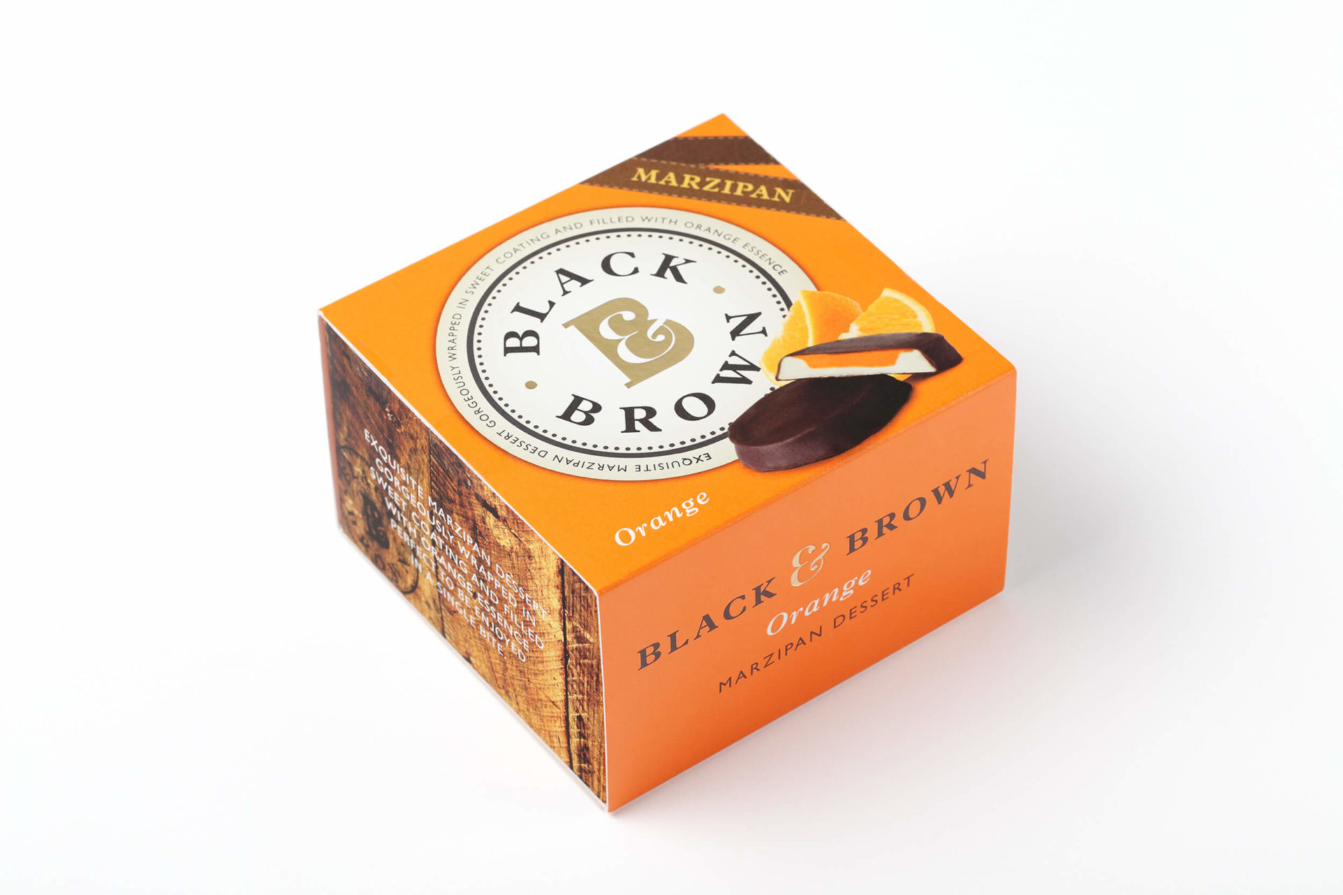
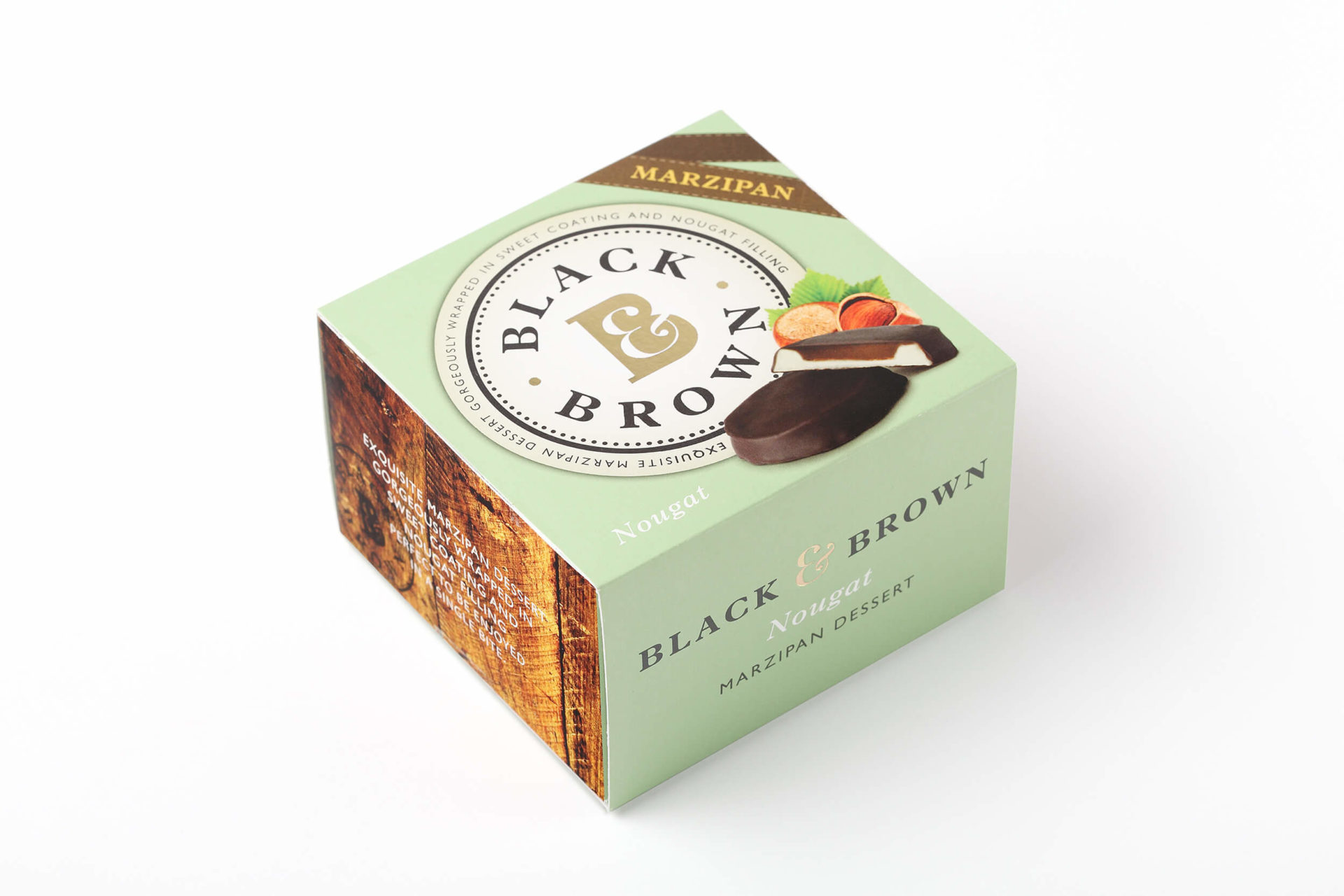
For the premium gift range, we also scrapped the pricey black tin boxes and replaced them with much less expensive square cardboard packs, with just a few details embossed in gold print.
This was one of those projects in which we not only helped boost clients’ sales, but also saved them a lot of money in the process.