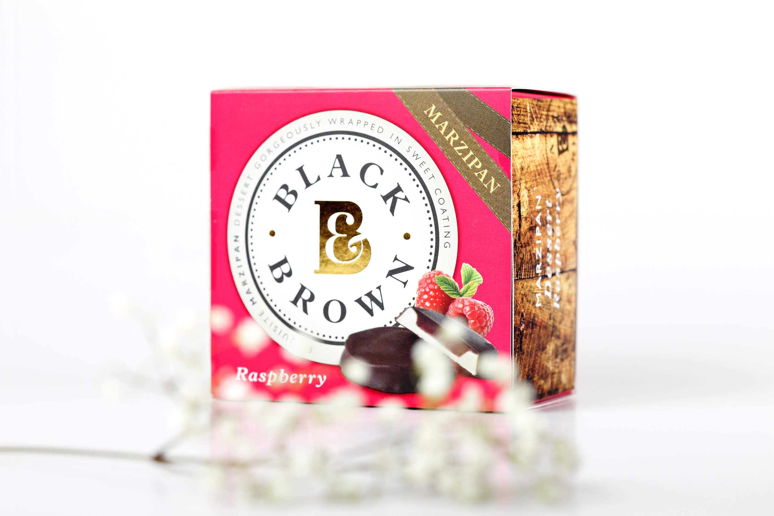
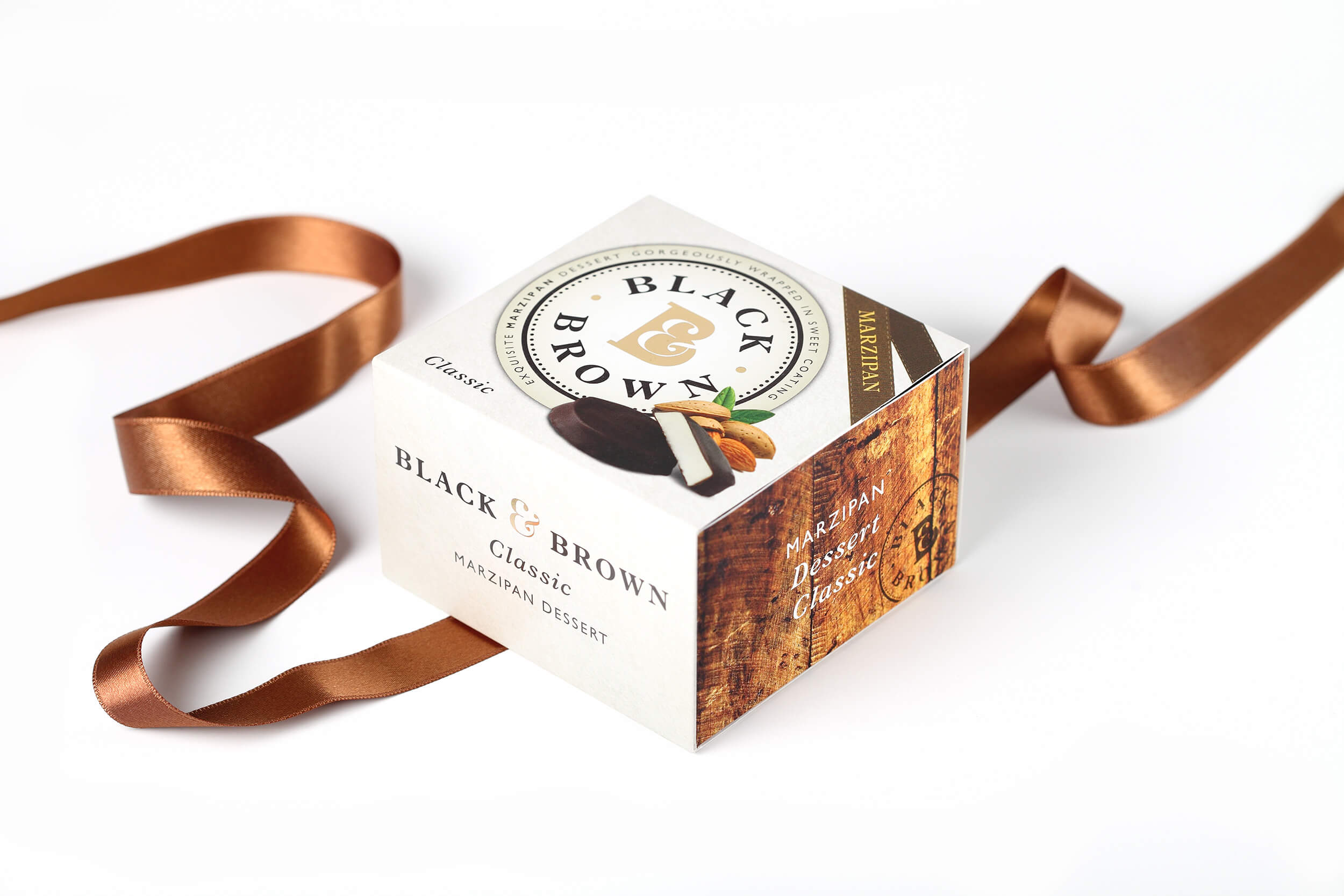
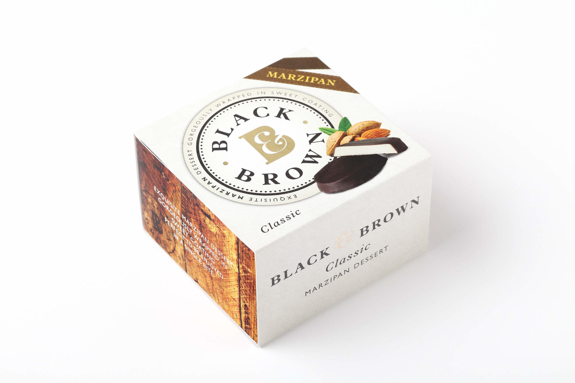
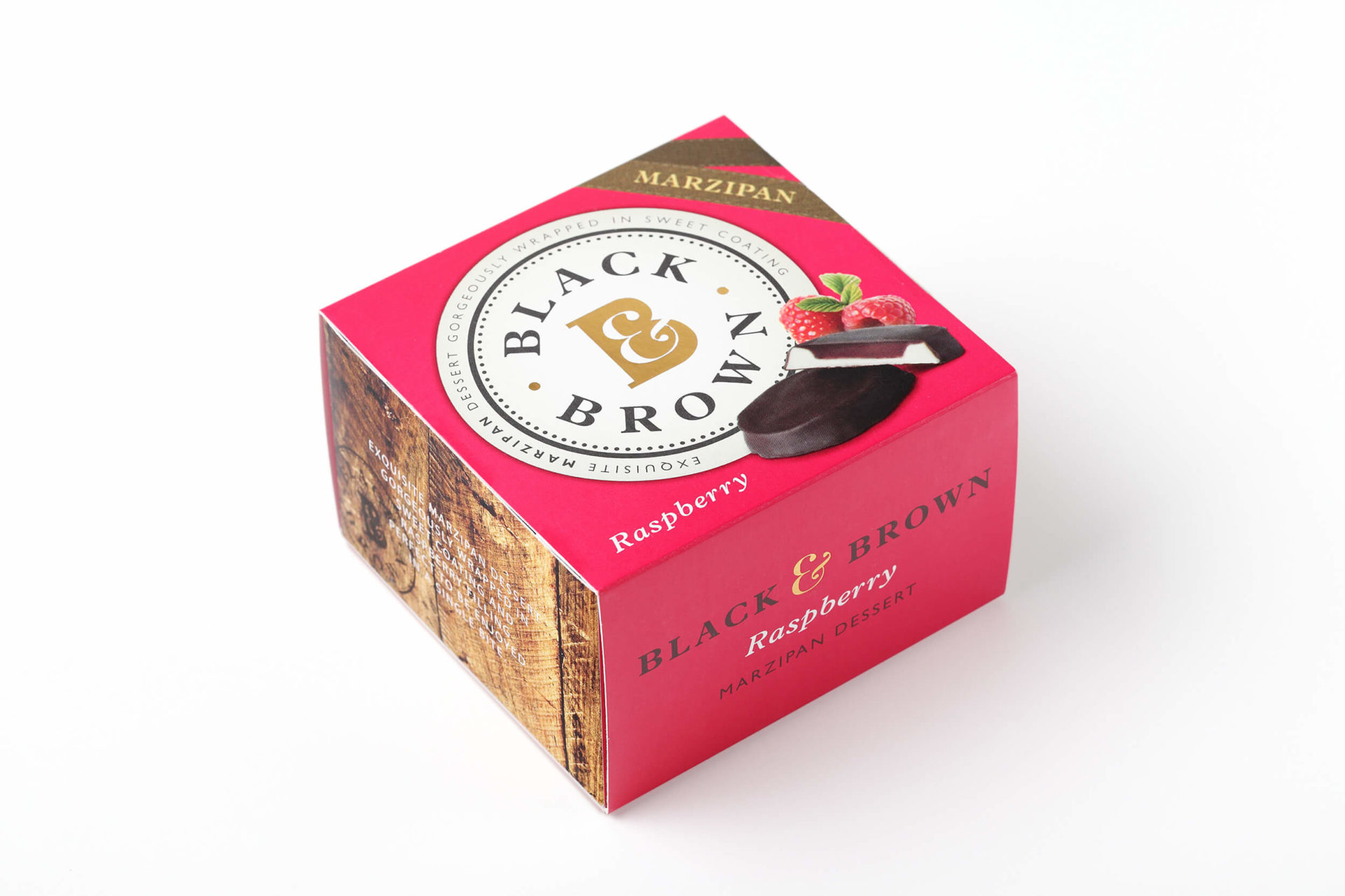
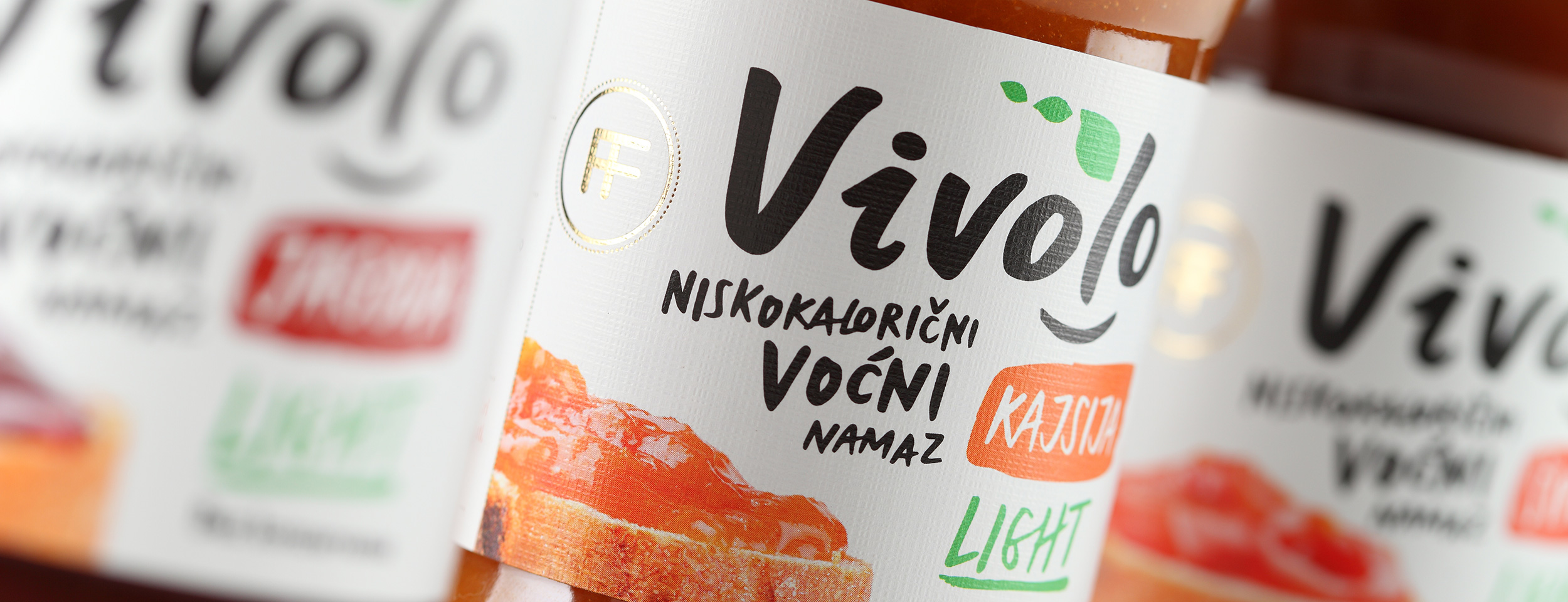
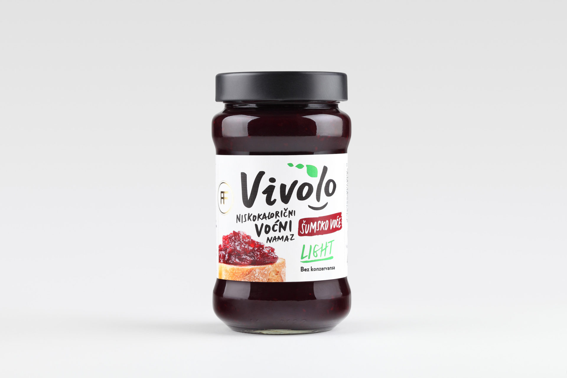
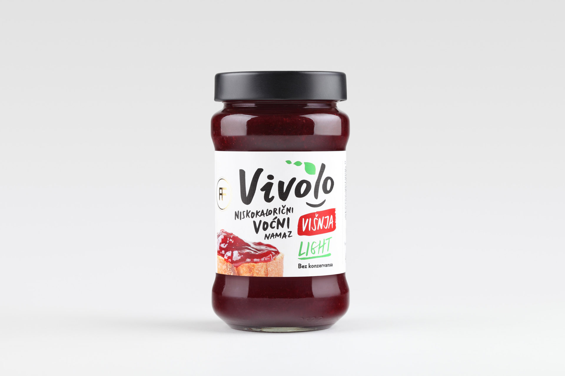
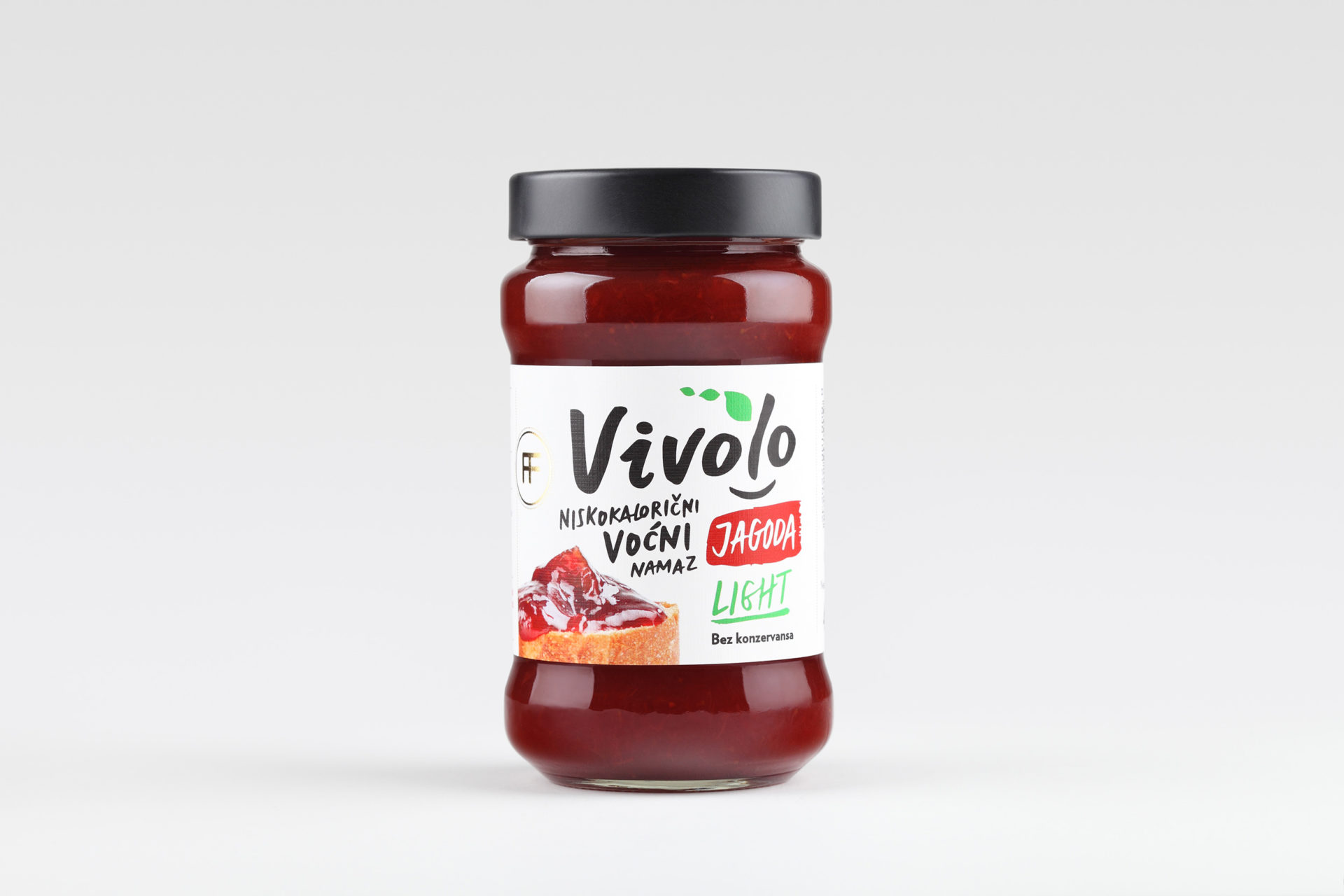
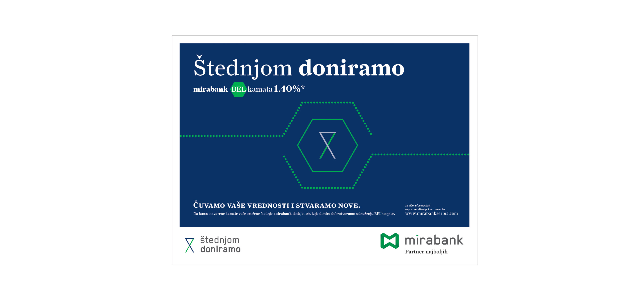
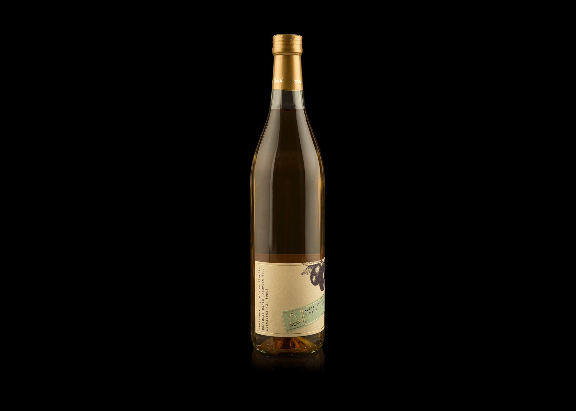
Hotel Grand Kopaonik

It takes a legend…
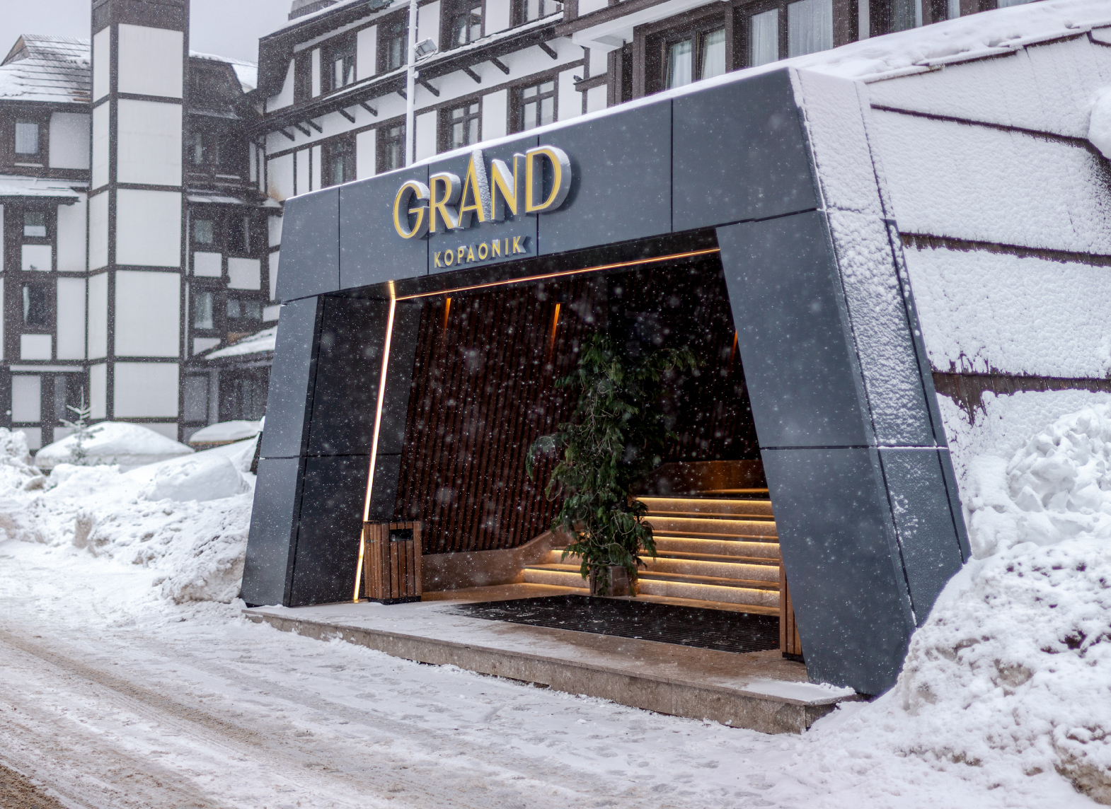
The high-end hotel Grand Kopaonik is the symbol of an industry and the mount Kopaonik itself.
Going through a major renovation, the hotel decided to make major brand identity changes at the
same time. The name holding such tradition is bearing a number of associations and it had to
refresh its visual expression too.

The approach

We have taken into an account the complete range of hotel and non-hotel services, the
environment, the increased competition, both local and international, we’ve researched the
habits, desires and needs of the people recognized as future visitors and came to an inevitable
conclusion that everything we come up with and create must be understandable, approachable
and recognizable.
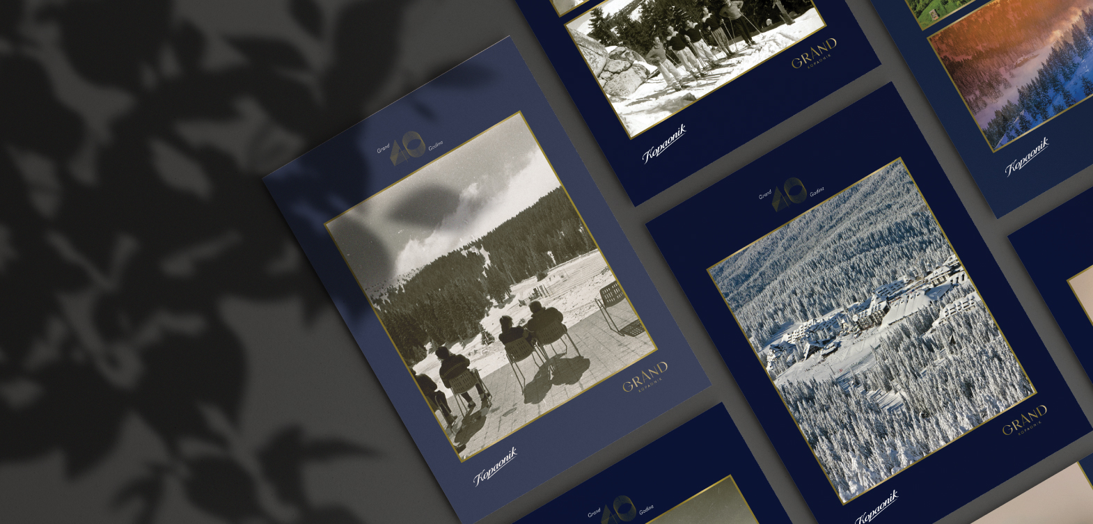
Hotel Grand Kopaonik opened its doors back in 1981, thus this 40 years old legend became a top
challenge for our team.
While innovating tradition, creating balance and designing a luxury brand – once again we’ve
concluded – the best ideas are always simple.
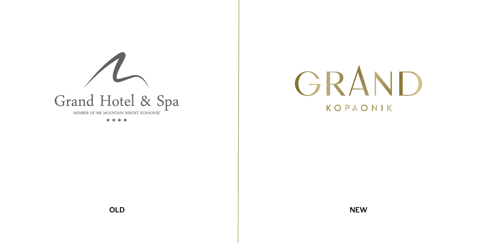
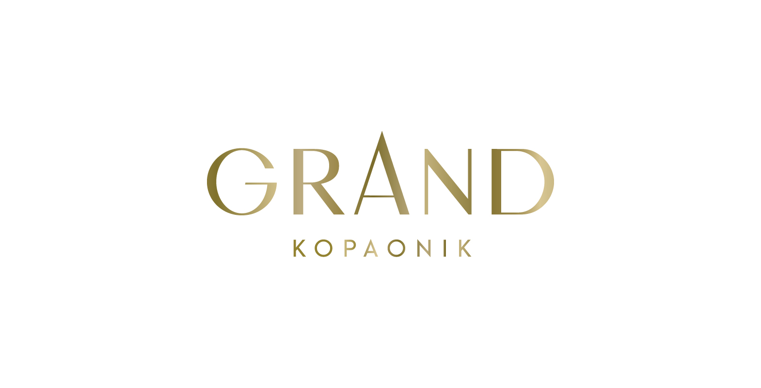
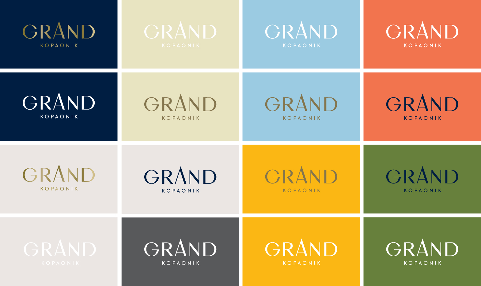
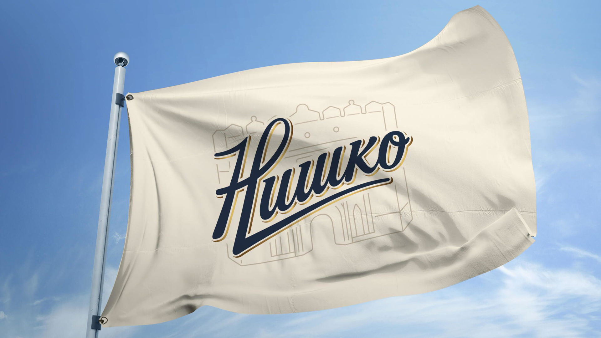
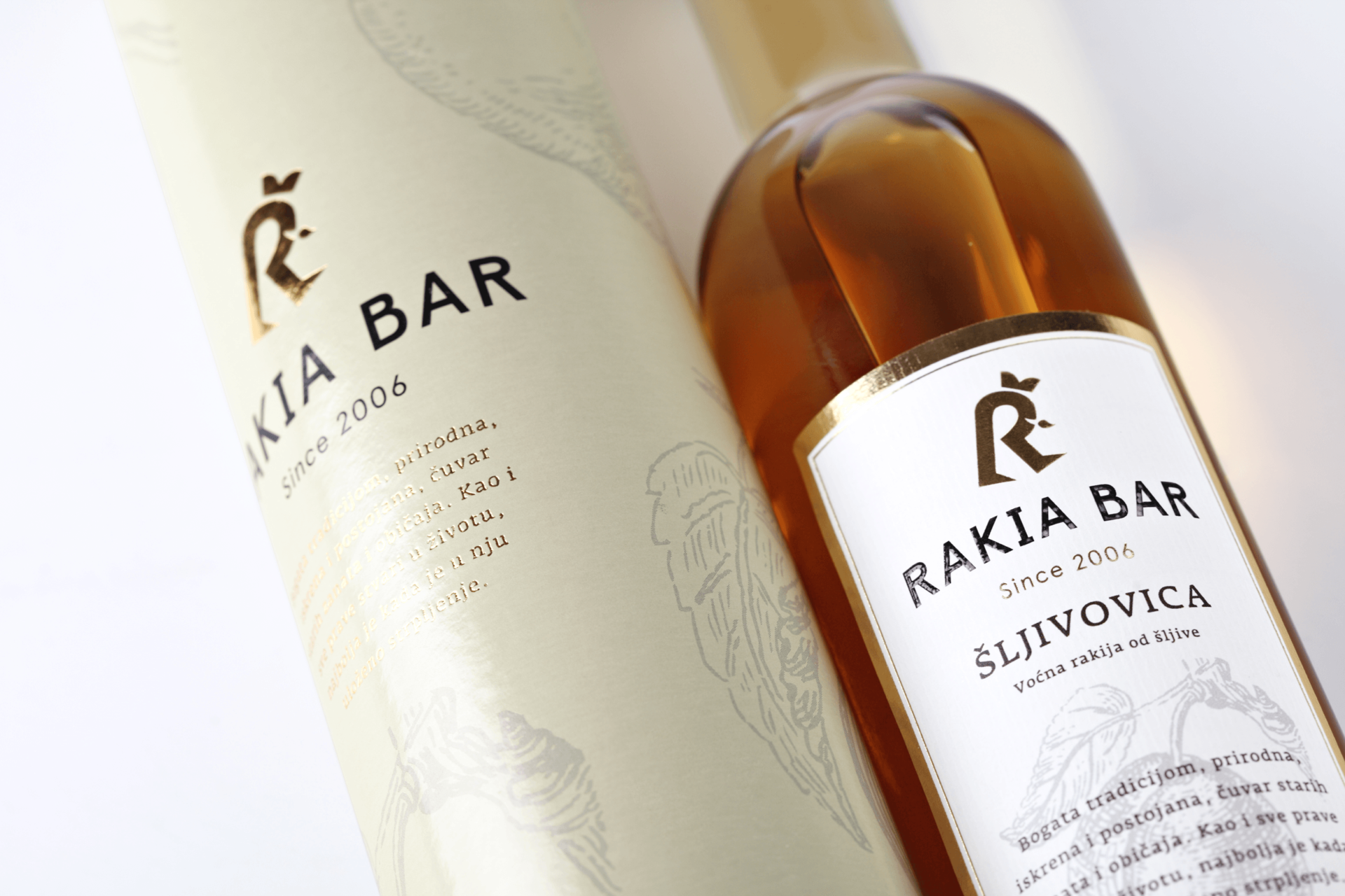
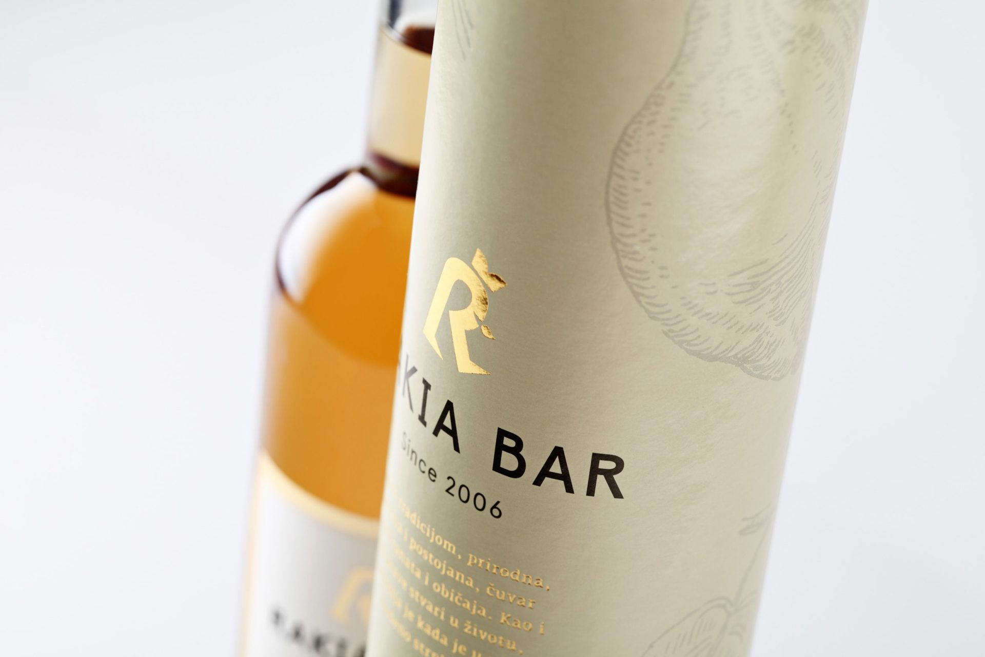
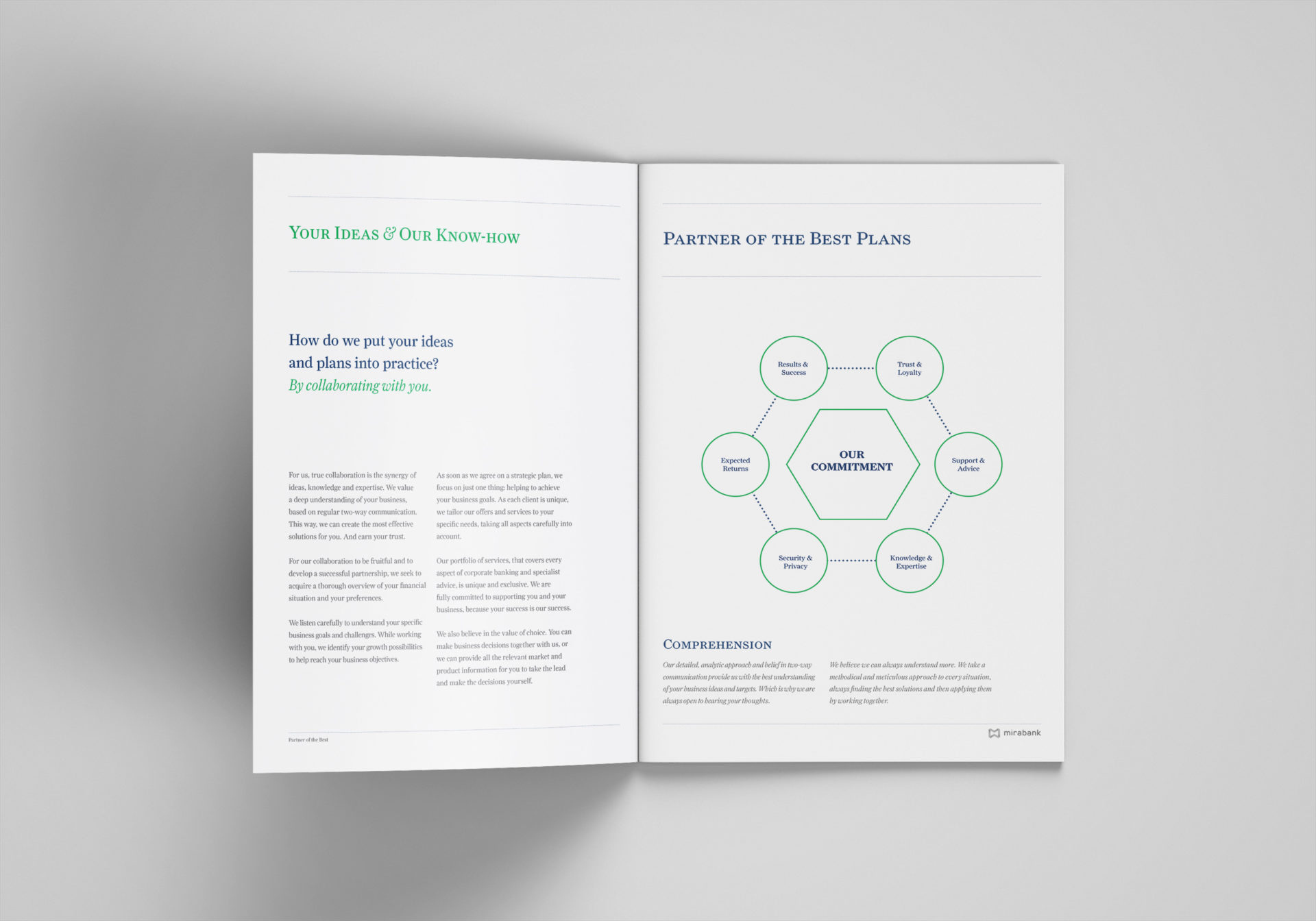
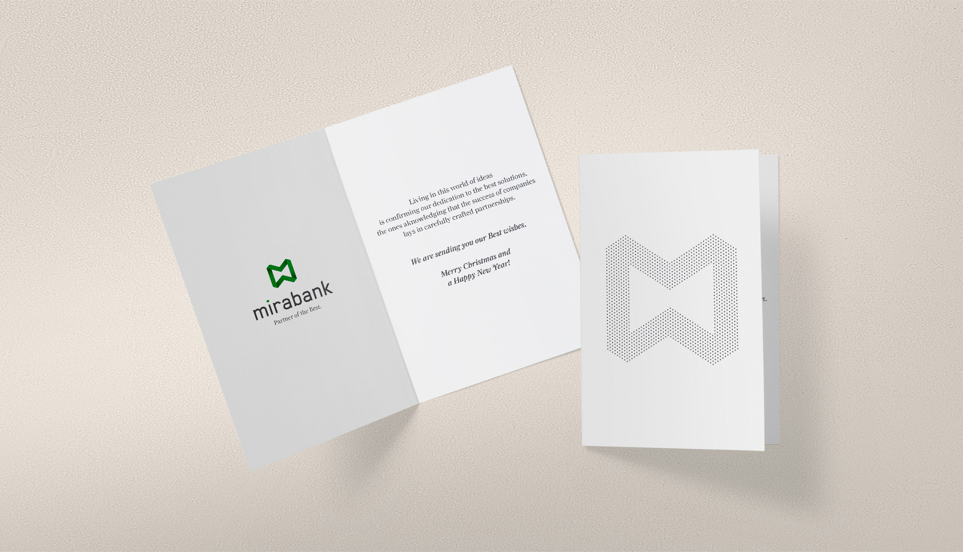
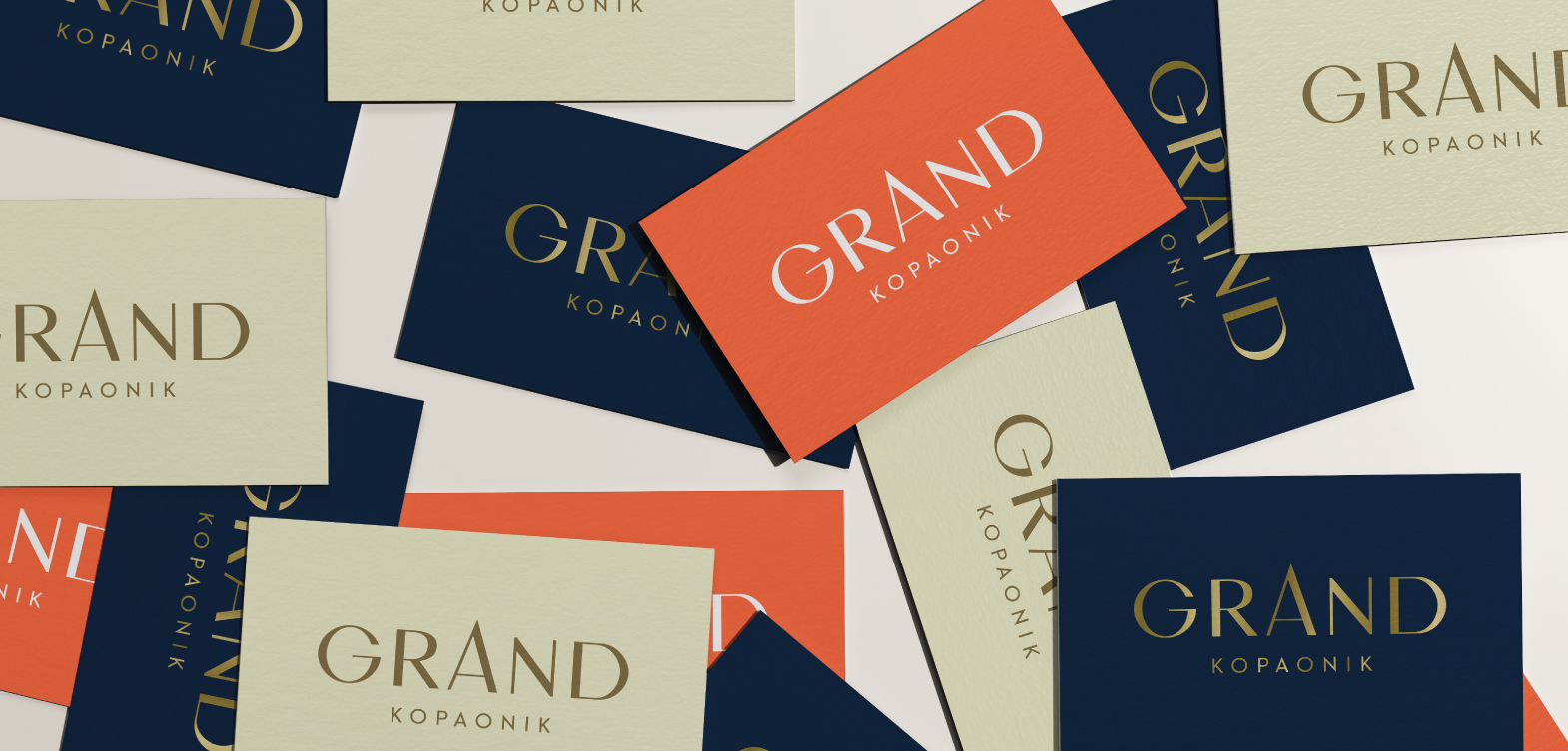
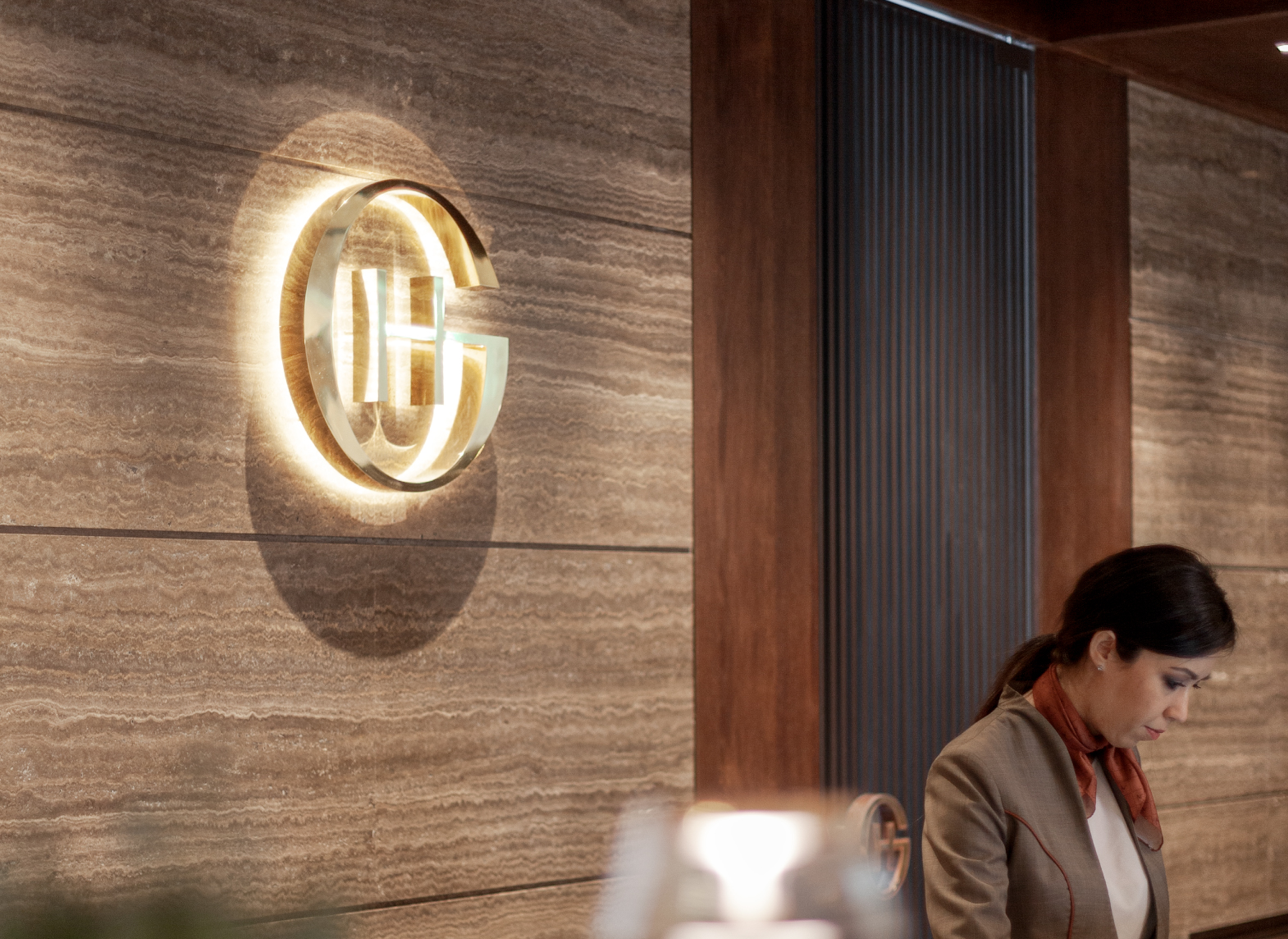
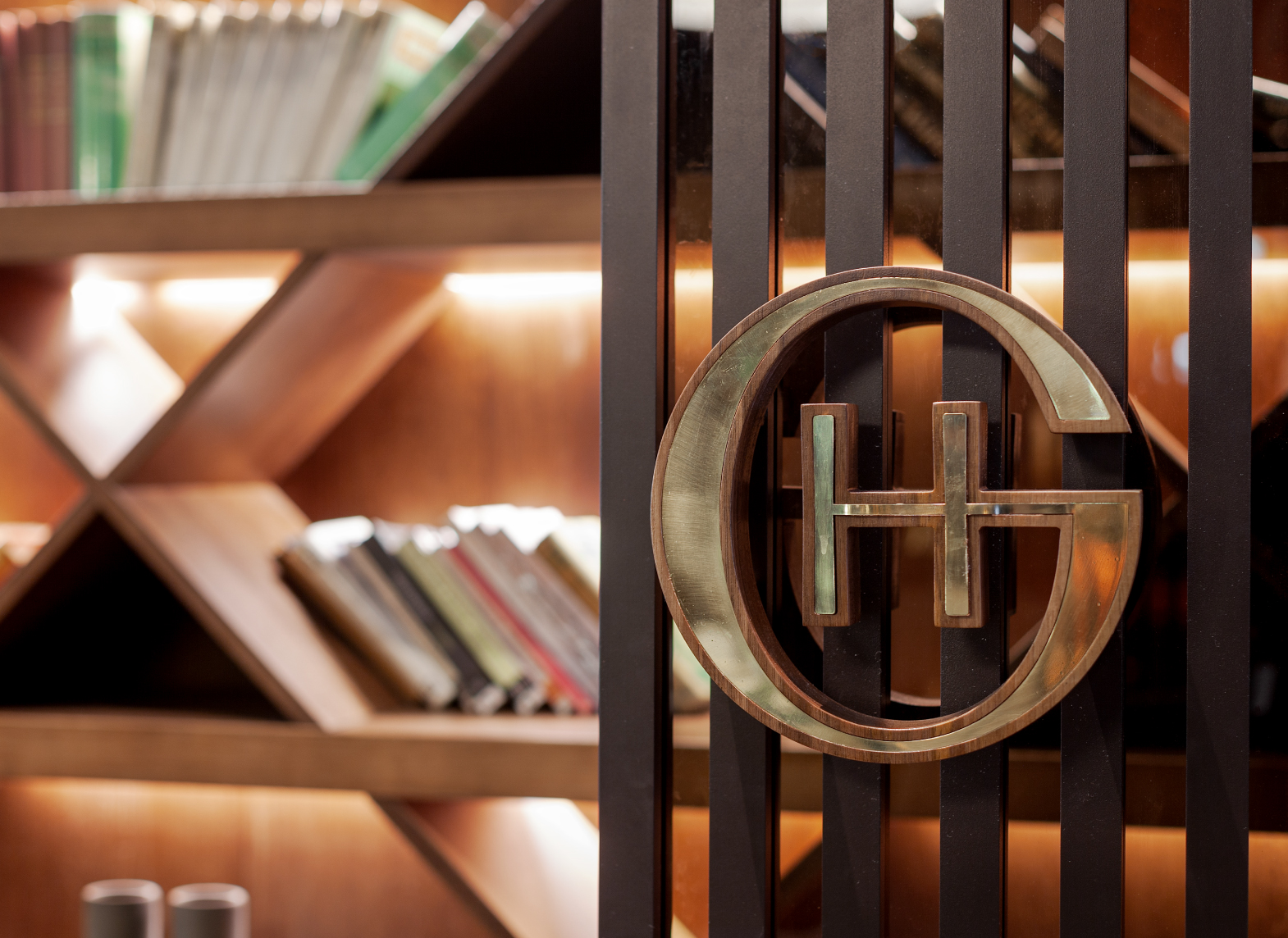
The logo

Having such a short and effective name consisting of five letters– enabled simple, smart and
disarming approach.
The top of the “A” letter, found in the middle of the word GRAND, was identified as a peak of the
mountain, symbolizing a peak of the service and accommodation provided in the hotel, at the
same time.
Simply “pulling out” the top of the letter A, gave the necessary characterization to the logo and
weaved all the values that the hotel offers its guest – from material to semiotic – from the top
treatment to the idea that this surely is the place matching your expectations.
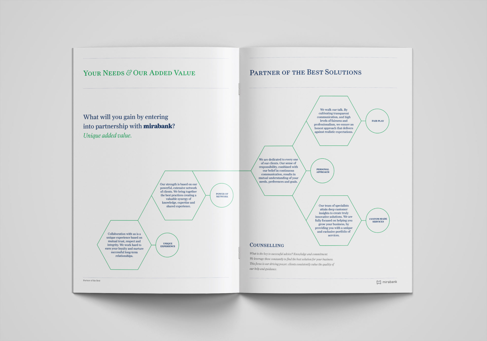
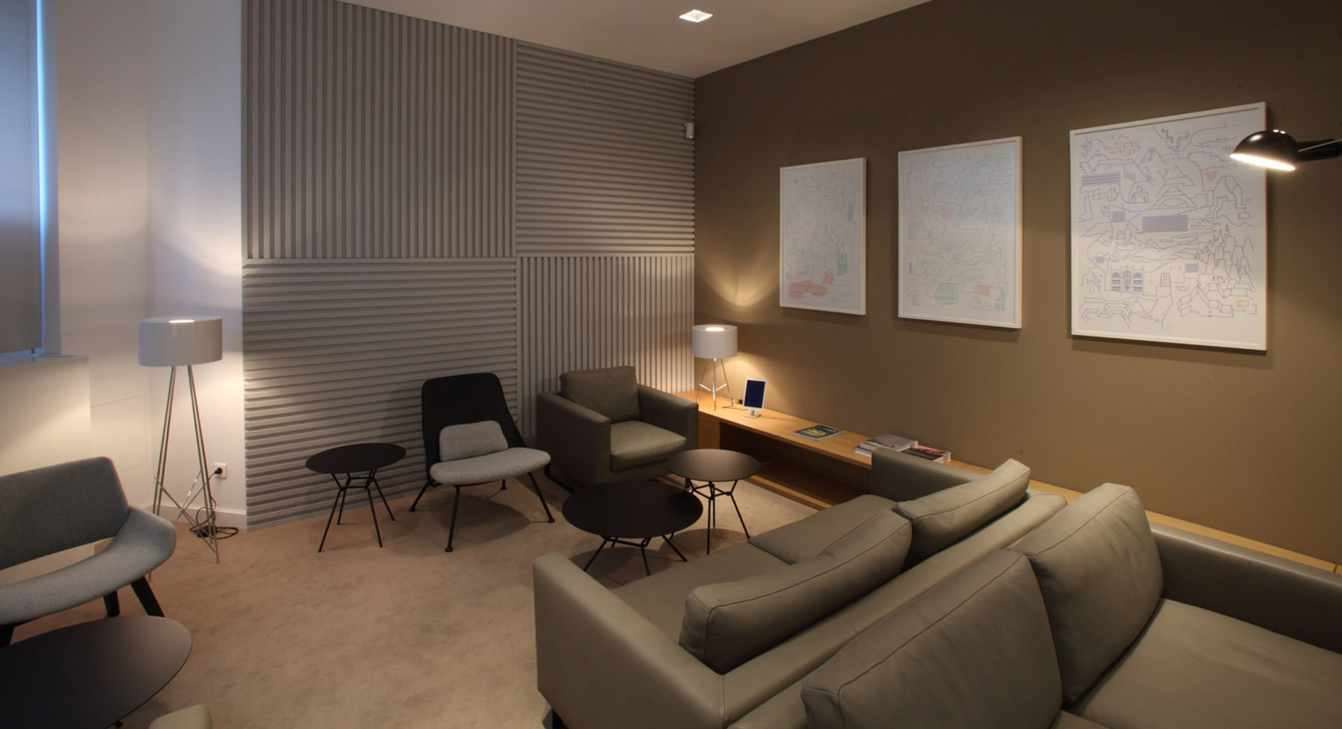
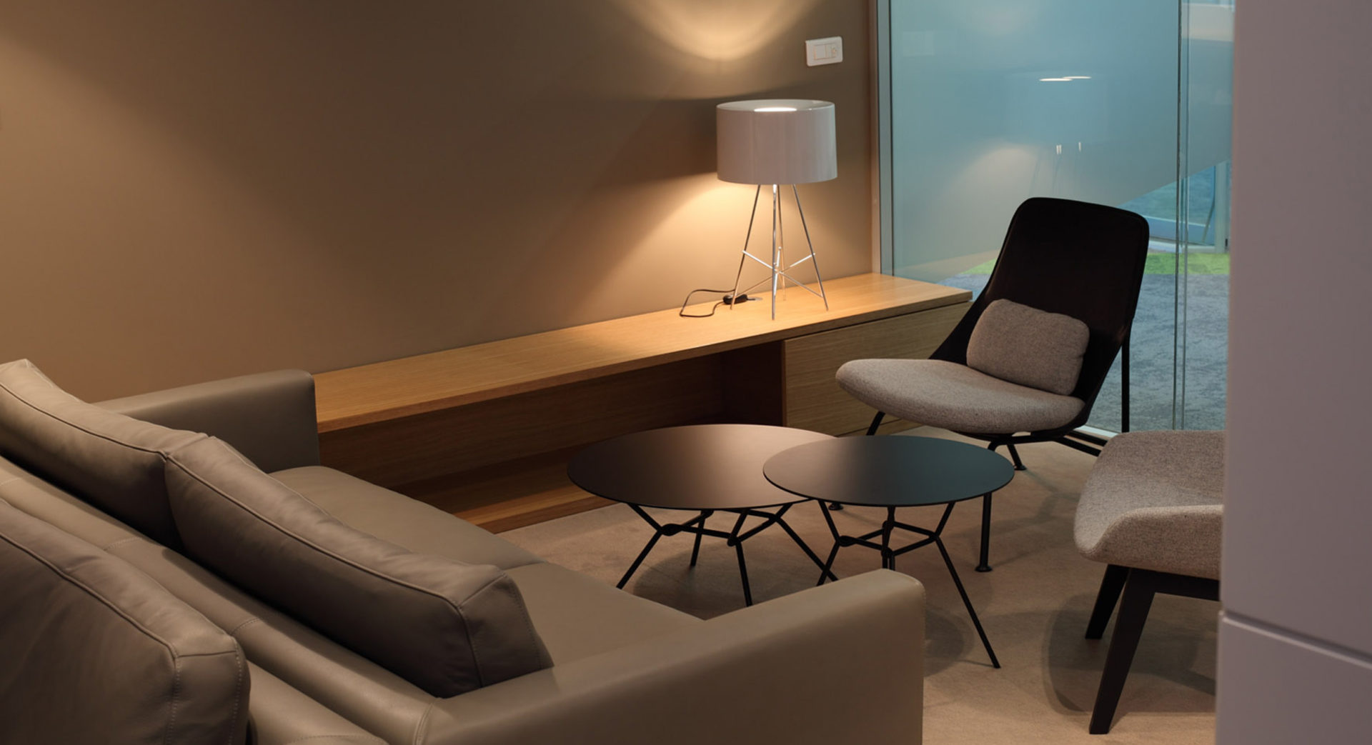
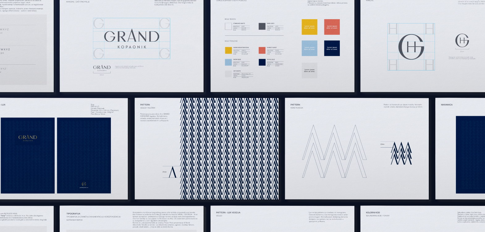
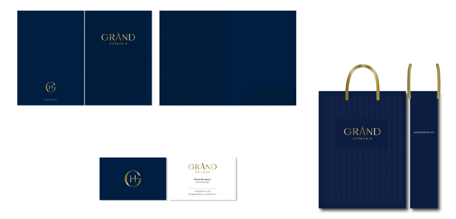
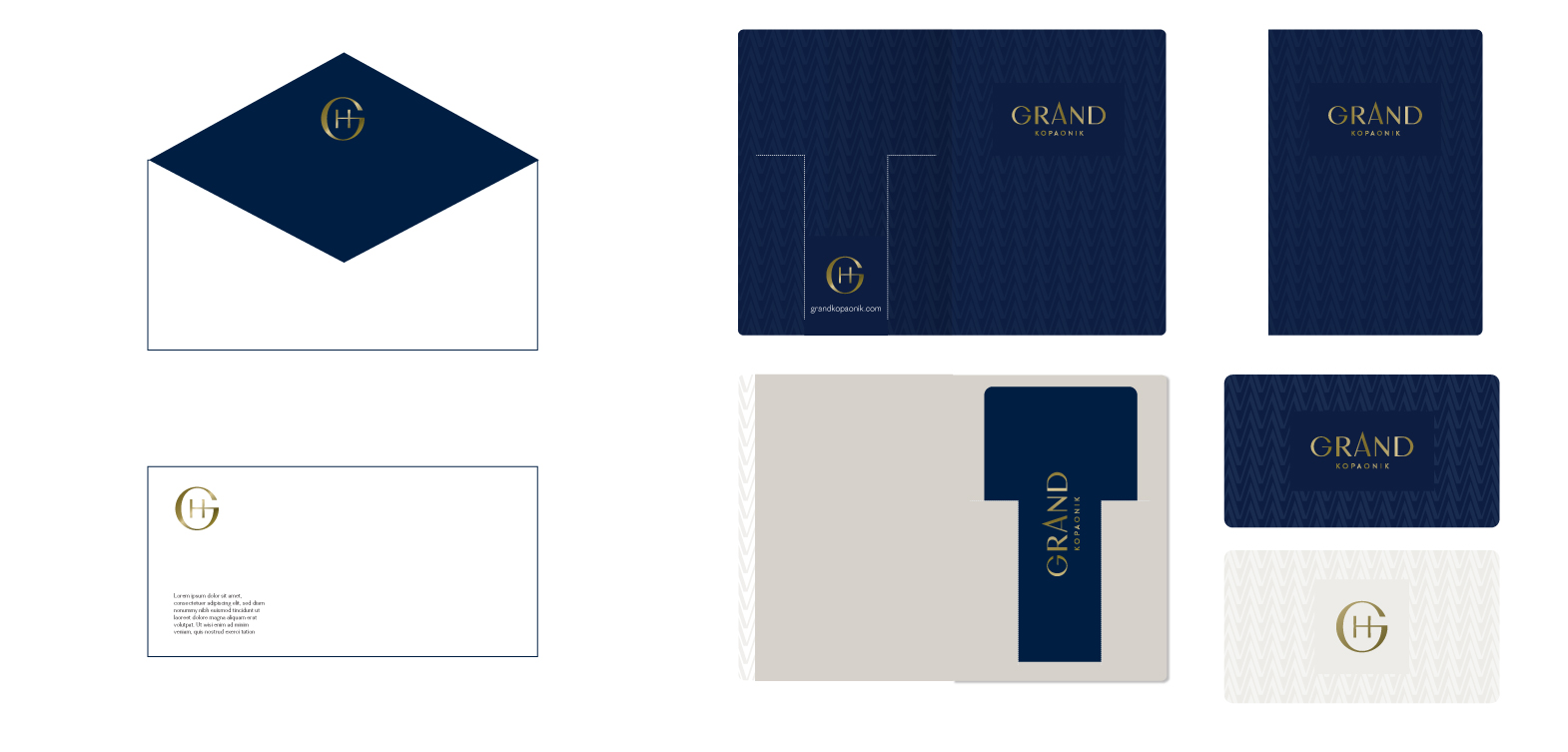
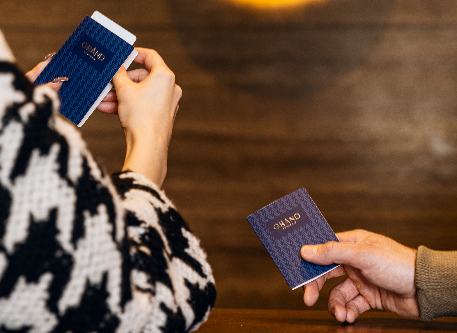
The identity

“A subtle luxury at every step” become a mantra we repeated constantly while creating all the
materials necessary for the smooth communication of the guest with the hotel and vice versa.
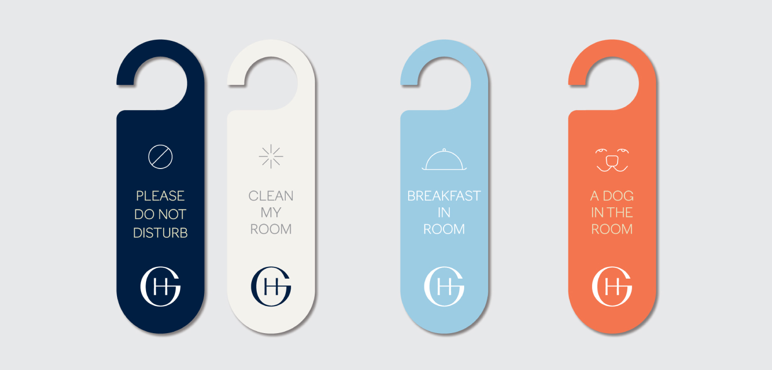
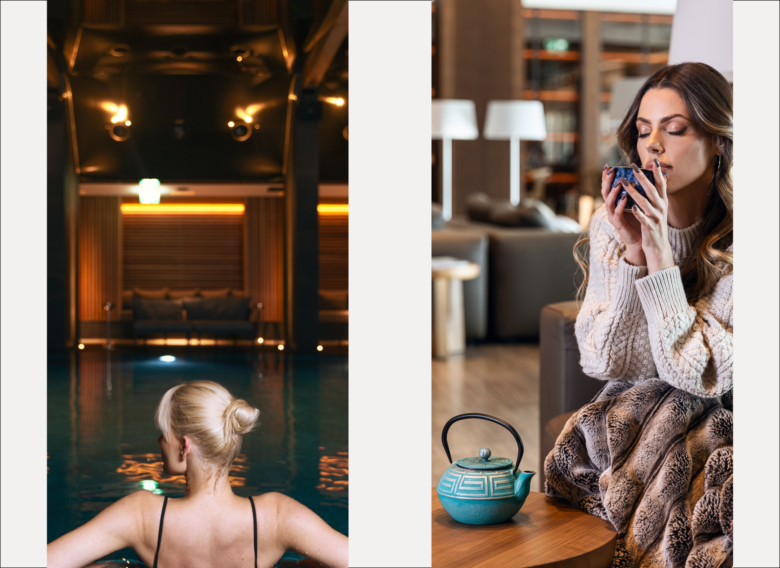
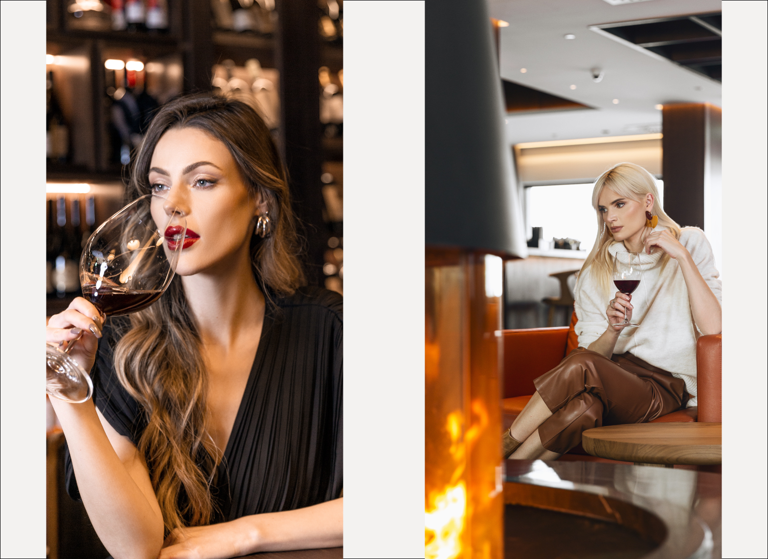
From the improved signage system in and around the hotel, through visual stimuli of each
restaurant and bar, to reflecting the full enjoyment of the SPA and wellness area – each detail had
to function flawlessly.
As the colors, textures, tactile elements, sounds and music and the appearance of the hotel staff
are an essential part of a breathing hole behaving in accordance with the reputation created over
the years, we had to take it all in account while creating a seamless visual identity.
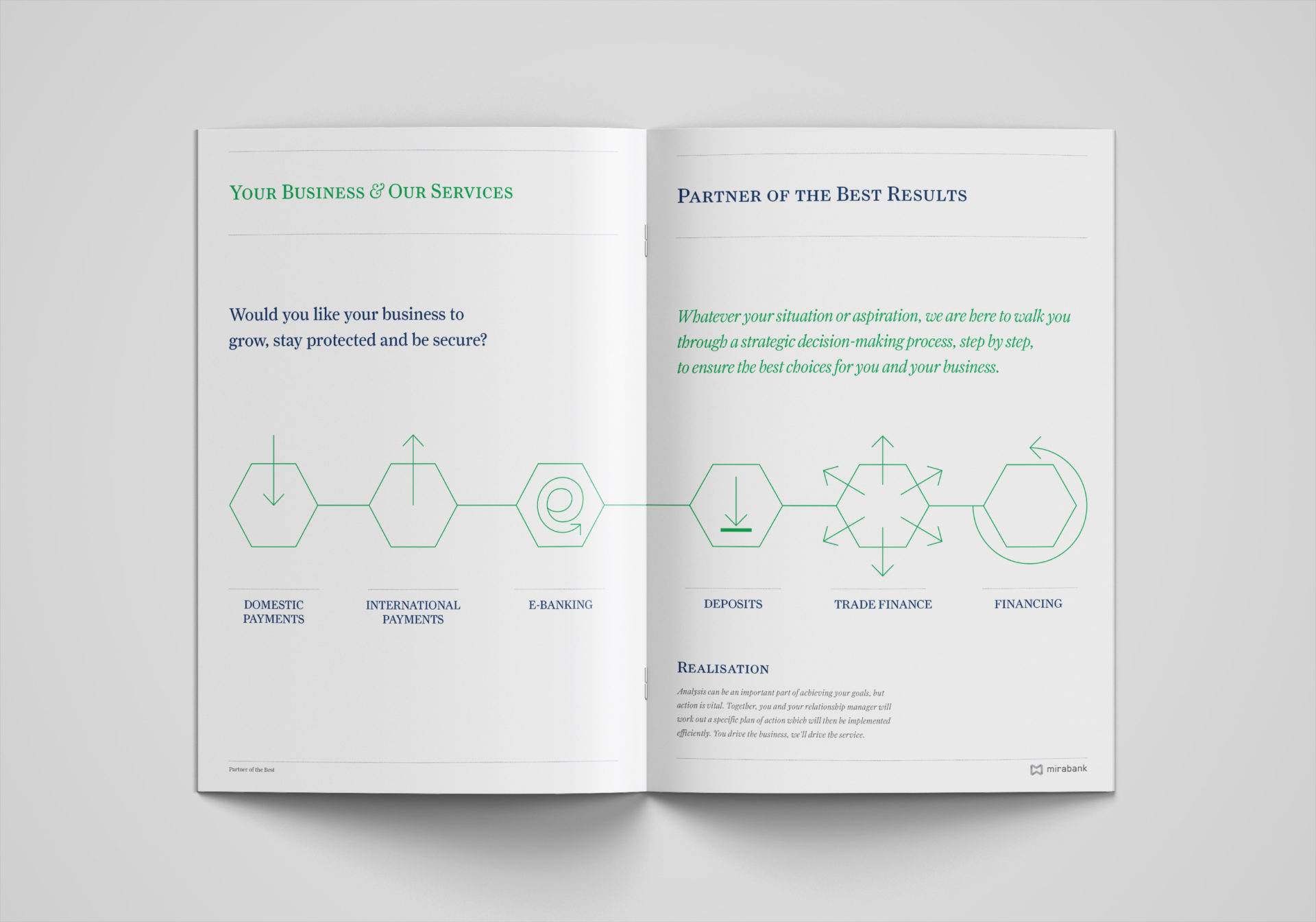
The communication

Naturally, the communication of the new brand had to find new standing points matching the
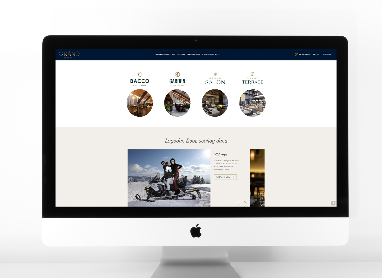
identity and changes the hotel was going through. We were in charge of naming the exclusive
fine-dining restaurant, Bacco, the Eather SPA, the hotel lobby bar – Grand salon, and the children
playhouse and mascot. The communication of each had its specifics and diversities, while relying
on the same crown concept.
The scenario and speech we had written for the Grand opening was answering to the highest
standards of engagement and nobility, simultaneously.

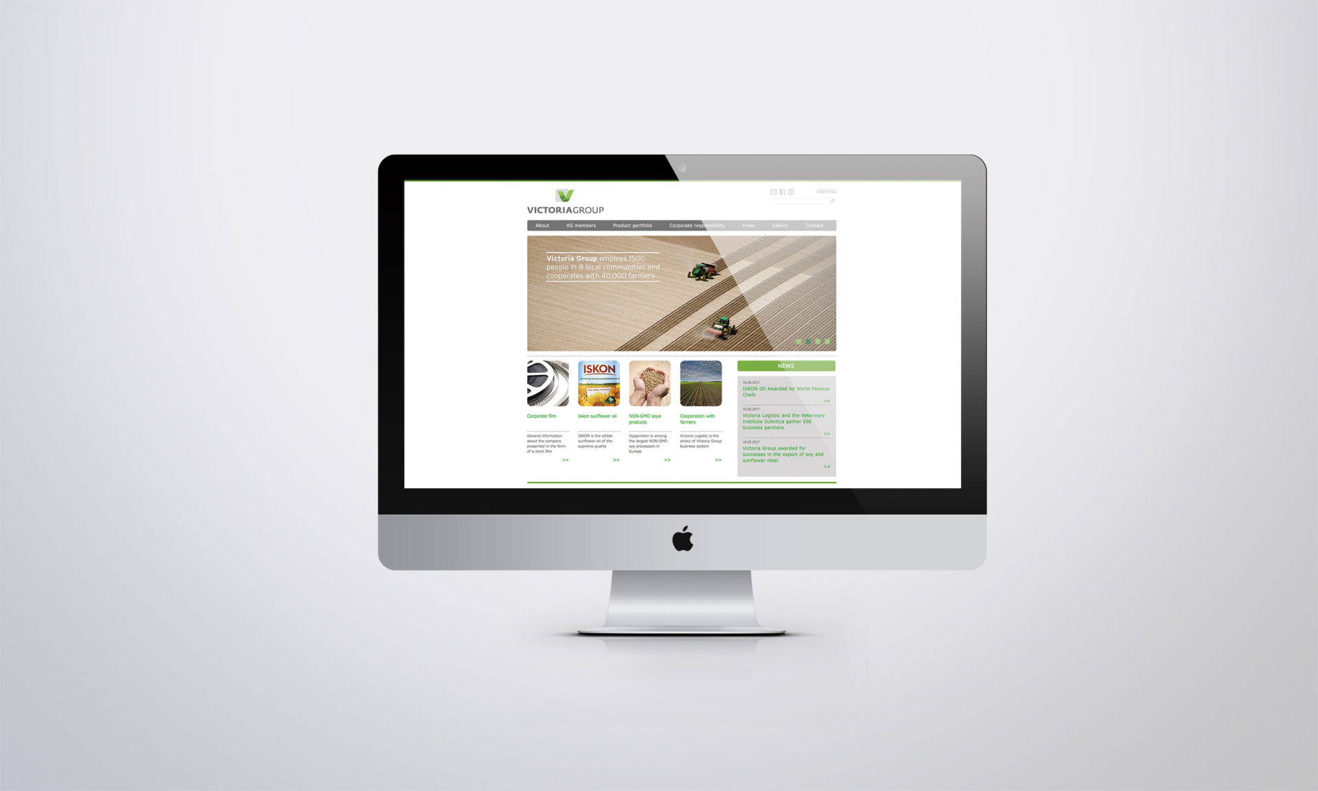
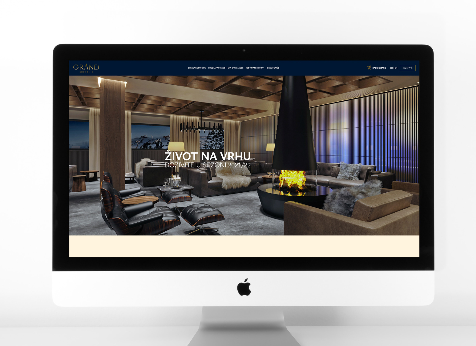
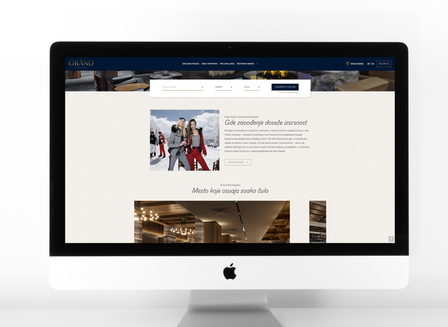
The design and structure of the website, that vividly designed communication stalwart are there to
show the best of the brand and its offer in intuitive and informative way.

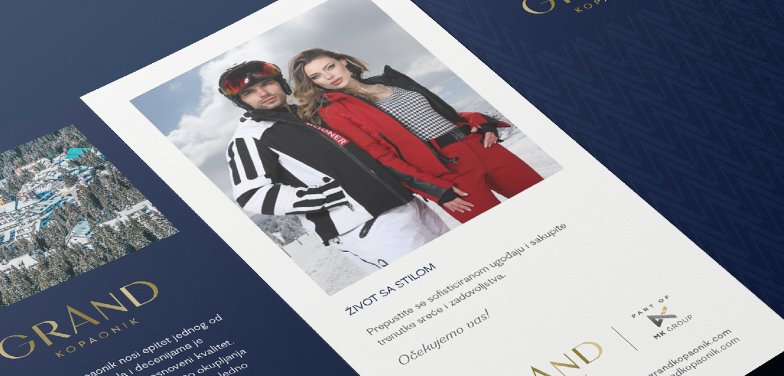
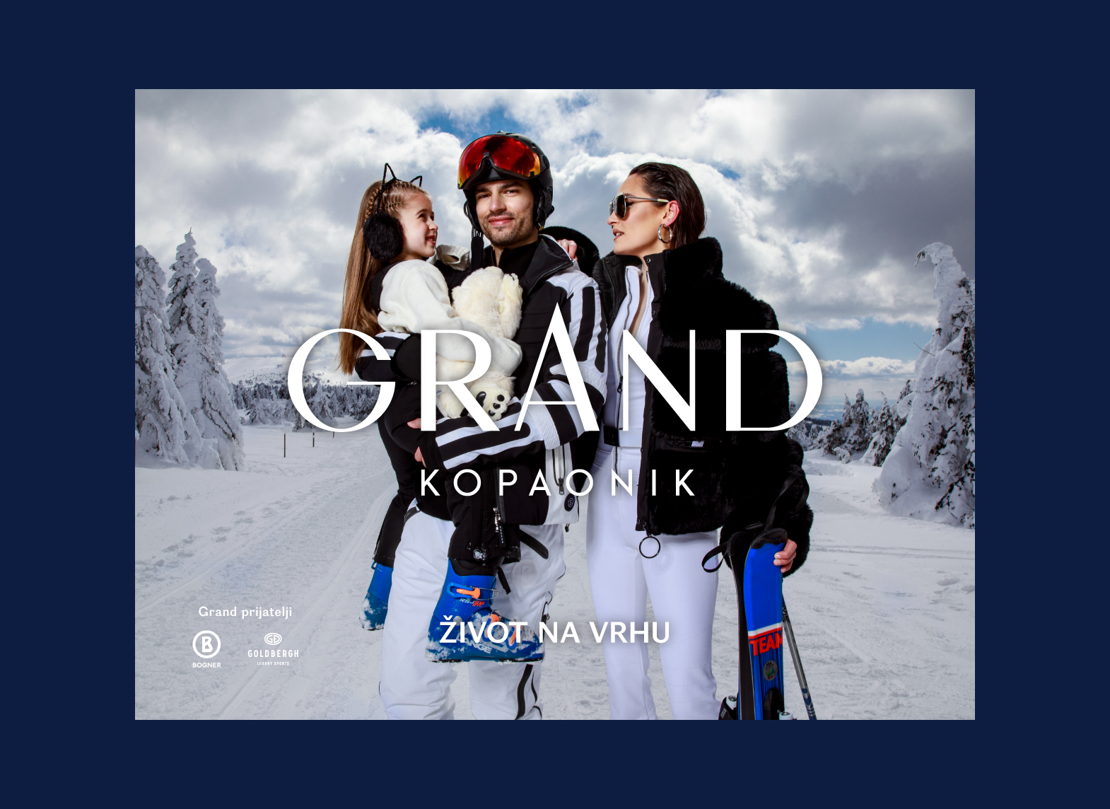
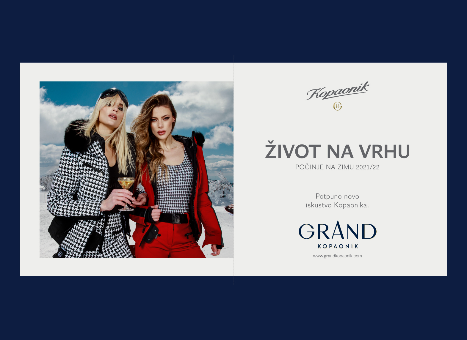
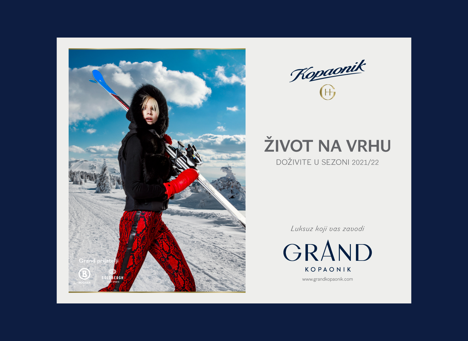
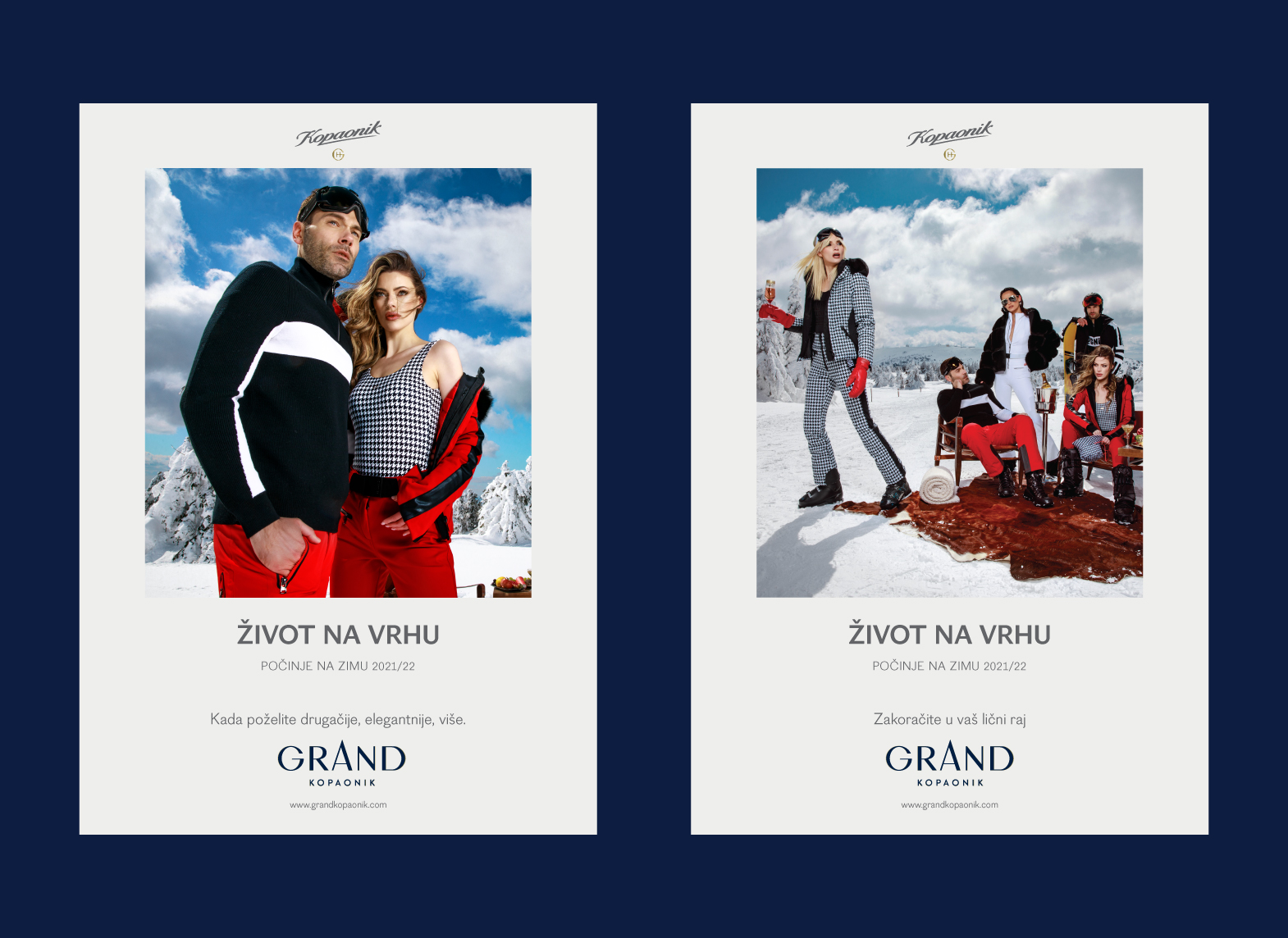
Add to all an advertising campaign, through traditional and digital channels, and the life at the top
will appear in all its splendor.

Max Medica


MaxMedica products have been approaching problems of daily stress, poor nutrition and hectic modern lifestyle for over a decade.

While in process of redesigning their diverse product range we were challenged to show different categories of their products, while obtaining consistency and elegance mandatory for the supplements of such quality.


Firstly, we went through a workshop in order to create a brand purpose statement necessary for the job ahead. After a busy day, we came to an understanding and agreed upon the following:

“Maxmedica produces superior products which encourage the quality of the lifestyle and contribute the preventive thinking of health and nutrition by providing people with vitality.”


From that point, it was easy. We named the categories – therapeutic, basic and supreme, giving Maxmedica a structure and an easy way to manage their portfolio.

Logo and sign Max Medica have a unique position and size on the packaging, giving it high shall visibility and making it memorable.


Typo, geometry and color palette are the structural elements for the visual coherency we’ve created.

Dream of Cookies

Sweet dreams are made of this

When our client discovered a throve of forgotten cookie recipes left after her late grandfathers legendary Belgrade confectionary shop went out of business, a new startup was born. Based on the genuine desire to experiment with all-natural homemade ingredients to discover the perfect recipe, her cookies blew away all who’ve tried them.

Struck with their energy and optimism, we immediately understood Dream of Cookies was one of those brands that build on their founders’ style and story and we put ourselves to work to express it.

The result is a brand that radiates style and optimism, aimed at the style-conscious people and all those who feel like one.

Elfi

What is really important to a parent in making the right decision while purchasing baby’s accessories and equipment? Which qualities does he seek for? How the packaging translates such feelings and qualities?

In redesigning the complete line of ELFI products, we were guided by the following terms: trust, quality, clean, new, safe. Alongside packaging, logo refreshment, collaterals we also had a strategic role by creating the positioning claim – Kids’ First.

Clean and simple design approach is used combining white and blue tones.

The structure and the layout of the graphic elements was inspired by the desired associations depicting the trustworthy product that is easy to use. The pattern is playful, vibrant and recognizable. As the product is aimed primarily to mothers – it was necessary to make a link with emotions that will by each and every detail denote the verified good, such as the doctor illustration, and the concise claim that gives us the most important information quickly, and encourages us to make an informed decision.


The positioning statement – brand headline, is sending two messages.
KIDS’ FIRST object, created with dedication and love
KIDS FIRST as an attitude in which we acknowledge the priority of caring for the child

The picograms are linear, stylized, informative and clear.

Standard Gin

It’s premium, made with 14 herbs, in small batches. Created in accordance with the traditional gold old standards of doing things the right way and the „good old“ philosophy found its way to identity design.

Comes with the summer and winter labels, both proud to emphasize the quality and style set by Standard and extra flavoured with hand-drawn details.

BRC Belgrade Running Club

The group of trained enthusiasts decided to unify their rich offer and create a memorable visual style that will make it instantly clear – BRC is in the house, lets RUN.

Belgrade Running Club existed under different names, each covering a specific course, and under different logotypes, for years.

The logo had to be bold and dynamic, intersected with lines depicting roads. The mark had to be unmistakably linked to a city where it all happens – the famous statue of Victor shown through hand drawn illustrations, statue caught in a moment of movement.

They’ve decided to build a hub on the Sava river boardwalk, in vicinity to the running track, that will gather all the running lovers, now having a place to train, chat, drink squeezed juices and spread the culture.

The slogan “We run this together” was created to gather the community under a shared feeling of belonging, of the same goals, while keeping in mind that each person is monitored and guided by a dedicated professional.

Stara škola rakija

This brandy was created out of the curiosity and a commitment of Mr. Donic who had been working to improve an old family recipe, year after year. His son joined him by studying food technology at the Faculty of Agriculture, with the idea of learning everything he needed to continue the family tradition.

Simple technology and small series, dedication and the attention to detail – inevitably led to a superior product and three gold medals at the Novi Sad Fair, and finally the Great Gold Medal in recognition of many years of participation with high quality samples.

The need for the redesign existed for years. When Stara Skola approached us – the most important thing was to create a label that could easily convey the impression of something solid that reflects both the tradition and quality, but does so delicately and with class.

Hommage Botanical Cosmetics

The nature has it all. Behind many closed doors there are secrets to be discovered. As old as the nature itself. With the right key in the hands of the right person – we unlock the beauty.

The key? The key has to be golden, no less. The fact that the symbol additionally represents letters “H” and “O” doesn’t bother us as it delicately emphasizes the brand’s name.

www.hommage.rs

Hommage based its principles on the needs of their customers who opt for selected ingredients and dedicated professionals, under the all-natural skin cosmetics philosophy.

Elegant, black and white packaging had to speak of the privilege of being the one who knows the meaning of simplicity. The unpretentious essence of nature promising the utmost skin care had to be complementary to the lifestyle, as well.

Bojovic, Draskovic, Popovic & Partners

After 15 years of practice Bojovic & partners law office were at the gates of announcing their new, reinforced structure through their new name – Bojovic, Draskovic, Popovic & Partners.

As this change came as a result of shared values existing among the name partners, they asked us to create a strong corporate identity able to show that human integrity, mutual respect and highest quality service goes hand in hand in Bojovic&Draskovic&Popovic&Partners company.

The story that had to encompass over a decade of complex human relations in law and legislation, growing together, and the encounter of different characters – was produced by our team, and played on the party where the change was made official.

Lumen

Since March 2016, we have been publishing LUMEN publication that brings new perspectives to important subjects for those doing business in the Balkan region. The Lumen magazine was published four times a year.

The content is carefully targeted towards issues that are identified as meaningful to the business customers of Mirabank, its clients and partners. The team aims to deliver an exclusive experience in a package that informs and is intelligent and serious, as well as being of immediate value to the business reader.

LUMEN_Making of from Coba&associates on Vimeo.

Mirabank is a Belgrade-based bank that is known as the first choice in corporate banking for many of the world’s best companies. mirabank’s mission is to support the economic growth of the countries where it operates by providing transparent and sustainable financial services. mirabank’s clients value the reliability and uniqueness of the experience and services they receive. Lumen magazine is published quarterly.

LIVING

Brings stories of successful people who share their knowledge and experience to bring you the best insight into the Balkans business.

UBER

The interview that makes the difference. Most prominent members of regional business community talk about their goals, business opportunities, key issues they face and how they overcome them.

MARKETS

Our experts give you numbers and trends for relevant economic sectors. They introduce the state of economy in the region. We cover the most important developments and examples of relevant countries – Serbia, Bosnia, Montenegro, Macedonia, Albania. Complete data overview + Business case+ Market analysts’ opinions+ HR trends+ interviews

EXPERIENCE

Reportages from the extraordinary authors on places, people, music, food, and festivals in the region.
Luxury destinations and travel recommendations.

NOTED

We take notes on things that make the region unique. The phenomenons on regional and global themes that caught our attention and are worth sharing.

Our readers value things of quality and fine aesthetics. Design and practicality is the key to our strategy. Our print format reaches readers with memorable, usable, and to-the-point content. Lumen’s physical interface elegantly interacts with the readers and delivers valuable, motivational and inspirational space.

Lumen shines a different light.

Video by Vladimir Milovanovic, Andrija Kovac & Nemanja Babic

Niška pivara

The brewery opened in 1884 during its long history left a trace in the whole south of Serbia, developing alongside its people and turbulent times. The new administration has decided to make a direct link between the consecrated intention to preserve all original recipes, strengthened with modern technology of production, and visual identity for both the brewery itself and its products.
MU4_web-compressor
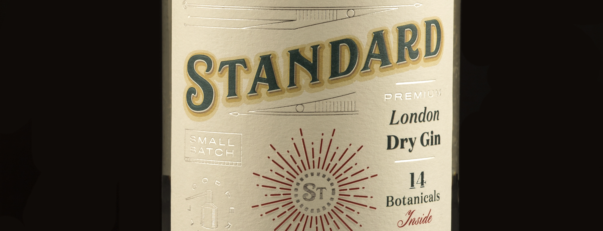
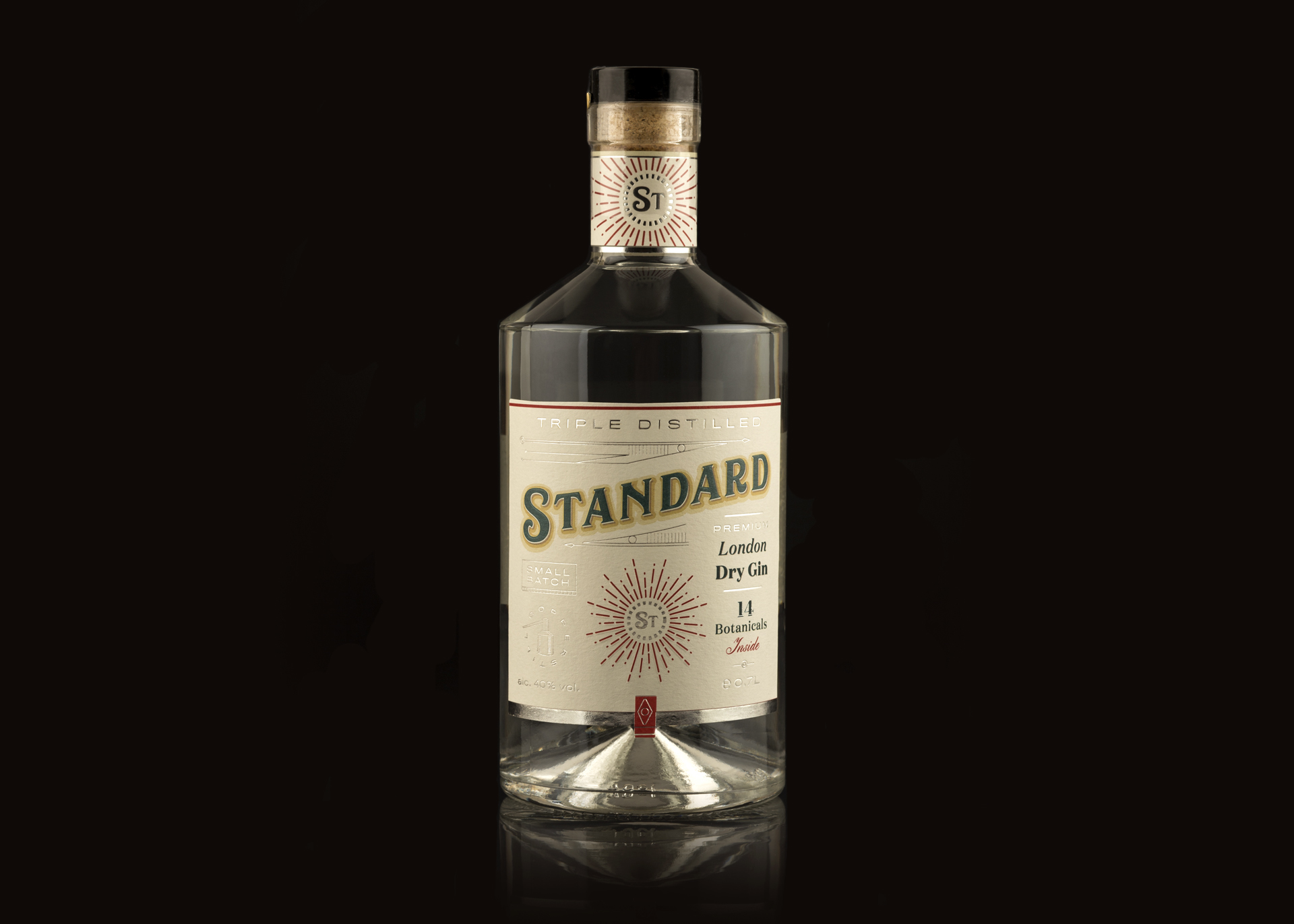
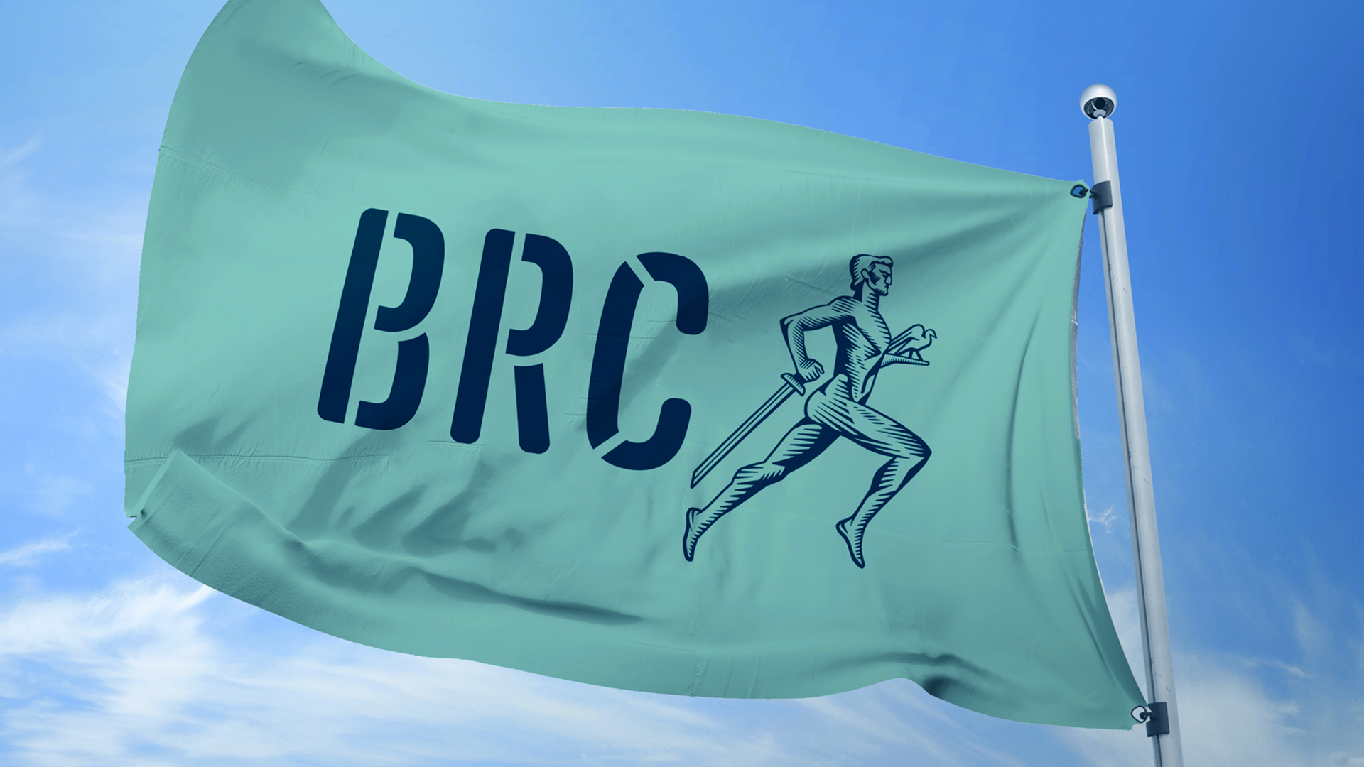
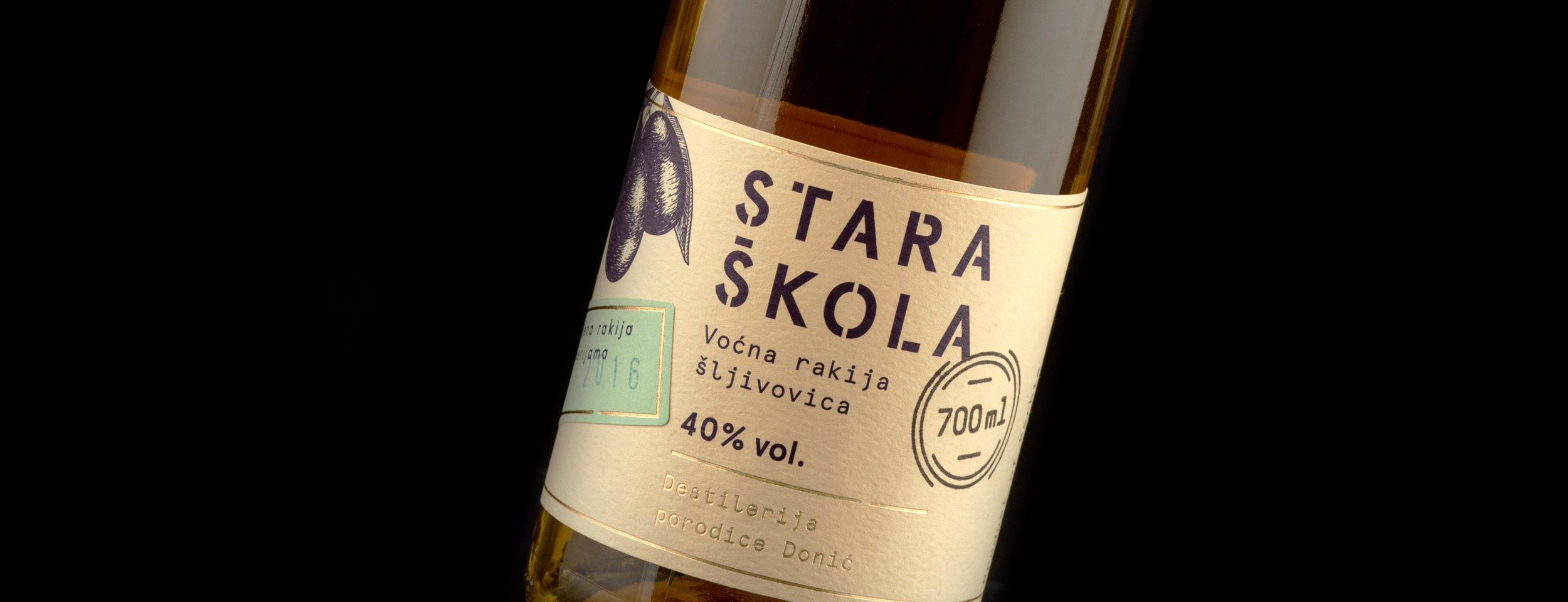
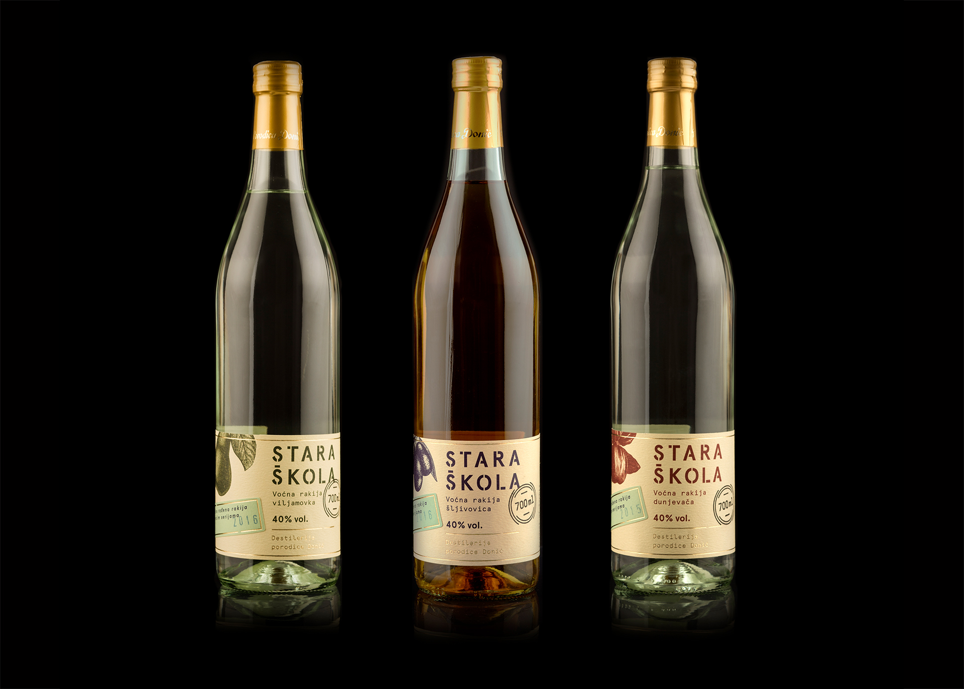
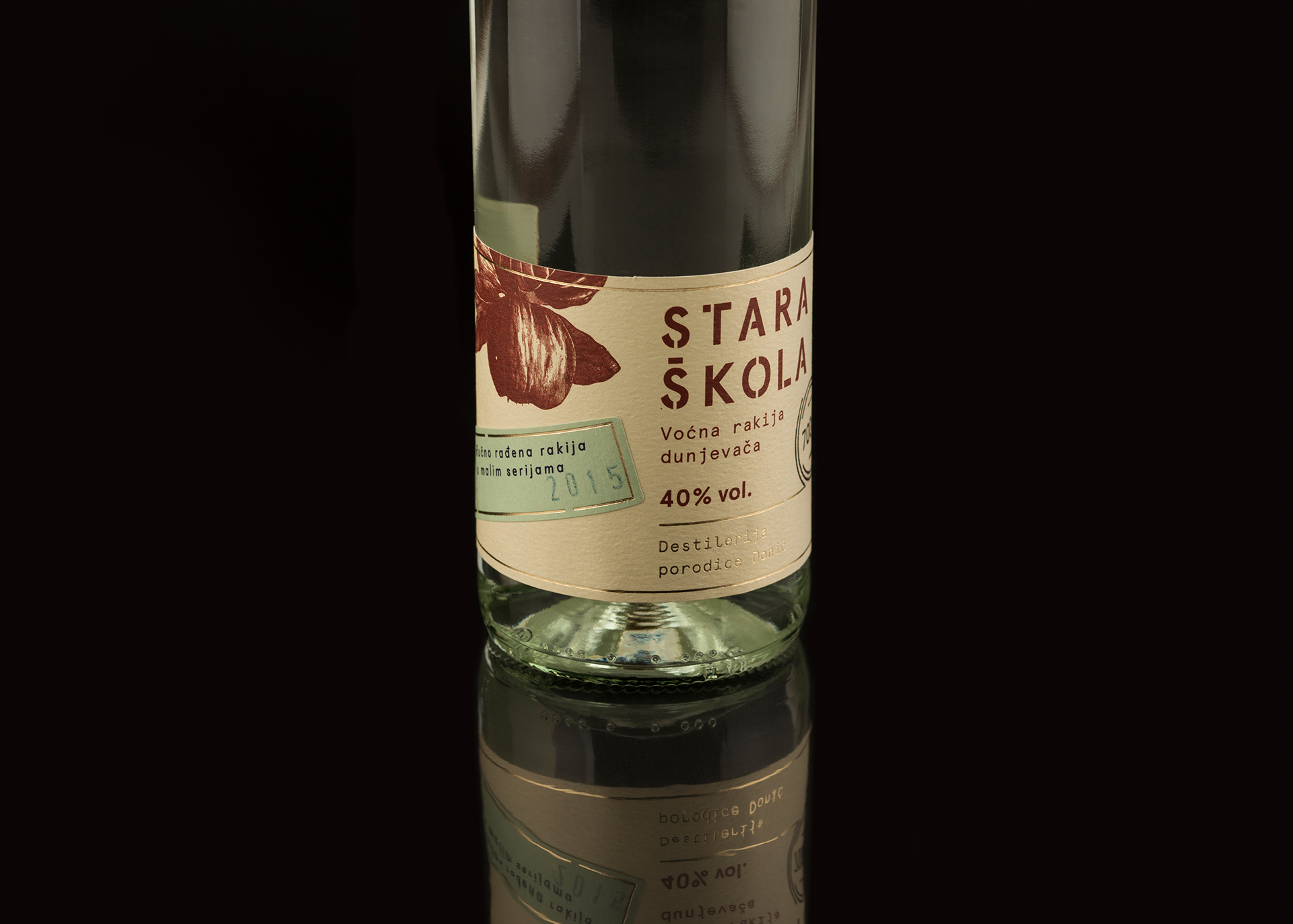
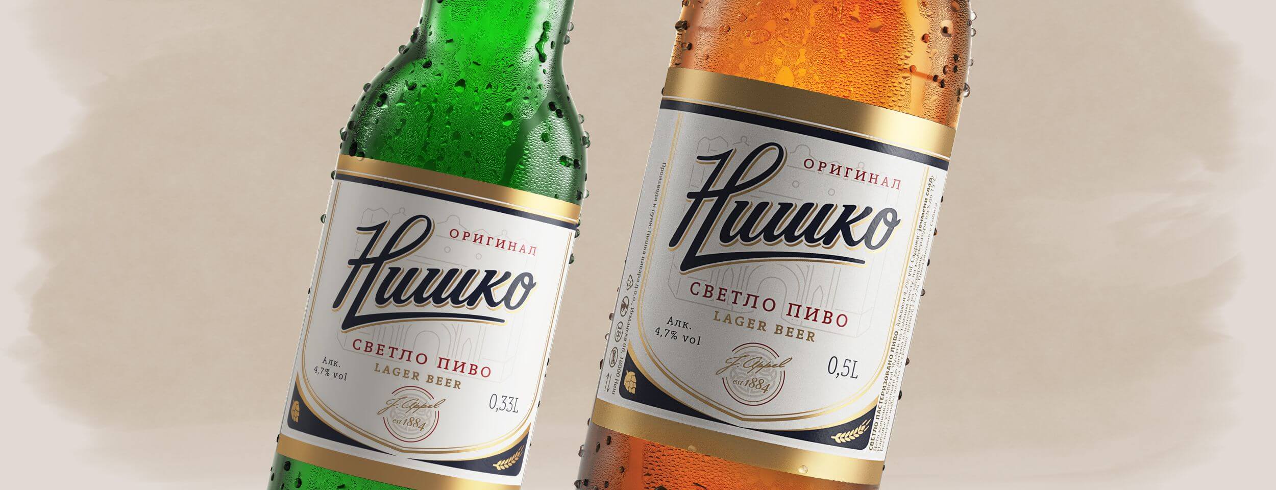
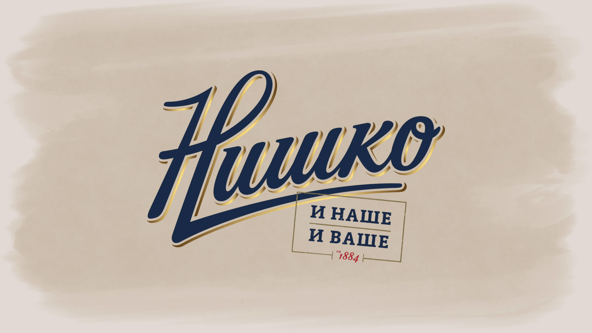
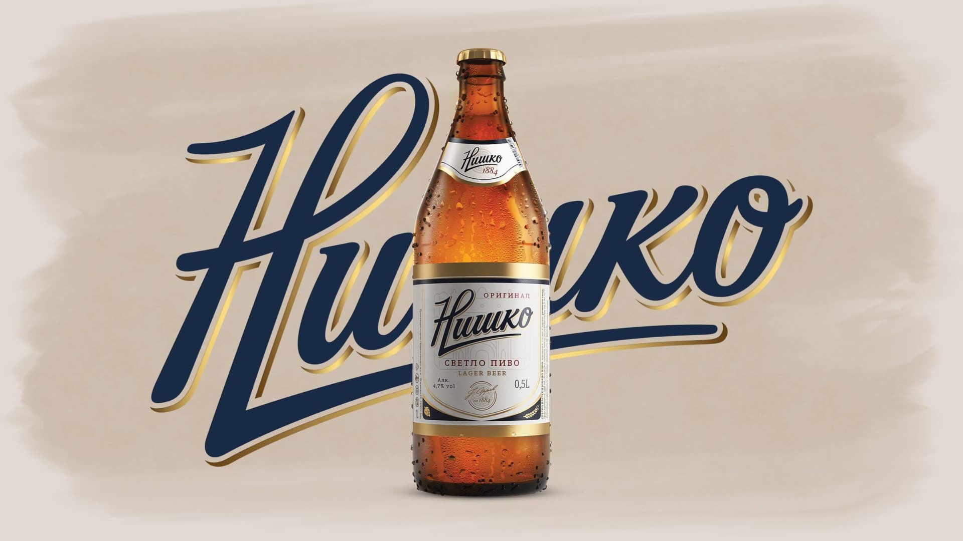
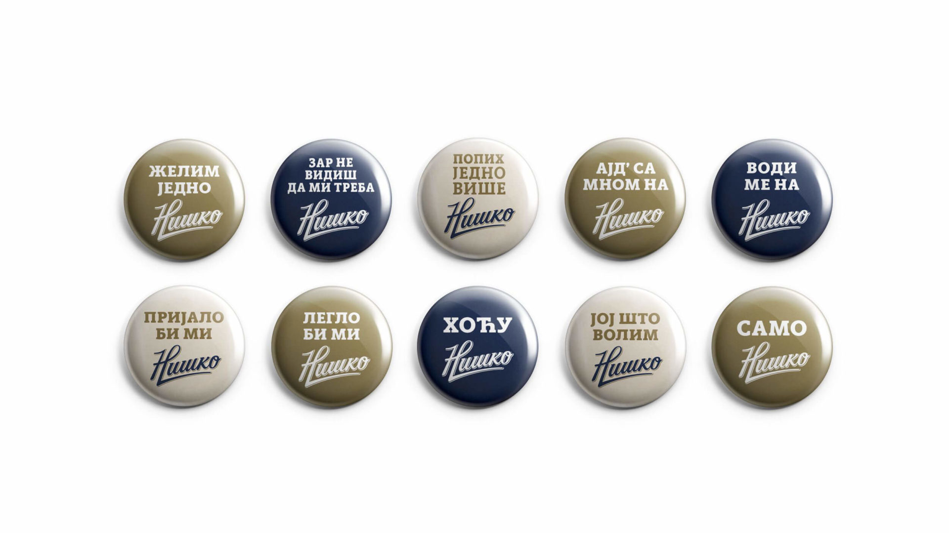
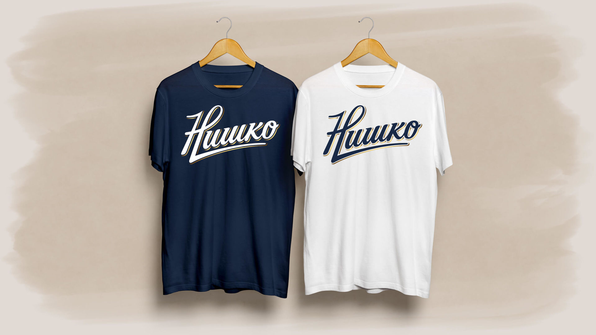
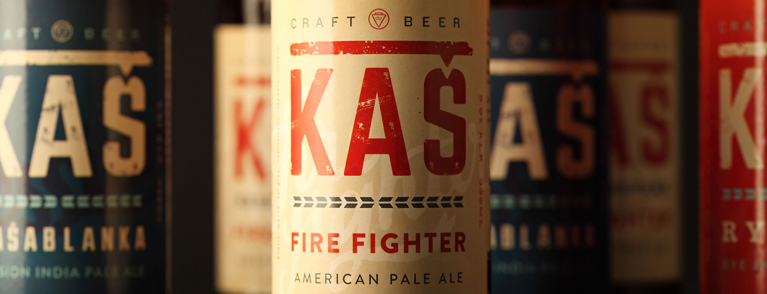
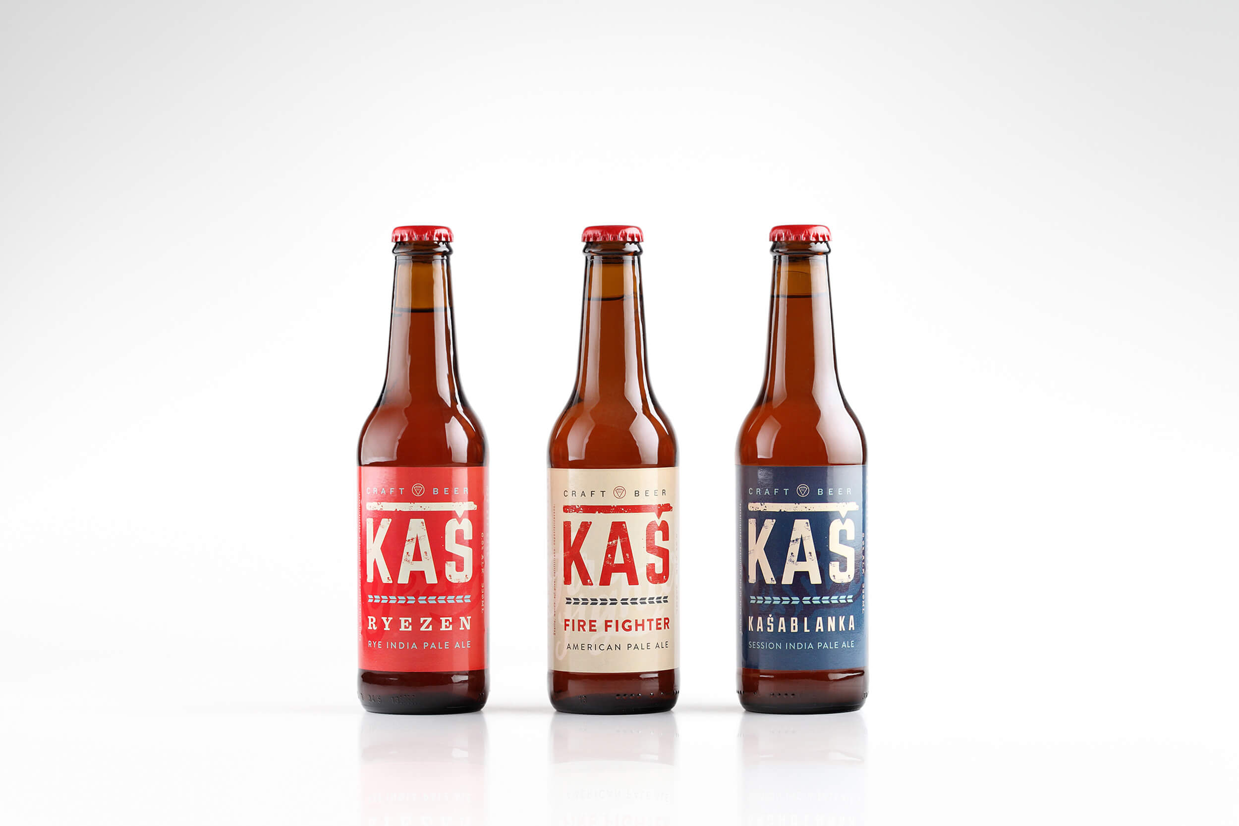
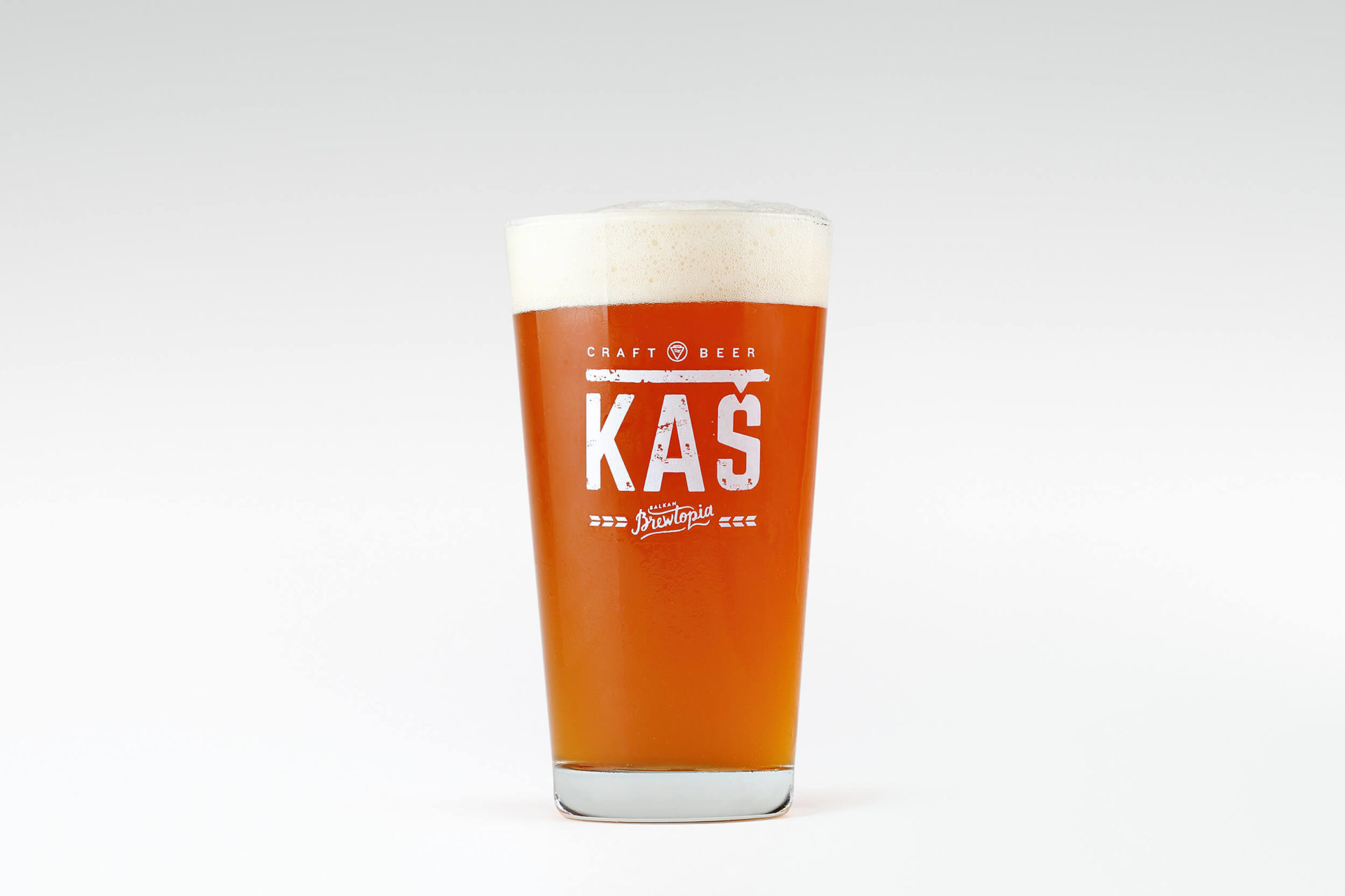
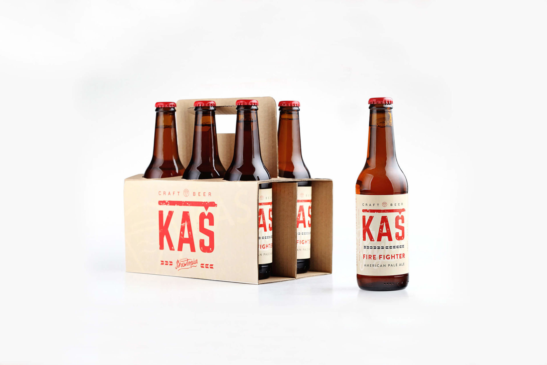
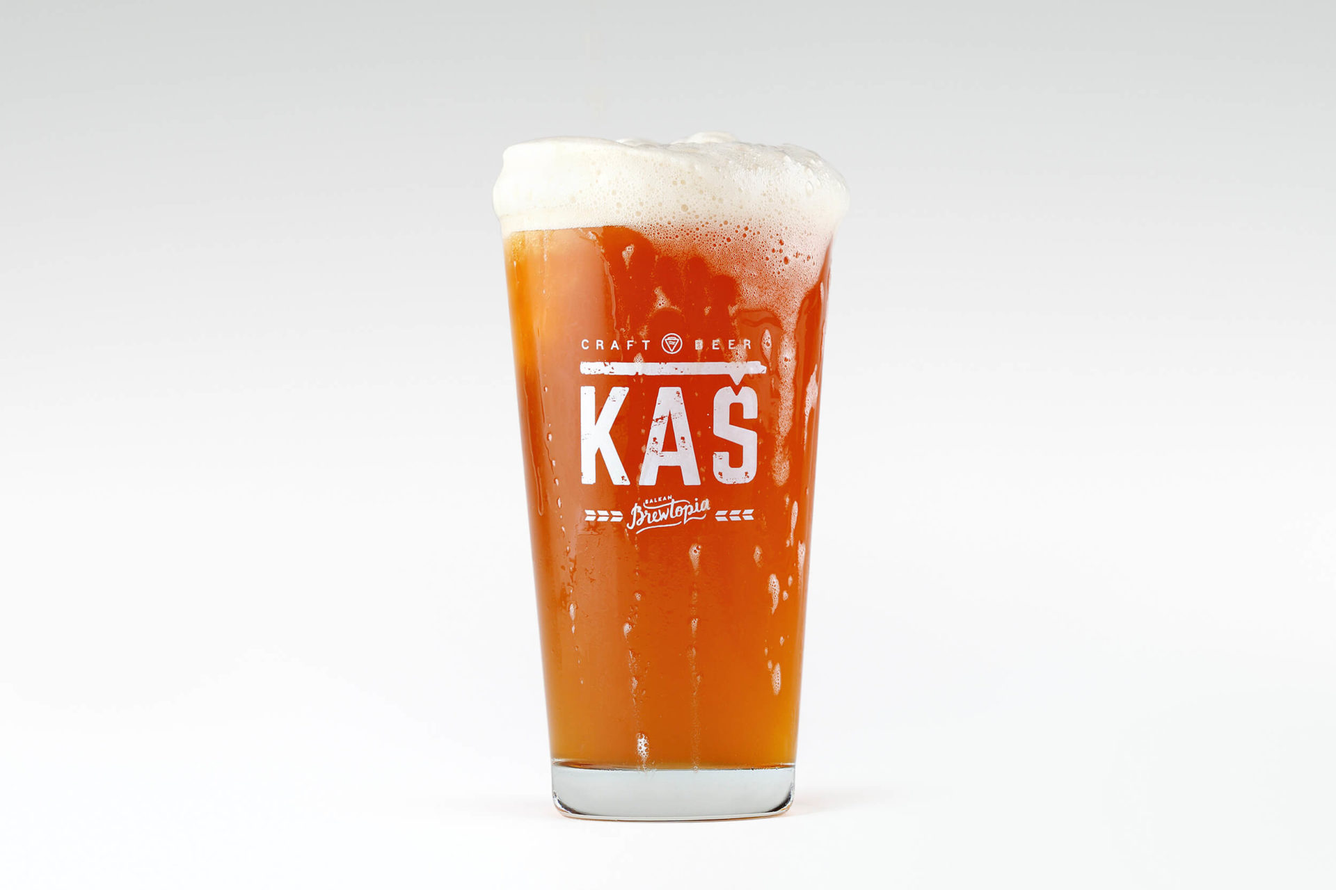
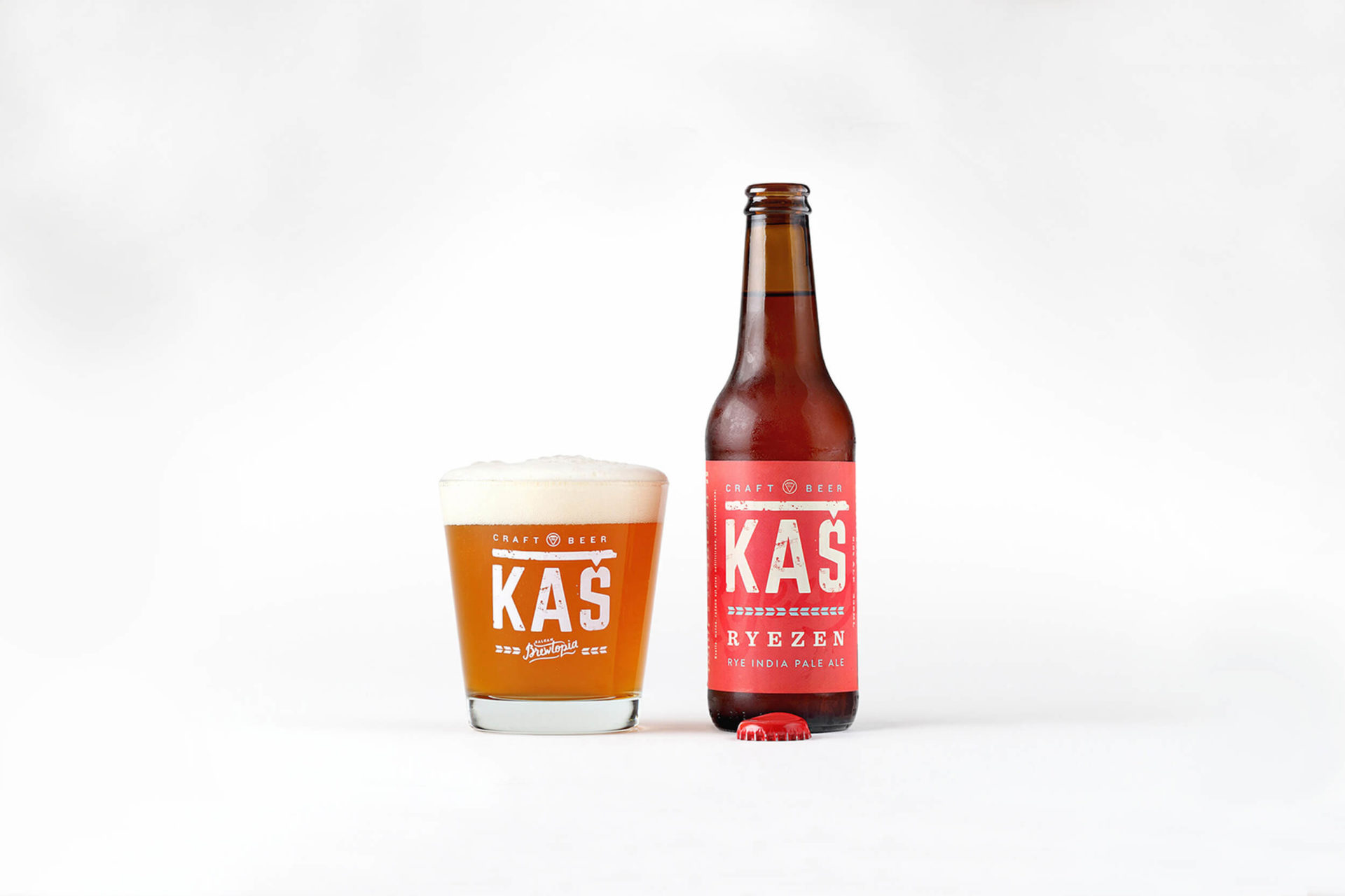
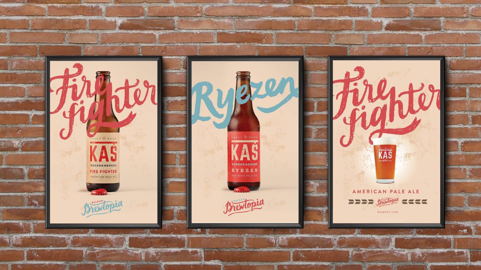
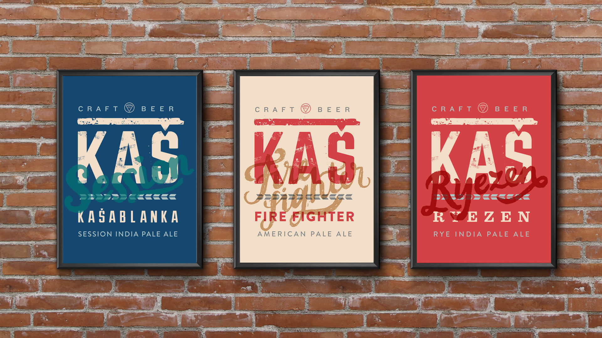
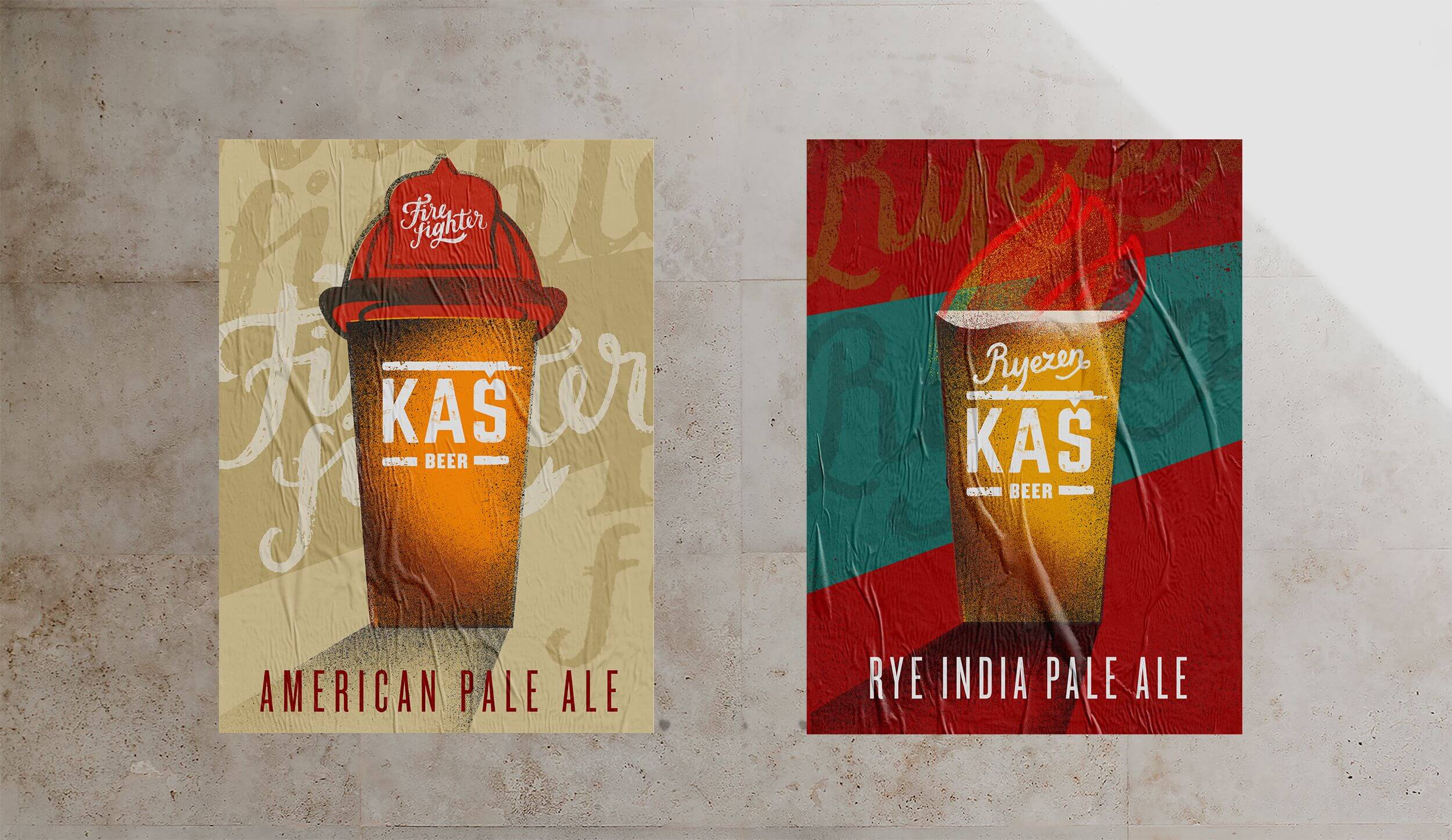
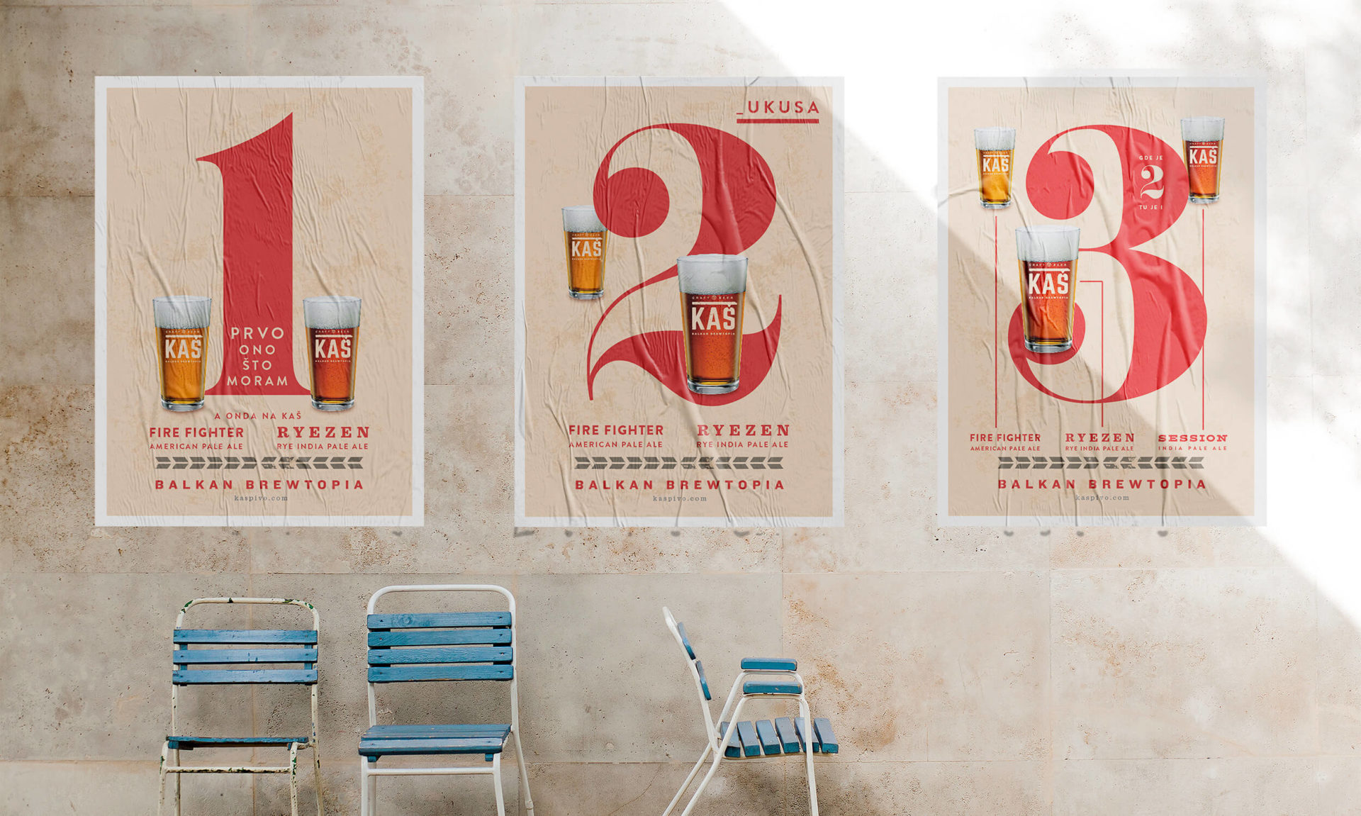
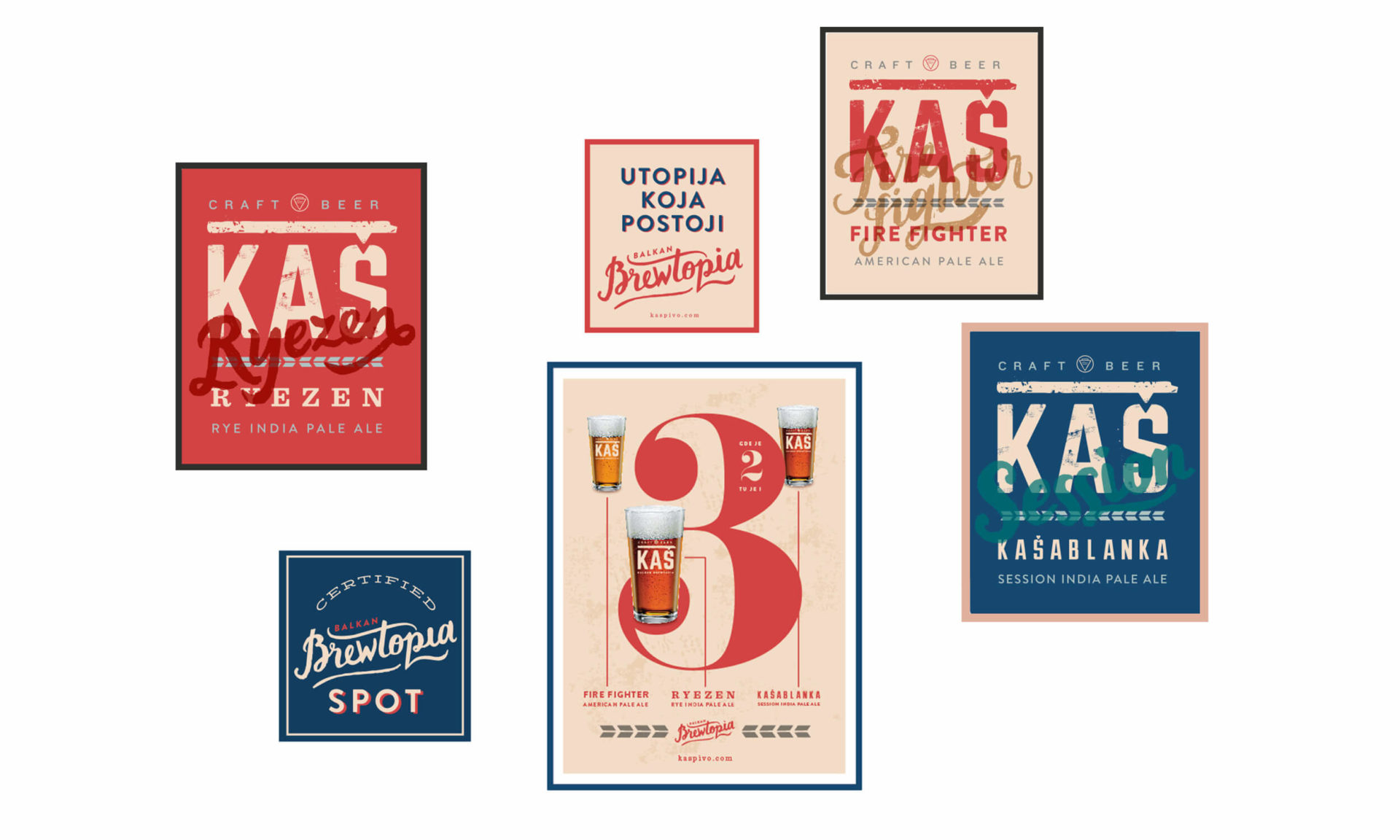
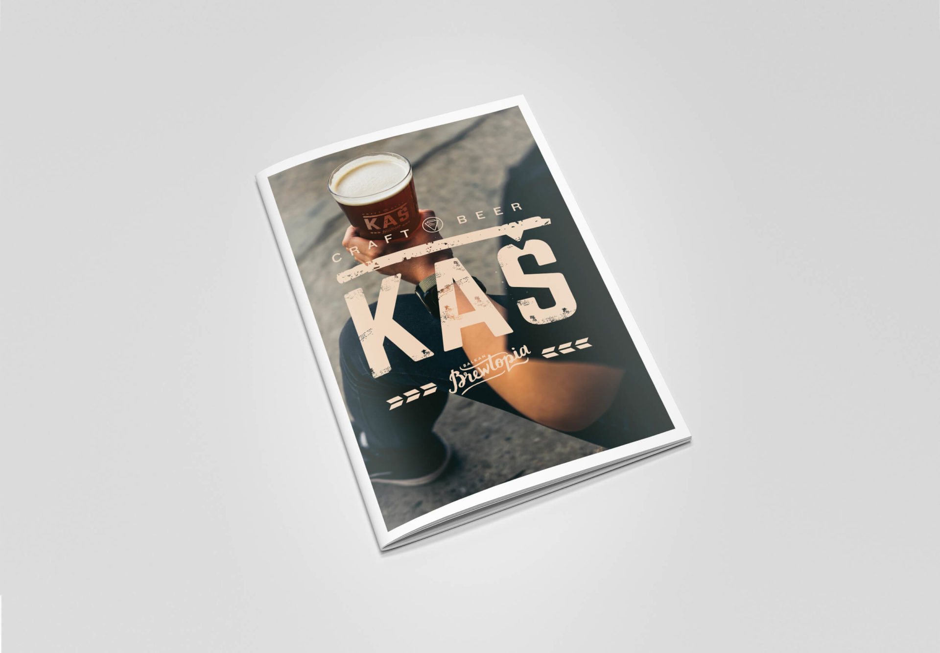
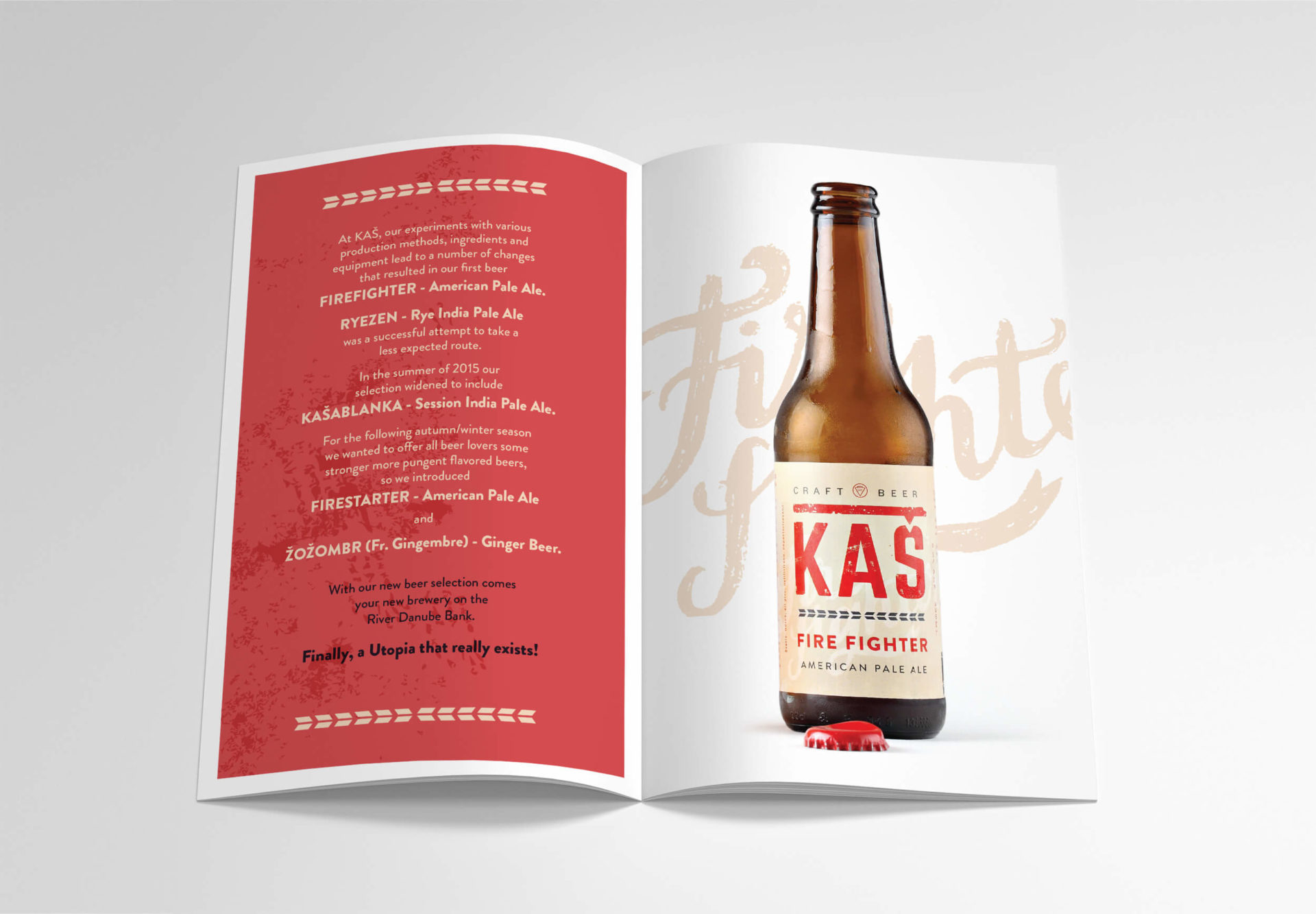
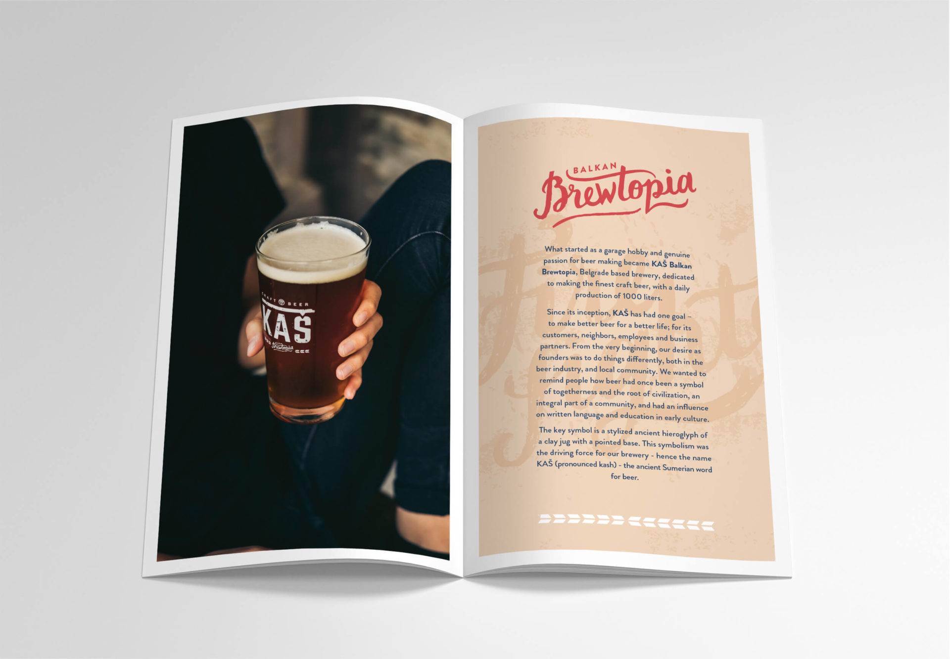
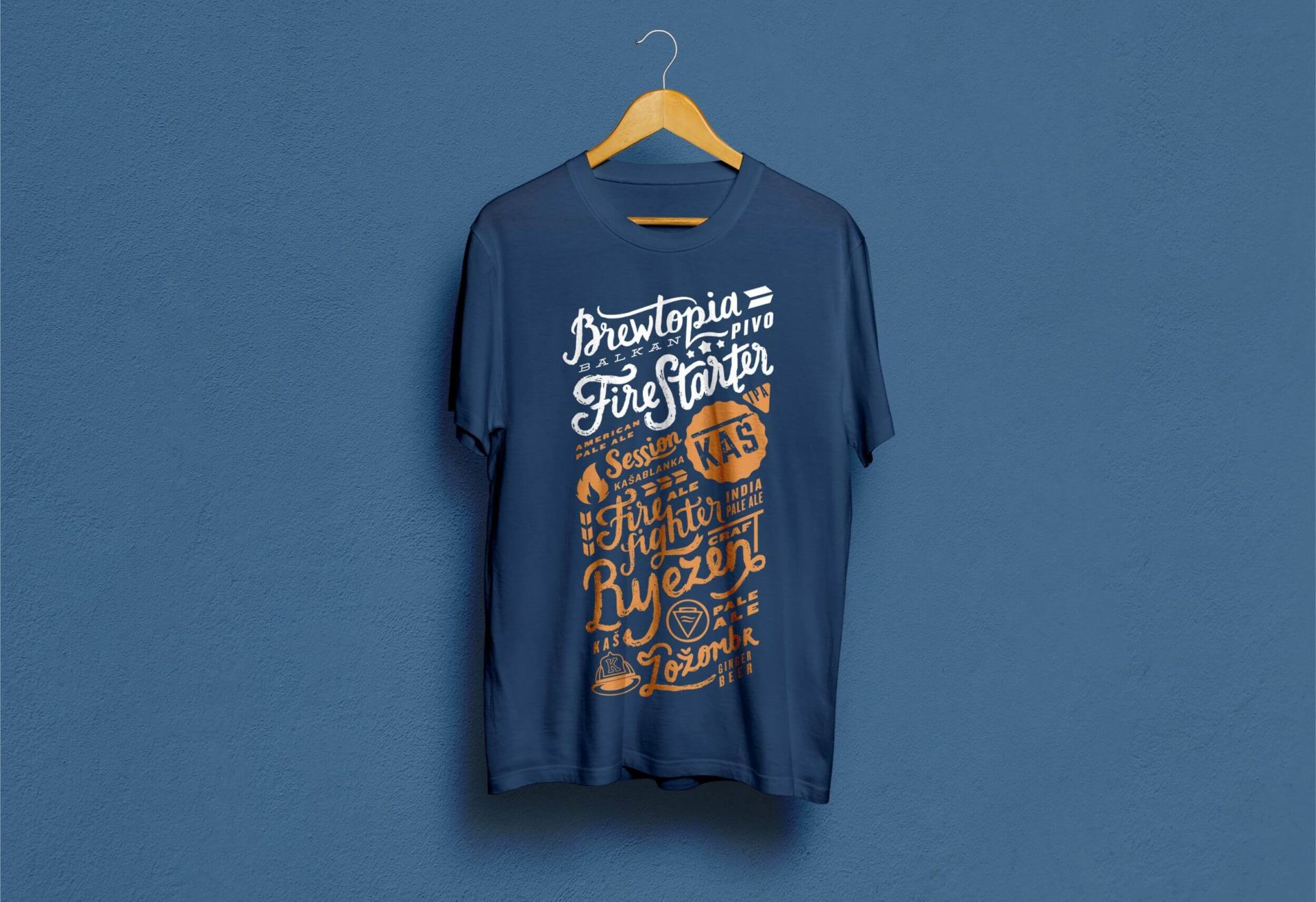
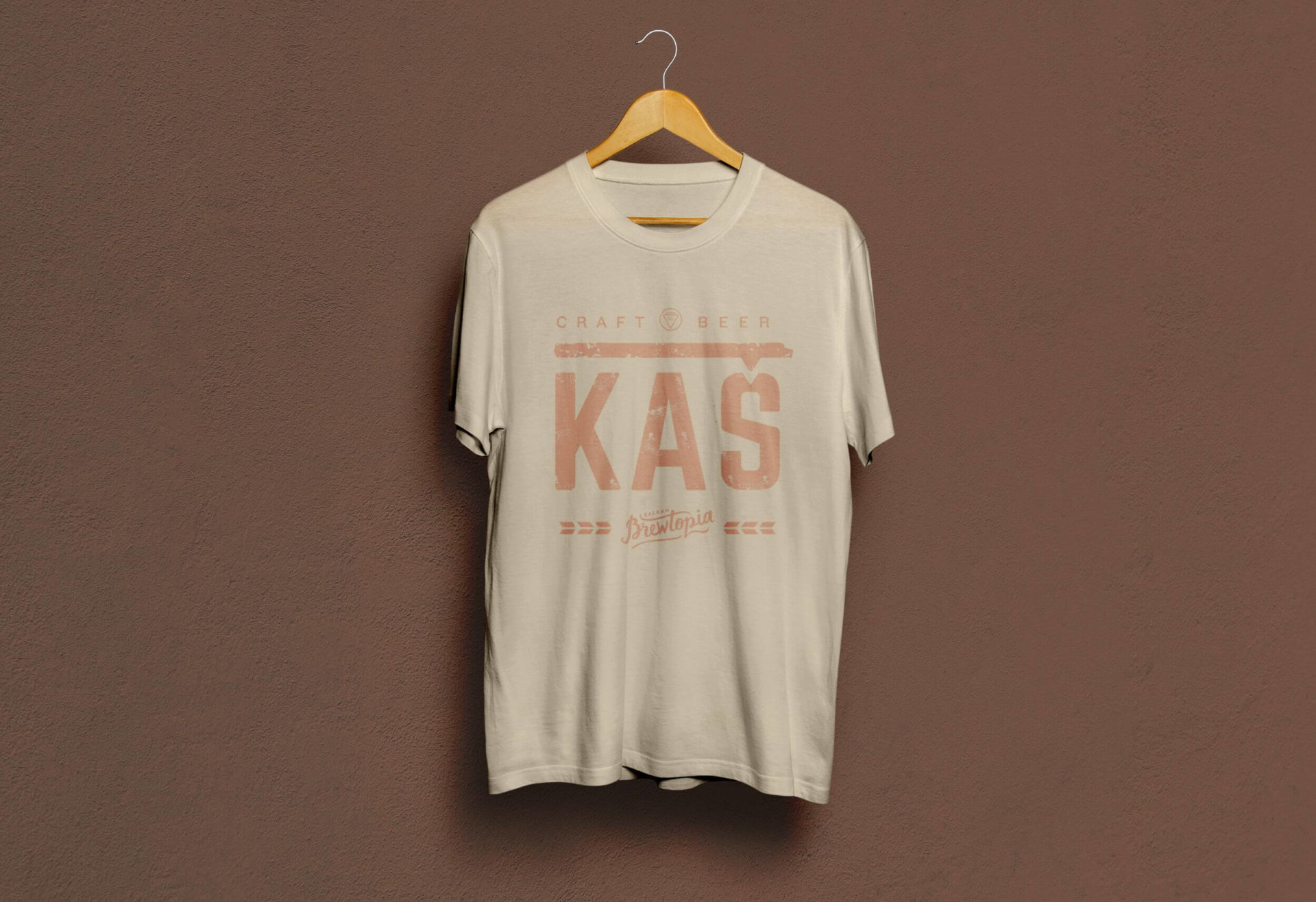
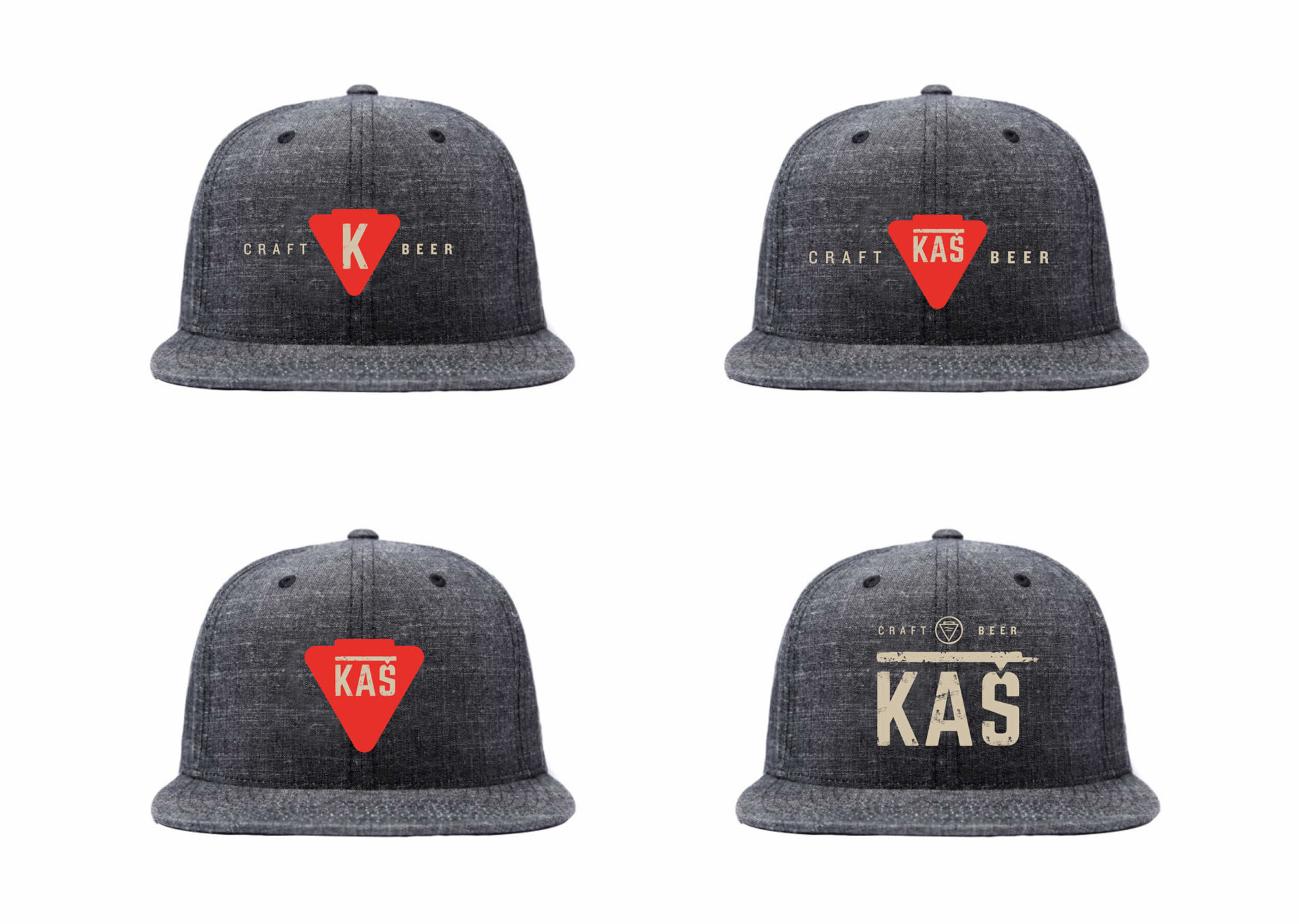
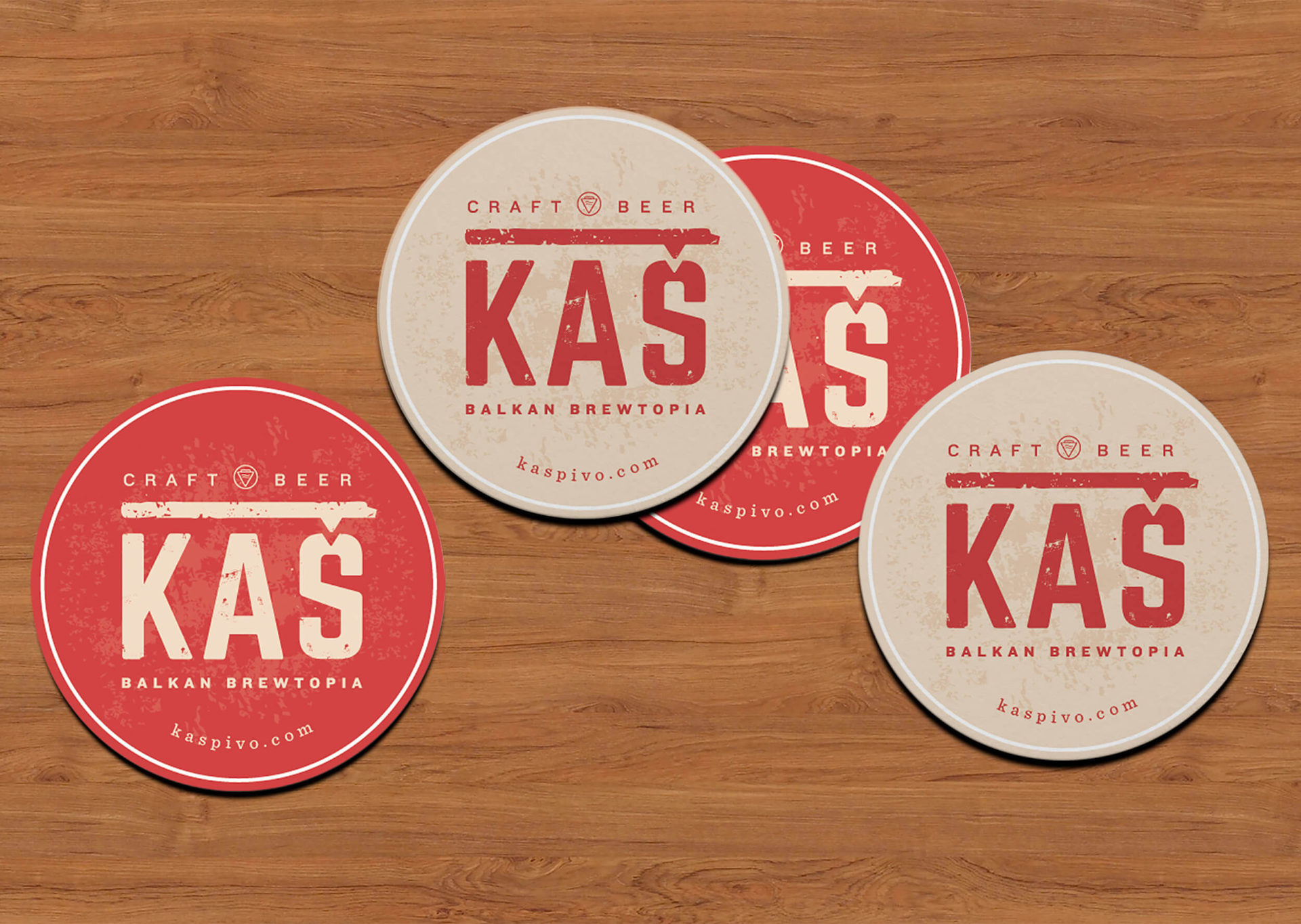
Realizing the strength of tradition, dedication and quality, we have created the identity that elegantly, unobtrusively brings the difference to the world of presentation and advertising of the beer industry.


We launched a teaser campaign which positioned the brand essence through two sentences. “You know who you are. You know where you come from” addressing people with the intention of awakening and recognizing the importance of love and relationship to their own origin.

The Launch campaign set the brand in an elegant way, placing the focus on quality, setting out the atypical tone of advertising the beer industry.

Niska-pivara_sajt-mockup_web

www.niskapivara.rs


Black&Brown

When the company with a range of premium quality marzipan-based snacks approached us, we were presented with a case of disjointed brand image, further complicated by expensive packing issues.

After research was conducted, the name Black&Brown was chosen to unify the product range, after which we set about repositioning it and redesigning its image. The idea was to communicate the premium price with an image of reassuring, yet approachable quality.

We created a new quality seal-like logo for the Black&Brown brand, applying it as a major visual unifier across the range, creating an instant shelf stand out, while at the same time suggesting a reputation for higher quality.

For the premium gift range, we also scrapped the pricey black tin boxes and replaced them with much less expensive square cardboard packs, with just a few details embossed in gold print.

This was one of those projects in which we not only helped boost clients’ sales, but also saved them a lot of money in the process.

Adore Tablet

When it comes to products themselves, to taste and aroma, hand-made chocolates certainly fall under the category of higher quality products instantly. We gave ourselves the liberty to think of it as the Adored category.

While the brand was developing, we had the task of creating packaging for the chocolate tablet. Our idea was to have ten different packages.

Each flavour received its own personality – its own look and name. Each flavour received a specific package, all of which are (from a production standpoint) totally unique in this region.

The use of thermal block foil, laser-cut paper and special printing techniques resulted in designs that communicate that Adoré Chocolate provides more than just taste – it is a brand that takes you on a journey.

Durum

Mitsides Point holds one of the leading positions in the Serbian flour, pasta and bakery products market. The company’s wide range of grain mill products, are highly praised and recognized for their high quality, both on the local and international markets.

Their package design was not up-to-date for some time before they approached us in need of redesign. The main objective was to show the Italy-inspired product ready to satisfy the taste of a well-traveled person as they offer a board range of pasta products from high quality ingredients.

The Lady of the grain is created as a symbol of the hand-made quality approach in production, positioned on a vivid color, enabling instant shelf visibility. Small, delicate details, such as ilustrated grain gave it a whiff of sophistication whilst avoiding the possible contrast between the transparent surface showing the pasta, and the photo of the meal, placed on a wooden table.

If asked to describe it in two words, the best ones would be „Buon appetito!“

Little Blue Pot

The name Little Blue Pot has its origin in a small blue enamelled pot that our client’s grandmother used as a scoop for flour, eggs and sugar when cooking. It is part of a family legend, according to which she always carried it, along with a book of recipes, through all the wars and migrations. It can be understood as a symbol of Serbian culinary heritage.

In contrast, the intention of the design was to point out the contemporary elegance.

Watercolour illustrations, san-serif fonts, simple typography, stylish and reduced style managed to create an elegant impression that encompasses both the look and feel of a luxurious jam intended for foreign markets.

Vivolo

The freshness of fruit, the colourful world of good and delicious tastes, the energy of nature, everything needed for one to shout “Viva!” out loud.

Inspired by the ease of life, it is beautified by hand-written prints, bright colours and a smile.

With a colourful, cheerful and contemporary design, Vivolo is a low-calorie fruit spread for all those who want to enjoy the fullness of fruit without worrying about calories.

La Promessa

You know the plot! There’s a guy … who meets a girl … but she doesn’t care … He’s determined to win her over and makes all kinds of promises!

Each flavor got its own pledge and a charming-method! Will he eventually make it? When you are presented with a top quality product, made of the best varieties of fruit, free of sugars and additives, you know straight away that the process of naming and designing its packaging demands an approach with identical dedication.

The original storytelling brings us a romantic couple, the prince and princess, who are the main protagonists of La Promessa jams. The prince is diligently trying to seduce the princess, without ever giving up, even though she shows no real interest in him, so he offers her various promises, while using the fruit as objects that depict his messages.

The prince and princess are drawn by hand, designed and illustrated specifically for this product, thus clearly indicating the higher quality of the product itself. Some promises are simply irresistible.

www.lapromessa.rs

Rakia bar premium

Generally purchased as a gift, Rakia bar’s premium rakia can be found in retail outlets. Design solutions were developed for different price categories, while respecting the aesthetics and overall impression of each of them.

All solutions are based on an elegant combination of the traditional and a modern touch, achieved with sophisticated typography and illustrations.

Airily, clean and stylish, each of the etiquettes gives you a chance to experience the simplicity of the natural tastes and aromas within.

Hand drawn illustrations denote the sort of fruit being used, thus emphasizing the dedicated approach existing in all phases of production.

Perun

What an interesting way to be presented with the brief – the client came to us with a bag full of bottles of the most famous brands, such as Johnny Walker, Baileys etc., and lined them up one beside another – “I want my product to stand naturally among these ones”, he said.

Perun, the Slavic god of Thunder, demanded that we approach the redesign with a strong, persistent and simple direction.

The metallic stamping that illustrates the powerful face of Perun is the same on all varieties, while a distinction is made through colours used beneath the name. As the brand itself is export-orientated, it had to have international appeal.

Delta

Major Serbian import-export, real-estate, retail and wholesale company. Delta Holding is a major Serbian company that performs a variety of trade services, such as import-export trade, real-estate, retail and wholesale trade. When Delta Holding organised a closed pitch for its new visual identity, we had a clear idea in mind.

The new identity emphasises the competitiveness of the company, based on its solid vision and tradition, as well as its readiness to change with the times in which it operates.

Pattern

Colours

Typography

Mirabank


The logo makes the ‘M’ memorable and highly visible, and also sends a message of the perfection of the closed system, where everything moves within in a bespoke manner, for almost an eternity.


Mira was chosen to form the base for the bank’s name, for its international and Arabic connotations.

The core thought of ‘modern confidence’ resulted with the visual style that is easily communicating contemporary and approachable elegance of an investment bank.

We produced a style guide book of graphic standards, a full range of business documentation, print ads, brochures, a website, interior signage guidelines and interior design and solutions, as well as organizing the opening event and celebrations of the first anniversary of the bank’s operations in Serbia.

Mirabank lounge

Kaš

Unfiltered and unpasteurized beer, created diligently in accordance with the craft beer culture movement, produced with care and dedication, in need of making a visual statement. This high quality craft beer demanded simplicity, charm and visibility. There was no need to overdesign.

As there are different Kaš beers available, each offering a unique world of aroma and personality, the design had to follow. We opted for creating the diversity by giving each Kas its own distinctive color.

We made it clear that Kas has arrived to set the place on fire and show the true meaning of Balkan brewtopia, the beer utopia that finally exists.

Serbia Tourism Organization

Better try to stay cool and calm when you get the chance to brand your own country. The mission was to encompass and symbolically present the inner truth, feeling and statement of a country based on diversity, richness of history and culture, and emotions that are always first to be mentioned when speaking of Serbia.

In the middle of the logo there is a heart-shaped object that easily emphasises the essence of Serbia. The indubitable virtue that tourists often state, when asked about Serbia, is the hospitality and openness of the people. Moreover, Serbian people have a passionate and emotional way of dealing with everything in life, thus the vivid and cheerful colors.

Victoriagroup

When Victoria Group, one of Serbia’s leading agribusiness companies and one of the country’s largest producers, exporters and investors, contacted us in need of a new visual identity, we had to think of the overall group identity in terms of creating something that could harmonise identities among all group members.

We needed a common element that would unify them all, and it was with this in mind that we came up with a unique symbol that can be easily modified. The roots and core of the Group lie in its agricultural sector, thus the leaf shape was a logical choice.

The overall impression had to suggest a contemporary and stylish, yet highly professional and successful mother company and its members.

Kozari

The client came to us with a plan to export premium goat’s milk products, such as a “miracle” probiotic drink, yoghurt, pasteurised milk, curd cream, sliced white cheese, smoked cheese, etc. We came up with a precise and appropriate name: Kozari.

This has international appeal and also says exactly what it stands for – Goat keepers.

By mixing the unrefined and the polished, we came up with stylish and innovative packaging and communication materials. When we showed them our vivid and colourful mood board, they reacted with full understanding of our inspiration and the direction in which we were heading.

The small packs of 250ml fit into the hand and complement walks as a tres chic accessory.

They showed patience and gave us time to articulate the declaration on the back of the packaging in a harmonious way, in order for it to become appealing and readable.

The round ones come with corrugated cardboard around the edge and a gold ribbon logo. It has a highly readable and well-ordered declaration, with breathing holes for the cheese.


Vita verde

Not your ordinary space, thus not your ordinary identity. The concept of the company is based on enriching the spaces with nature, thus creating an inspiring, healthy and welcoming environment.

The Vita Verde brand was created with the very notion of landscape architecture in mind.

The minimalist typographic approach and the simplification of the plant form into the VV sign directly juxtapose the notion of enriching the space with plant life and architectural rules as its core methodology.

Additional hatch patterns, commonly used in architectural drawing, add an occasional visual device to complete the whitespace and simple typographic elements.